Discussion
Hi. I have been working for some time in creating many Caterham logos. Brands of the World is a site with tons of vector logos. The Caterham logo that can be found there was uploaded by me some years ago and it was not very accurate (a very similar font), so I decided to look for the official one or create perfect version, as well as the rest of emblems, etc. Before anyone could think: hey, you want to have the vector files to cut the logos yourself in vinyl and save the money of the stickers, let me say that, considering the price of the stickers, and the amount of job that creating the vector images take, that idea is senseless. What I am doing is expressing my admiration for this brand by recreating the logos used by Caterham, for me and for the rest of the world, to have the chance to use them freely. For instance, what if you prefer the Superlight R500 sticker much larger in your car? Or if you want to have the 7 logo cut in PVC to decorate your room? Having the vector form let you do this, and also print in big formats, manage the images with transparency in Photoshop, apply filters, etc. There are many advantages.
After some searches, I found the logo included in a pdf from the Caterham website and extracted it with Illustrator. I mean, for instance, the text 'CATERHAM' and 'Designed for...' and also the Motorsports version. This typeface is actually helveticaneue blackcond, but vertically stretched (and using just the outline, although you can find also the solid version). I have the logo also in Freehand in text form, with the right tracking, so I can edit it preserving the original format.
From brandsoftheworld.com I also got the '7'. There's a very cool version with the emboss effect too. Then I created the round logo, with the 'Super 7' emblem on the center and the text 'CATERHAM' and '16 valve' in the path of the circle. That font is Bookmanitc lt bt bold. So, I made several variations, with the word 'SPRINT', 'HERITAGE', 'SUPERLIGHT' and 'ROADSTER'. With the 7 logo I also created some alternative forms, with and without outlines.
The '50 years anniversary' logo, with the olive branches, etc. took some more time, but the result was perfect. Another free variation, inspired in the logo of a merchandise cap, is the one with the banner displaying 'HERITAGE'. I also made another version with the 7 alone a a new kind of olive branch.
From the same pdf I also got the vector banner with the chequered flag for the 'Drive experience' logo. The font for 'drive experience' was a commercial font that I didn't have, but I was able to extract the characters used from the pdf and convert them to a ttf. Finally, I made some own creations, using 'motorsport' together with the chequered flag, and also with the 'Racing' logo, just for fun.
The Colin Chapman signature was vectorized with Streamline (not manually). Since, it's handwritten, imperfections in the vectorization do not matter. The original bitmap had medium resolution. I suppose this signature must be in vector form somewhere, since the vynil stickers with it are sold and I suppose they are not prints.
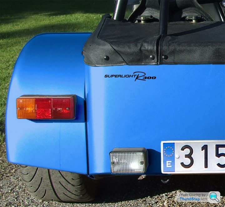
This leads me to my plea to the forum. A very high resolution photo (straight, not in angle), could help me make a better vectorization. The Colin Chapman logo is not a very big problem, as I explained, and I don't know if it will be easy to find anyone who has the sticks and can send a photo, but what I'd really love to have is the Superlight R300 logo. It was downloaded from brandsoftheworld, but I'm afraid it could not be very accurate. The spacing between the letters look excesive and the 300 looks less bold than the original. Same problem with the degree of inclination of the letters. I cannot tell for sure because I have not high res photos of these stickers, but just what can be seen in car photos, which is not very detailed. Again, I ask for your help. Any Caterham user could please be so kind to take a photo of these vinyl decals? If you send me or upload photos of the Roadster, CSR, etc I can also work on them. With luck, the font can be identified too.
I have uploaded the logos to brandsofthewold in Adobe Illustrator format. However, this updated version is still not listed, and I don't know why. I have uploaded it to my server: http://www.alvarezeninternet.com/temp/caterham-log... I have included also the images in a pdf, in case you do not have Illustrator.
If you need the file in FreeHand MX, don't hesitate to ask for it: stormrider@alvarezeninternet.com
This is a preview pic.

Thanks for reading, and sorry for my English.
After some searches, I found the logo included in a pdf from the Caterham website and extracted it with Illustrator. I mean, for instance, the text 'CATERHAM' and 'Designed for...' and also the Motorsports version. This typeface is actually helveticaneue blackcond, but vertically stretched (and using just the outline, although you can find also the solid version). I have the logo also in Freehand in text form, with the right tracking, so I can edit it preserving the original format.
From brandsoftheworld.com I also got the '7'. There's a very cool version with the emboss effect too. Then I created the round logo, with the 'Super 7' emblem on the center and the text 'CATERHAM' and '16 valve' in the path of the circle. That font is Bookmanitc lt bt bold. So, I made several variations, with the word 'SPRINT', 'HERITAGE', 'SUPERLIGHT' and 'ROADSTER'. With the 7 logo I also created some alternative forms, with and without outlines.
The '50 years anniversary' logo, with the olive branches, etc. took some more time, but the result was perfect. Another free variation, inspired in the logo of a merchandise cap, is the one with the banner displaying 'HERITAGE'. I also made another version with the 7 alone a a new kind of olive branch.
From the same pdf I also got the vector banner with the chequered flag for the 'Drive experience' logo. The font for 'drive experience' was a commercial font that I didn't have, but I was able to extract the characters used from the pdf and convert them to a ttf. Finally, I made some own creations, using 'motorsport' together with the chequered flag, and also with the 'Racing' logo, just for fun.
The Colin Chapman signature was vectorized with Streamline (not manually). Since, it's handwritten, imperfections in the vectorization do not matter. The original bitmap had medium resolution. I suppose this signature must be in vector form somewhere, since the vynil stickers with it are sold and I suppose they are not prints.
This leads me to my plea to the forum. A very high resolution photo (straight, not in angle), could help me make a better vectorization. The Colin Chapman logo is not a very big problem, as I explained, and I don't know if it will be easy to find anyone who has the sticks and can send a photo, but what I'd really love to have is the Superlight R300 logo. It was downloaded from brandsoftheworld, but I'm afraid it could not be very accurate. The spacing between the letters look excesive and the 300 looks less bold than the original. Same problem with the degree of inclination of the letters. I cannot tell for sure because I have not high res photos of these stickers, but just what can be seen in car photos, which is not very detailed. Again, I ask for your help. Any Caterham user could please be so kind to take a photo of these vinyl decals? If you send me or upload photos of the Roadster, CSR, etc I can also work on them. With luck, the font can be identified too.
I have uploaded the logos to brandsofthewold in Adobe Illustrator format. However, this updated version is still not listed, and I don't know why. I have uploaded it to my server: http://www.alvarezeninternet.com/temp/caterham-log... I have included also the images in a pdf, in case you do not have Illustrator.
If you need the file in FreeHand MX, don't hesitate to ask for it: stormrider@alvarezeninternet.com
This is a preview pic.

Thanks for reading, and sorry for my English.
Edited by Elapido on Monday 21st June 23:04
I have found what I needed for the Superlight logo. I've made all versions: R300, R400 and R500, in one and two lines. Now, am I wrong or this version of the logo is now old and the new one is the one in the attached photos (a high res version would be fantastic: stormrider@alvarezeninternet.com). If you take a look at the Caterham website, you will notice that all this R000 logos are like this one. I don't know if the R belongs to any font or it's an original creation (the old one is Rage Italic). I guess the numbers are the same font used in Drive Experience, which is September Medium Italic. I have not been able to find it (it's a comercial font).


Nicodema, if you have the September font, could please you pass it to me? I've been looking for it for so many hours...
I think it's easy to make a perfect vector version of the R rather than trying to find to what font it belongs.
As regards SUPERLIGHT, it's pretty strange that there are differences even between the stickers. Look. The S and R are different, the spacing is different, the vertical and horizonal strokes have different width... My vector version is acceptable, although it would be better with a font like in the second bitmap, which doesn't look stretched.

¡Hola! Elapido
As promised, massive resolution images. Just click on the Show all sizes button and vhoose original size.
Big Pictures
Enjoy,
Martyn
As promised, massive resolution images. Just click on the Show all sizes button and vhoose original size.
Big Pictures
Enjoy,
Martyn
This is crazy haha. Look, two stickers in high res and the official logo in medium res. The 3 fonts are different. The one in the middle, which was the one that I was taking as model before, is the most different. However, the first one also has some changes, like the horizontal strokes being too thin. Notice for instance the hole in the R, which has different proportions. Another interesting thing: the big R in the original font (Avant...que) is not very nicely designed. The logo seems to be based on it, but with cleaner. I've made a vector version.
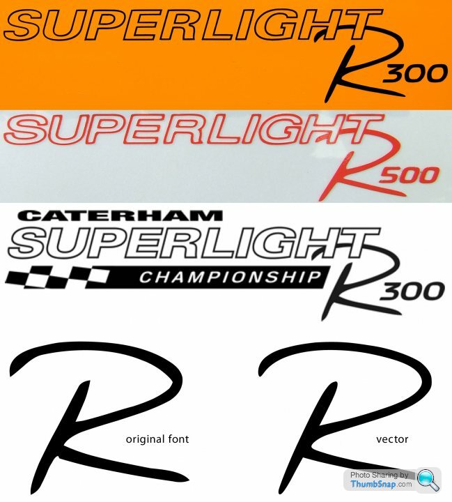

Those are looking very nice. I feel a t-shirt order coming on. It wouldn't surprise me if CC have had a few different companies making up the decals. The model decals (e.g. Superlight R300) are cut vinyl, and there are two different sizes; small for the rear panel, large for the bonnet sides.
I've got myself an extra, silver one in the large size that I've applied to the carbon dash in front of the passenger.
I've got myself an extra, silver one in the large size that I've applied to the carbon dash in front of the passenger.
I just uploaded them to http://www.logonica.com
I hope you don't mind. But I've divided your file into separate ones, e.g each file is one logo. Search for "caterham" to list all of them. Some of them I had to fix because they were strangely flattened when converted to eps.
I hope you don't mind. But I've divided your file into separate ones, e.g each file is one logo. Search for "caterham" to list all of them. Some of them I had to fix because they were strangely flattened when converted to eps.
Gassing Station | Caterham | Top of Page | What's New | My Stuff


