Black & White thread
Discussion


AB8219 said:
 heatherwood2 by Aaron Brown, on Flickr
Any tips on how to improve would be gratefully received.
Edited by AB8219 on Sunday 23 August 12:31


LastLight said:
A 2nd attempt - not been anywhere near Photoshop, just modified contrast, shadows, blacks and whites in Lightroom - less severe cuts to the blacks this time!
 From a rainy Curbar Edge by David Hawkes, on Flickr
Very nice!From a rainy Curbar Edge by David Hawkes, on FlickrLastLight said:
Thanks Robbie; the story behind it is one of operator malfunction, wrong settings and lots of what could have been special shots ruined. So good to at least partially rescue a couple.
Well I don't know what the scene looked like originally but that image is very Ansel Adams-esque and I'm a fan!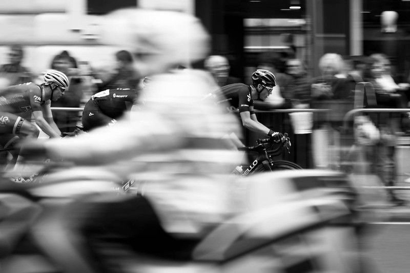

DibblyDobbler said:
^^^ Excellent! One small point - you appear to have accidentally got it in focus 
LL has previous form in that respect - at least he does in the B&W thread.Mind you, this being PH, the central subject is obviously the fire engine in the field and if you look at that specifically at 100% zoom viewing the proffered size of the original ...... it's a little soft at the edges.
So I think tradition is honoured here.

LongQ said:
LL has previous form in that respect - at least he does in the B&W thread.
Mind you, this being PH, the central subject is obviously the fire engine in the field and if you look at that specifically at 100% zoom viewing the proffered size of the original ...... it's a little soft at the edges.
So I think tradition is honoured here.
Funny you should say that - funny not in the Dibbley way - as I was talking to my brother about this today. The light yesterday was very hazy and wishy washy and the original had very little contrast or bite. Yet with a bit of a play in Lightroom it looks quite sharp, though in colour the 'dehaze' makes the dark top look too blue and no end of messing with the sliders can balance it quite well.Mind you, this being PH, the central subject is obviously the fire engine in the field and if you look at that specifically at 100% zoom viewing the proffered size of the original ...... it's a little soft at the edges.
So I think tradition is honoured here.
We looked at the fire engine, which actually looks sharper and better defined in colour, marvelling at what current cameras and lenses can do. We worked out that the width and height was so small it would fit oodles of times in the frame so recognisable despite being well under 1% of the frame. Ditto with things like the sheep. We zoomed in and on screen and the badge on the front - fire engine, not sheep - unreadable, fair enough, but obviously a badge, was something like 9 pixels with a 1 pixel band around it. So less than a dozen of the 43 million, yet visible. Remarkable.
LastLight said:
LongQ said:
LL has previous form in that respect - at least he does in the B&W thread.
Mind you, this being PH, the central subject is obviously the fire engine in the field and if you look at that specifically at 100% zoom viewing the proffered size of the original ...... it's a little soft at the edges.
So I think tradition is honoured here.
Funny you should say that - funny not in the Dibbley way - as I was talking to my brother about this today. The light yesterday was very hazy and wishy washy and the original had very little contrast or bite. Yet with a bit of a play in Lightroom it looks quite sharp, though in colour the 'dehaze' makes the dark top look too blue and no end of messing with the sliders can balance it quite well.Mind you, this being PH, the central subject is obviously the fire engine in the field and if you look at that specifically at 100% zoom viewing the proffered size of the original ...... it's a little soft at the edges.
So I think tradition is honoured here.
We looked at the fire engine, which actually looks sharper and better defined in colour, marvelling at what current cameras and lenses can do. We worked out that the width and height was so small it would fit oodles of times in the frame so recognisable despite being well under 1% of the frame. Ditto with things like the sheep. We zoomed in and on screen and the badge on the front - fire engine, not sheep - unreadable, fair enough, but obviously a badge, was something like 9 pixels with a 1 pixel band around it. So less than a dozen of the 43 million, yet visible. Remarkable.
Back in the day (of film) the fire engine might have been represented by one or two grains on the film surface (other than when using large format film) so to be able to distinguish anything much about it from a relatively small digital sensor - even using enhancing software - is no mean feat.
That we can make such observations after a few minutes using a computer rather than hours in a fume room is also somewhat significant.
IMO.
LastLight said:
DibblyDobbler said:
^^^ Excellent! One small point - you appear to have accidentally got it in focus
Very funny, very droll. Some of the soft focus pictures (I bet they go down like a lead balloon here!) are deliberately so, at least in some areas. Well, some of them. I blame Sony for the rest. Wait 'till I get my Actus back, with tilt and a decent lens I should be able to get at least ooh, 1/5 of a scene reasonably sharp. Or an eighth, or something...As long as I remember the tripod.
1958 Mercury Commuter...spotted in my local Asda supermarket.
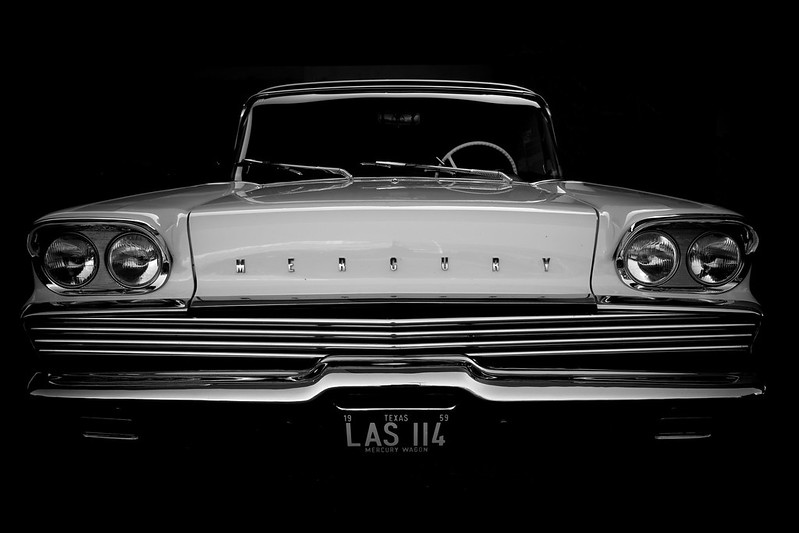
1958 Mercury Commuter by André Jardinière, on Flickr
1958 Mercury Commuter by André Jardinière, on Flickr

Gassing Station | Photography & Video | Top of Page | What's New | My Stuff