Would like some opinion on this post processing
Discussion


I was at the Grand Canyon quite a while ago now and I am only just getting chance to get into the photos and process them. One of the reasons its taken so long is that I just didn't know what to do with these photos which, to someone unfamiliar with post processing, may look like complete losses.
It was very early morning, there was a haze that didn't look too strong to the eye and it was bloody freezing, so we weren't hanging about. But combination of wrong settings perhaps and no polariser has meant nearly all of the photos have come out like this:
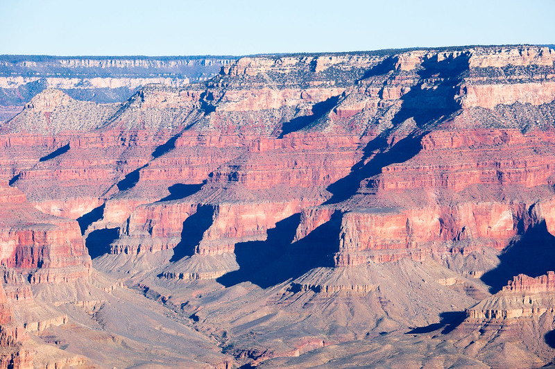 GrandCanyon-2 by Alex Mason, on Flickr
Washed out completely with a very strong blue tinge to the shadows. This isn't too bad, but I have one where the shadows are literally bright indigo!
I have tried many things to rescue them and I think I have cracked it. I suspect this is really a job for photoshop and now that I can use it through CC, I may have a go. I know LR isn't designed to have lots of manipulation and local editing, but through use of the RGB tone curves, temperature, clarity, contrast, hue and luminance sliders plus local brush and gradient adjustments I managed to get it to look like this:
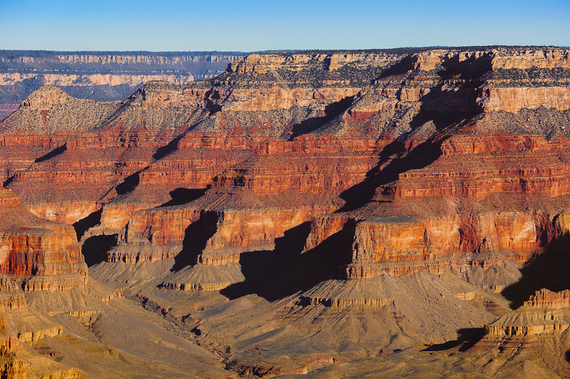 GrandCanyon-1 by Alex Mason, on Flickr
What do you think? does it look ok? or does it look too strong/radioactive? I don't like the sky, but for the life of me I cannot get it to look natural. Perhaps I need to wash it out more.
If anyone wants to have a try in PS, i can send you the RAWs if you like.
It was very early morning, there was a haze that didn't look too strong to the eye and it was bloody freezing, so we weren't hanging about. But combination of wrong settings perhaps and no polariser has meant nearly all of the photos have come out like this:
GrandCanyon-2 by Alex Mason, on FlickrWashed out completely with a very strong blue tinge to the shadows. This isn't too bad, but I have one where the shadows are literally bright indigo!
I have tried many things to rescue them and I think I have cracked it. I suspect this is really a job for photoshop and now that I can use it through CC, I may have a go. I know LR isn't designed to have lots of manipulation and local editing, but through use of the RGB tone curves, temperature, clarity, contrast, hue and luminance sliders plus local brush and gradient adjustments I managed to get it to look like this:
GrandCanyon-1 by Alex Mason, on FlickrWhat do you think? does it look ok? or does it look too strong/radioactive? I don't like the sky, but for the life of me I cannot get it to look natural. Perhaps I need to wash it out more.
If anyone wants to have a try in PS, i can send you the RAWs if you like.
Yellabelly said:
Try Google images for the same location and see what the colours look like there. You can then decide whether you prefer your interpretation.
Good idea. I think the colours may be too strong, especially for the time of day. I have made it look more like I imagine it would at sunset.
RobDickinson said:
pretty decent job overall, only crit is you have blocked out some of the shadow detail.
Recopy the original, mask it back into the shadow areas, but choose a blend mode of lighten or something
Yeah the shadows were hard to do as thats where the strongest blue tinge is. They do look too dark don't they and their edges look weird because of how the auto-masking has worked.Recopy the original, mask it back into the shadow areas, but choose a blend mode of lighten or something
Otispunkmeyer said:
RobDickinson said:
pretty decent job overall, only crit is you have blocked out some of the shadow detail.
Recopy the original, mask it back into the shadow areas, but choose a blend mode of lighten or something
Yeah the shadows were hard to do as thats where the strongest blue tinge is. They do look too dark don't they and their edges look weird because of how the auto-masking has worked.Recopy the original, mask it back into the shadow areas, but choose a blend mode of lighten or something
If you can get a colour range mask from it and play with the levels, you just have to catch it before the shadows go milky.
Pixel Pusher said:
Otispunkmeyer said:
RobDickinson said:
pretty decent job overall, only crit is you have blocked out some of the shadow detail.
Recopy the original, mask it back into the shadow areas, but choose a blend mode of lighten or something
Yeah the shadows were hard to do as thats where the strongest blue tinge is. They do look too dark don't they and their edges look weird because of how the auto-masking has worked.Recopy the original, mask it back into the shadow areas, but choose a blend mode of lighten or something
If you can get a colour range mask from it and play with the levels, you just have to catch it before the shadows go milky.
Better to learn myself I suppose. What is a colour range mask then?
Otispunkmeyer said:
This looks better. I can't feed you the RAW file can I ? :P
Better to learn myself I suppose. What is a colour range mask then?
I'd be happy to take a look for you tomorrow from the RAW. Fire it over.Better to learn myself I suppose. What is a colour range mask then?
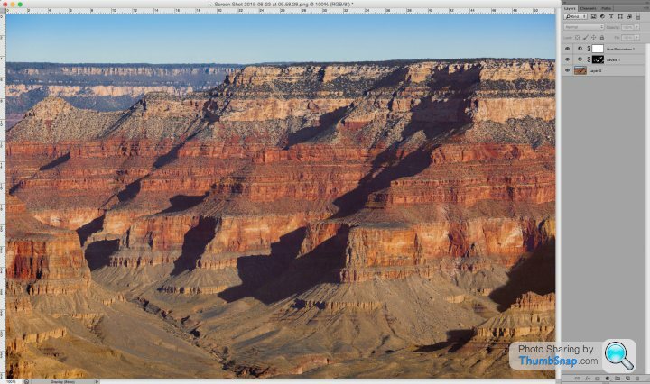
I have Capture one at work so may be able to get a better start point there. I did that one from a screen grab of your Flikr file so the masks are pants.
Colour range is one of the masking tools in Photoshop, it basically samples a tint / colour in the file and masks everything in that range.
That was done 'blind' based on what you thought was too weak & too strong, so if you feel that's how it looked on the day, then we'll aim for that.

Pixel Pusher said:
Otispunkmeyer said:
This looks better. I can't feed you the RAW file can I ? :P
Better to learn myself I suppose. What is a colour range mask then?
I'd be happy to take a look for you tomorrow from the RAW. Fire it over.Better to learn myself I suppose. What is a colour range mask then?
I have Capture one at work so may be able to get a better start point there. I did that one from a screen grab of your Flikr file so the masks are pants.
Colour range is one of the masking tools in Photoshop, it basically samples a tint / colour in the file and masks everything in that range.
That was done 'blind' based on what you thought was too weak & too strong, so if you feel that's how it looked on the day, then we'll aim for that.
I am not so sure the colours were that strong on the day, because it was early morning and the light from the sun wasn't really that warm. But I like warm and vivid. Its how I like to remember things.
Heres the RAW:
http://1drv.ms/1CrmivJ
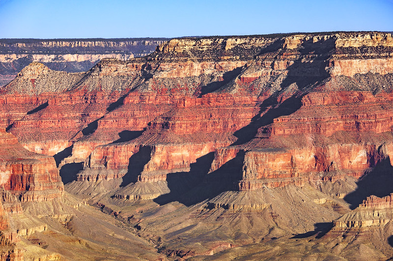 DSC09544 by Alex Mason, on Flickr
Had a go with it in PS. Does that look better?
I am getting lost now. You can spend ages on these and think, yeah that looks alreet pet! Then you come back after your tea to exclaim; who's vom'd on my screen?
The top section of rocks, to me, looks too punchy, too contrasty. Perhaps I need to mask that off and dial it down. Also I can't seem to get rid of the haze. But its nearly there. Hopefully the shadows look better?
I forgot to crop/rotate. Sorry. I did remember to sharpen though.


It's too red. too strong. Comparing to mine, has the upload service blurred the details or have I over sharpened?
The sky is another bone of contention. In RAW image its really pale thanks to the haze. Trying to get the blue back just makes it look wrong. I can't seem to get it to look realistic.
Have to say PS is very much better for attacking this sort of thing. I had been trying to do it all in LR.
The sky is another bone of contention. In RAW image its really pale thanks to the haze. Trying to get the blue back just makes it look wrong. I can't seem to get it to look realistic.
Have to say PS is very much better for attacking this sort of thing. I had been trying to do it all in LR.
Edited by Otispunkmeyer on Thursday 25th June 14:11
There's 4 areas to edit in this, and they're separate of each other, but they need to come together to make one image.
There's what looks to be a pincushion (edit, sorry) distortion going on that needs correcting, the sky and the far left mountains need colour correction on their own (it'd gone too purple in one of your earlier edits), the rock shadows on their own need some recovery and the colour of the main rocks needs saturation and contrast sorting.
You'll be able to do it across 4 layers with masks easily enough, but if you look at each of the problem areas on their own first, you should start to see a final edit coming together
Edited by andy-xr on Thursday 25th June 14:18
Gassing Station | Photography & Video | Top of Page | What's New | My Stuff