Critique this please.
Discussion


Rogue86 said:
As a standalone image, I like it. But I dont think it would stand out particularly among other competing images.
This is VERY true. I'm the youngster at the club at 48 and the majority are retired people with lots of time and the green stuff.They can get out of bed at 4 a.m, go to their favourite spot, get the picture, come home for a snooze, then spend hours on PS! There are some very good images in the competitions, taken by people with all sorts of letters after their names. I work 6 days a week for minimum 10 hour days. I take pictures at the time I happen to have a camera with me! The sort of image I'm up against makes mine almost embarrassing, which is why I thought I'd look for criticism first.Here's one member's website: http://www.smartdigitalimages.com/all-photographs
Edited by bernhund on Wednesday 7th October 20:33
Well you are obviously up against some stiff competition - but one thing is for certain, you won't win unless you enter! As has already been stated, yours is a perfectly nice image, no exposure issues and technically well composed. Lighthouses are notoriously difficult subjects because there is usually a lot of vertical and not much else around. Your main feature of interest here is its colour! If you had the inclination you could try adjusting the foreground in photoshop and maybe reduce the blue in the sky. Do you have access to any editing software? Good luck!
bernhund said:
This is VERY true. I'm the youngster at the club at 48 and the majority are retired people with lots of time and the green stuff.They can get out of bed at 4 a.m, go to their favourite spot, get the picture, come home for a snooze, then spend hours on PS! There are some very good images in the competitions, taken by people with all sorts of letters after their names. I work 6 days a week for minimum 10 hour days. I take pictures at the time I happen to have a camera with me! The sort of image I'm up against makes mine almost embarrassing, which is why I thought I'd look for criticism first.
Here's one member's website: http://www.smartdigitalimages.com/all-photographs
Looking at that first page I dont see any images that would need a 4am start. Though there is a lot of processing involved most of it could be done in 5min in lightroom - it looks like a quick B&W conversion for them. You can get quick at the basics of editing with experience, almost all my edit on most shots is done with adjustments to half a dozen sliders in adobe camera raw (same for LR).Here's one member's website: http://www.smartdigitalimages.com/all-photographs
I suggest you look through that website and take on board the compositions, they certainly have an eye for it.
Simplify, use negative space where you can, be creative. Learn to see the lines and angles good composition needs. This isnt easy, takes time and tbh some native skill. One I really dont have in abundance either.
As to the lighthouse image, its OK but not a stand out, I would have tried to avoid the straggly grass in the foreground. There is a lot of empty blue sky but thats not too bad either. IMO would make a decent print and stock image but wont wow anyone, mainly because of the flat daytime lighting.
Good photography has to cover all 4 bases for me, composition, light, timing and creativity.
The more of those you nail the better the end result.
Composition - the rules work almost always, but creativity part means you should look at breaking these when possible. Always try keep things simple on a big scale eevn if the scene is busy
Light - often means golden hours for landscapes but can work in stormy daytime conditions, or fluffy clouds, long exposures etc. In NZ quite often we have long blue sky days for half the year meaning you have to put in extra effort to be at the right times.
Timing - either on the big side, right time of year for the suns position, right time of month for the moon, right time of day for sunrise, or right time for that one person in the right position, or bird, or timing for waterfalls etc.
Creativity - use and abuse the 3 above, shoot low, high, move back, get closer. Pick the good light, or bring it with you, manage exposure for it. Abuse the exposure triangle when you want ( long exposures, fast shutter, low key/high key, depth of field - plus anything else you can throw in to the shot. mostly this is the icing on the cake that pushes a 9/10 shot to 10/10.
I'm taking all this on board guys, so thank you very much. Whether it will still be on board the next time I'm out with my camera is questionable!
So, I will put the image in the competition just to see how it is received. I'll let you know what the judge says.
Could you help me out with this one too please, as it's one that I have fiddled with in PS. I've not added anything that wasn't there, except cloned a bit of cloud into the top left hand corner where there wasn't any. Other than that, just made slider adjustments and heavily cropped. I think it has probably lost quite a lot of pixels in doing so. Again, I know it's not a winner, but is this more like what you'd expect?

bernhund said:
I'm taking all this on board guys, so thank you very much. Whether it will still be on board the next time I'm out with my camera is questionable!
So, I will put the image in the competition just to see how it is received. I'll let you know what the judge says.
Could you help me out with this one too please, as it's one that I have fiddled with in PS. I've not added anything that wasn't there, except cloned a bit of cloud into the top left hand corner where there wasn't any. Other than that, just made slider adjustments and heavily cropped. I think it has probably lost quite a lot of pixels in doing so. Again, I know it's not a winner, but is this more like what you'd expect?
I'd have processed the sky more to add some drama, then again the first thing I thought when I saw this was..So, I will put the image in the competition just to see how it is received. I'll let you know what the judge says.
Could you help me out with this one too please, as it's one that I have fiddled with in PS. I've not added anything that wasn't there, except cloned a bit of cloud into the top left hand corner where there wasn't any. Other than that, just made slider adjustments and heavily cropped. I think it has probably lost quite a lot of pixels in doing so. Again, I know it's not a winner, but is this more like what you'd expect?
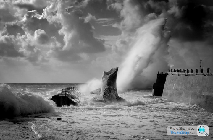
'This needs a huge shark
 ).
).D
Going back to the original image for a moment ...
I suspect it is one of those that is much more impressive viewed (and especially printed) large when all of the detail it undoubtedly contains - especially colour details - will attract the eye.
If it were my image I would be somewhat keen to try to do something the the straw coloured grass across the bottom - especially the longer growths. I find them distracting here as I do when I end up with something like that inthat my own shots. That may be a personal obsession of course. It's mainly about the uncontrollable randomness of the positioning in an image, not the fact that there are clumps of grass there. Obsession might be too strong a terms. An image like this seems to me to be stronger the simpler it is.
In that vein I think it would be better without the fence too. However I would guess that might not be so easy to remove and still retain exhibition quality for a large output format containing subtle detail. Maybe it could be toned down a little?
Once again the objective for me would be simplification of the overall image to allow the "assumed" subtlety of the colours in the sky the sea and the structure to take on the role of primary interest.
Just my opinion of course and reflecting my personal preferences.
Clearly there are likely to be any number of reasons why such eliminations from the image may not be good form.
LongQ said:
Going back to the original image for a moment ...
I suspect it is one of those that is much more impressive viewed (and especially printed) large when all of the detail it undoubtedly contains - especially colour details - will attract the eye.
If it were my image I would be somewhat keen to try to do something the the straw coloured grass across the bottom - especially the longer growths. I find them distracting here as I do when I end up with something like that inthat my own shots. That may be a personal obsession of course. It's mainly about the uncontrollable randomness of the positioning in an image, not the fact that there are clumps of grass there. Obsession might be too strong a terms. An image like this seems to me to be stronger the simpler it is.
In that vein I think it would be better without the fence too. However I would guess that might not be so easy to remove and still retain exhibition quality for a large output format containing subtle detail. Maybe it could be toned down a little?
Once again the objective for me would be simplification of the overall image to allow the "assumed" subtlety of the colours in the sky the sea and the structure to take on the role of primary interest.
Just my opinion of course and reflecting my personal preferences.
Clearly there are likely to be any number of reasons why such eliminations from the image may not be good form.
I can see that now. The straw like grass just pokes its head above the parapet! If the entire plant could be seen, it may have been a different story. But as it is, it's just a distraction.I suspect it is one of those that is much more impressive viewed (and especially printed) large when all of the detail it undoubtedly contains - especially colour details - will attract the eye.
If it were my image I would be somewhat keen to try to do something the the straw coloured grass across the bottom - especially the longer growths. I find them distracting here as I do when I end up with something like that inthat my own shots. That may be a personal obsession of course. It's mainly about the uncontrollable randomness of the positioning in an image, not the fact that there are clumps of grass there. Obsession might be too strong a terms. An image like this seems to me to be stronger the simpler it is.
In that vein I think it would be better without the fence too. However I would guess that might not be so easy to remove and still retain exhibition quality for a large output format containing subtle detail. Maybe it could be toned down a little?
Once again the objective for me would be simplification of the overall image to allow the "assumed" subtlety of the colours in the sky the sea and the structure to take on the role of primary interest.
Just my opinion of course and reflecting my personal preferences.
Clearly there are likely to be any number of reasons why such eliminations from the image may not be good form.
It's very useful asking for these opinions, as I've stared at the image so many times, I've become blinded. I'm in danger of just ending up with a blue canvas if I'm not careful though. Having said that, a couple of years ago Barnett Newman, a New York artist, painted one with a white line through it....it sold for $44m!

Small point - there is a rule that says you can't please everyone. And as you're finding, the more opinions you get the more confused you get - because everyone has different opinions and they are only that - other people's opinions. You took this shot, you like it, it's not bad at all. Win to you 
Longer growths of grass indeed! Are you supposed to take a lawnmower?
Longer growths of grass indeed! Are you supposed to take a lawnmower?
Simpo Two said:
Small point - there is a rule that says you can't please everyone. And as you're finding, the more opinions you get the more confused you get - because everyone has different opinions and they are only that - other people's opinions. You took this shot, you like it, it's not bad at all. Win to you
Longer growths of grass indeed! Are you supposed to take a lawnmower?
Very true for the first point Simpo.Longer growths of grass indeed! Are you supposed to take a lawnmower?
For the second. Nope.
A scythe would be more in keeping.
Or there's Photoshop like treatment to remove (or add) to the grass along with the bench or seat already de-imaged.
If one was a painter one could do that by not painting the grass in to start with. The camera sees things that we overlook at the time and throws them at us later.
There is no reason to suppose that only one version of a vision is acceptable. Indeed for most artists, and now many photographers in the "Fine Art" universe, multiple versions of images are good business.
LongQ said:
There is no reason to suppose that only one version of a vision is acceptable. Indeed for most artists, and now many photographers in the "Fine Art" universe, multiple versions of images are good business.
Sure, 10 different people will like 10 different versions. Bench/no bench, grass long/short/medium, sky cropped/not cropped, fake seagull/no fake seagull and all the permutations thereof.But how does that help the OP?
Simpo Two said:
LongQ said:
There is no reason to suppose that only one version of a vision is acceptable. Indeed for most artists, and now many photographers in the "Fine Art" universe, multiple versions of images are good business.
Sure, 10 different people will like 10 different versions. Bench/no bench, grass long/short/medium, sky cropped/not cropped, fake seagull/no fake seagull and all the permutations thereof.But how does that help the OP?
In which case, to my mind, the original image has something to offer in my opinion. But may be stronger "simplified" for use in a competition.
One option for simplification to make is "stronger" as a designed piece would be to modify the near grass in some way. A second would be to eliminate the fence. That may be a less intuitive suggestions. One might conceivably move position and eliminate the grass and still get a satisfactory compositional outcome. The fence is a bit more problematic I suspect. One might not immediately consider trying to imagine the image without it (or with its presence diminished.)
That said the real help we could offer is probably insider knowledge of what the Club Members prefer. Not being members of the club we probably can't help out much with that - other than to provide a variety of suggestions.

ecsrobin said:
Rogue86 said:
That image is much stronger.
Agreed. The choice of the lighthouse or the waves I'd go with the waves. Is everyone OK with 66.67% sky and 33.33% sea?
Maybe lose the sea?
Simpo Two said:
ecsrobin said:
Rogue86 said:
That image is much stronger.
Agreed. The choice of the lighthouse or the waves I'd go with the waves. Is everyone OK with 66.67% sky and 33.33% sea?
Maybe lose the sea?
Stick with the shark.
On
OK so we have a plan. Lose the bench, lose the grass, lose the fence, lose the lighthouse.
Is everyone OK with 66.67% sky and 33.33% sea?
Maybe lose the sea?Belly laughed at that 
Simpo Two said:
ecsrobin said:
Rogue86 said:
That image is much stronger.
Agreed. The choice of the lighthouse or the waves I'd go with the waves. Is everyone OK with 66.67% sky and 33.33% sea?
Maybe lose the sea?
Simpo Two said:
ecsrobin said:
Rogue86 said:
That image is much stronger.
Agreed. The choice of the lighthouse or the waves I'd go with the waves. Is everyone OK with 66.67% sky and 33.33% sea?
Maybe lose the sea?
bernhund said:
Simpo Two said:
ecsrobin said:
Rogue86 said:
That image is much stronger.
Agreed. The choice of the lighthouse or the waves I'd go with the waves. Is everyone OK with 66.67% sky and 33.33% sea?
Maybe lose the sea?
Gassing Station | Photography & Video | Top of Page | What's New | My Stuff