Critique this please.
Discussion


Last year I joined my local camera club and to date, have only been an observer. This season I'm considering entering some competitions, but would like your input before I go and make a numpty of myself.
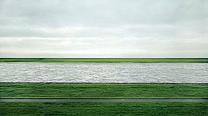
So here is a simple but pleasing image (for me anyway!) that I might enter. The title is 'The Look Out' at Samphire Hoe. I would appreciate honest opinions, good or bad, and any pointers that could improve it. (Albeit I can only manipulate what you see here). Cheers.

So here is a simple but pleasing image (for me anyway!) that I might enter. The title is 'The Look Out' at Samphire Hoe. I would appreciate honest opinions, good or bad, and any pointers that could improve it. (Albeit I can only manipulate what you see here). Cheers.

Nice shot,
Could i ask what camera you use and what settings you were using at the time? I used to work for Kodak a few years back and used to get involved in digital large format printing etc.
Looking at it without a colour balanced monitor i would say that you have slightly over exposed the shot as the grass in the bottom left hand corner looks (on this screen) like it is losing the colour, also the composition is good but i would have moved the building slightly more to the right so it sat maybe 3/4's of the way across in stead of 2/3's but that more personal preference really!
AngusDavie said:
Nice shot,
Could i ask what camera you use and what settings you were using at the time? I used to work for Kodak a few years back and used to get involved in digital large format printing etc.
Looking at it without a colour balanced monitor i would say that you have slightly over exposed the shot as the grass in the bottom left hand corner looks (on this screen) like it is losing the colour, also the composition is good but i would have moved the building slightly more to the right so it sat maybe 3/4's of the way across in stead of 2/3's but that more personal preference really!
Thank you. I can't be sure right now about settings or camera, as I've loaded this post from my phone. I'll post those details when I get home tonight. Likely to be Nikon D80 or D7100. Could i ask what camera you use and what settings you were using at the time? I used to work for Kodak a few years back and used to get involved in digital large format printing etc.
Looking at it without a colour balanced monitor i would say that you have slightly over exposed the shot as the grass in the bottom left hand corner looks (on this screen) like it is losing the colour, also the composition is good but i would have moved the building slightly more to the right so it sat maybe 3/4's of the way across in stead of 2/3's but that more personal preference really!
I suppose composition wise, I've ended up with the textbook rule of thirds. But we know those rules are for breaking!
I like the punchy colours though, they remind me of the Cibachrome days!
It's a nice picture because it simple yet effective. I like the exposure and saturation although maybe the colour could do with a little warmth? Seems a bit too blue to my eye.
Other than that I agree with the above that I would crop it. I think it needs to come in closer to lose some of the sky. You have a lot in there and it throws off the top of the image. You can still keep your rule of thirds (it works well for this image) but bring the top down so you have equal spacing above the lighthouse and bellow it, like this...

Other than that I agree with the above that I would crop it. I think it needs to come in closer to lose some of the sky. You have a lot in there and it throws off the top of the image. You can still keep your rule of thirds (it works well for this image) but bring the top down so you have equal spacing above the lighthouse and bellow it, like this...
I am not sure if we are meant to be saying 'brilliant!!!', or offering critque...
Of course, I could say: what lens did you use? Etc!
Anyway, to offer something more -
- Could use be made of the foreground? There is not much being made of this
- The sky is somewhat artificially blue. Clouds might add something. Not saying you should put any in, just that there are none
- This looks taken at midday sun. Light is much more interesting at dawn and dust.
- The interesting part is the sea, cliff, building and sky. Which has been replaced by inoffensive grass.
Other possibilities for involving pictures:
- where does the fence go?
- is there a cliff?
- is that a door in it?
- Why is it blue?
- Can anything be said about the scale?
- What is it made from? Think texture!
- What would look like with a lot less sky, and more sea/building.
An obvious suggestion would be to wait for a dramatic sky and pop a red/orange filter on an use B&W.
Consider Andreas Gursky. But this is 1m90 by 3m60. Vast!!!!!
MysteryLemon said:
It's a nice picture because it simple yet effective. I like the exposure and saturation although maybe the colour could do with a little warmth? Seems a bit too blue to my eye.
Other than that I agree with the above that I would crop it. I think it needs to come in closer to lose some of the sky. You have a lot in there and it throws off the top of the image. You can still keep your rule of thirds (it works well for this image) but bring the top down so you have equal spacing above the lighthouse and bellow it, like this...
Yes I prefer the headroom on this framing. For me, i'd stick with the rule of thirds for the horizon and let the rising land on the left break it, atm the land is on the third, not the horizon. All personal preference though. Other than that I agree with the above that I would crop it. I think it needs to come in closer to lose some of the sky. You have a lot in there and it throws off the top of the image. You can still keep your rule of thirds (it works well for this image) but bring the top down so you have equal spacing above the lighthouse and bellow it, like this...

No Bend said:
I think the icons detract from the scene.
Yes, they appear to be hanging in space with no means of support. They should be nailed to a post so it makes sense.- Could use be made of the icons? They are just floating there doing nothing.
- This looks taken at midday sun. Icons are much more interesting at dawn and dusk.
- where do the icons go?
- Can anything be said about the scale of the icons?
- What would look like with a lot less sky, and more icons.
- Can we get 'juxtapose' in anywhere?
I'm purely looking for constructive criticism and not praise, even if anyone were to consider it praise worthy!
Good comments so far, and taken on board. The lighting is as it was a the time, which happened to be in passing, so early/evening light would have to be on another visit. The manipulation is minimal in that I brushed a tiny amount of sky darker just to the left of the white top of the building to try to give a 3d effect. I also saturated the colours a little. Lastly I removed a bench that was half in the picture. Sadly the bench was always going to be in the wrong place & when it wasn't, everything else was!
I can definitely see the improvement in chopping the sky down a bit and recognise that white fluffy clouds would be great. Almost surreal. But they simply were not there.
Simpo Two said:
No Bend said:
I think the icons detract from the scene.
Yes, they appear to be hanging in space with no means of support. They should be nailed to a post so it makes sense.- Could use be made of the icons? They are just floating there doing nothing.
- This looks taken at midday sun. Icons are much more interesting at dawn and dusk.
- where do the icons go?
- Can anything be said about the scale of the icons?
- What would look like with a lot less sky, and more icons.
- Can we get 'juxtapose' in anywhere?
bernhund said:
I'm purely looking for constructive criticism and not praise, even if anyone were to consider it praise worthy!
Good comments so far, and taken on board. The lighting is as it was a the time, which happened to be in passing, so early/evening light would have to be on another visit. The manipulation is minimal in that I brushed a tiny amount of sky darker just to the left of the white top of the building to try to give a 3d effect. I also saturated the colours a little. Lastly I removed a bench that was half in the picture. Sadly the bench was always going to be in the wrong place & when it wasn't, everything else was!
I can definitely see the improvement in chopping the sky down a bit and recognise that white fluffy clouds would be great. Almost surreal. But they simply were not there.
Ah, that is photography: very early mornings, patience and a degree of luck. Good comments so far, and taken on board. The lighting is as it was a the time, which happened to be in passing, so early/evening light would have to be on another visit. The manipulation is minimal in that I brushed a tiny amount of sky darker just to the left of the white top of the building to try to give a 3d effect. I also saturated the colours a little. Lastly I removed a bench that was half in the picture. Sadly the bench was always going to be in the wrong place & when it wasn't, everything else was!
I can definitely see the improvement in chopping the sky down a bit and recognise that white fluffy clouds would be great. Almost surreal. But they simply were not there.
I can image that many would think that Andreas Gursky just rocked up one dreary morning. A bit of fiddling in photoshop, sent it to snapfish then sold it for $4.4m! Kerching!
P.S. I think this is great. A dull subject made interesting.
https://www.flickr.com/photos/placid_casual/154328...
I am not saying you should like it, but that it is an attractive and well balanced picture.
https://www.flickr.com/photos/placid_casual/154328...
I am not saying you should like it, but that it is an attractive and well balanced picture.
This might feel harsh but to me there isn't anything memorable or notable about it. There's nothing wrong with it (and who's to say what's right or wrong?), but I find it to just be a reasonable photo of a reasonable subject.
It needs an angry sky, or breaking waves, or a dramatic sunset, or the moon behind using a 600mm lens or.... well you get the idea.
Good job for having the balls to ask though, I wouldn't.
It needs an angry sky, or breaking waves, or a dramatic sunset, or the moon behind using a 600mm lens or.... well you get the idea.
Good job for having the balls to ask though, I wouldn't.
budfox said:
This might feel harsh but to me there isn't anything memorable or notable about it. There's nothing wrong with it (and who's to say what's right or wrong?), but I find it to just be a reasonable photo of a reasonable subject.
It needs an angry sky, or breaking waves, or a dramatic sunset, or the moon behind using a 600mm lens or.... well you get the idea.
Good job for having the balls to ask though, I wouldn't.
That's a perfectly acceptable critique. I recognise that on another day and perhaps at a different time, the conditions would have been different and produced a more dramatic result. So I suppose one could argue that that's what photography is all about..different moods.It needs an angry sky, or breaking waves, or a dramatic sunset, or the moon behind using a 600mm lens or.... well you get the idea.
Good job for having the balls to ask though, I wouldn't.
I think the picture is a bit boring myself, I must confess. But I do like it, and maybe just because it's not all powerful or moody. Just a punchy, simple shot that's inoffensive. It is its simplicity that works for me and there probably is a place for it (screensaver!!lol) somewhere.
I'm going to try to get back there sometime and see some different conditions. I'll post them up and see just how different this scene could be.
It is what it is. Most people with most cameras (with a steady hand) would get a similar photo from that position in that light. It's a breeze.
Seriously, if you want a critique, post some photos when light was difficult, and we can be of more help.
There are some seriously talented people in here (not me), and they will add and help... but only when there is an issue that can be addressed.
HTH
Seriously, if you want a critique, post some photos when light was difficult, and we can be of more help.
There are some seriously talented people in here (not me), and they will add and help... but only when there is an issue that can be addressed.
HTH
I think some are critiquing quite harshly; the clue is in the opening sentence - "last year I joined my local camera club". We're not sat at a picture desk discussing the next front cover for National Geographic here and we all started somewhere!
Compositionally this is a solid image with the structure and horizon both on thirds. I'm not going to judge this on what you could have done - none of us were there, we didnt know what else surrounded your frame or how it could have better been used.
That said, I think there are elements of truth above. The image is very 'safe'. Thats not a criticism as such, its a good capture of what was there at the time, but people above are correct in that you could improve by returning when circumstances are a touch more dramatic.
As a standalone image, I like it. But I dont think it would stand out particularly among other competing images.
Gassing Station | Photography & Video | Top of Page | What's New | My Stuff