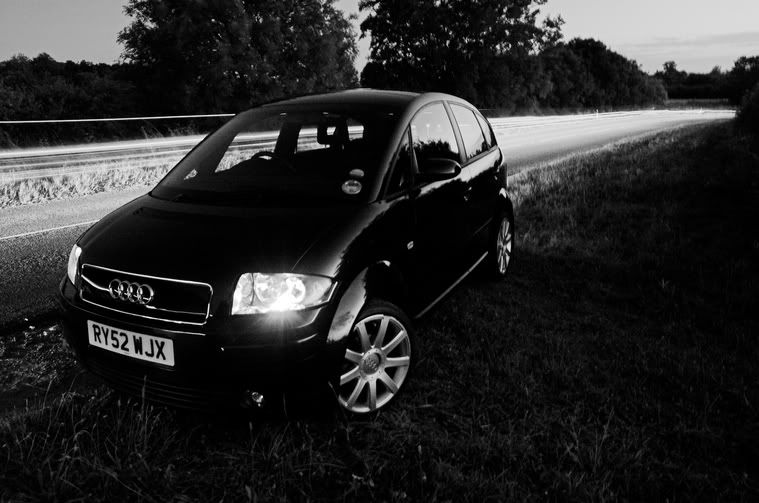
First one is good, I like it a lot. A bit of fiddling in photoshop would bring out the foreground a bit more, which I think would make it better (just my personal taste).
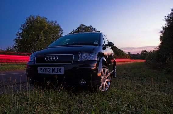
I really like number 3 - seems very stylised (in a good way!). Really nice composition and stuff - could possibly do with a little more levels on the shadows (but again, my monitor could be out!)
Number 1 looks a bit dark on my monitor - again, usual caveat!