Over Stickered Bikes
Discussion


Am I alone in my dislike of a zillion stickers spoiling a nice bike?!
Being of a certain age I want a bike with minimal stickering. EG a Boardman can have a Boardman Badge & say Hybrid Pro. Maybe a discrete made in Taiwan sticker underneath somewhere. But your typical bike says Designed in England/E2P/ dozens of other useless information plastered a over it. My car doesn't have Castrol Oil Stickers down the sides & every component makers name on view.
The tacky rubbish stickers are lacquered over so can't peel most of them off!
I guess the answer is to buy the same frame unbranded from the Far East or strip down a new bike & get it repainted
Jimboka said:
Am I alone in my dislike of a zillion stickers spoiling a nice bike?!
Being of a certain age I want a bike with minimal stickering. EG a Boardman can have a Boardman Badge & say Hybrid Pro. Maybe a discrete made in Taiwan sticker underneath somewhere. But your typical bike says Designed in England/E2P/ dozens of other useless information plastered a over it. My car doesn't have Castrol Oil Stickers down the sides & every component makers name on view.
The tacky rubbish stickers are lacquered over so can't peel most of them off!
I guess the answer is to buy the same frame unbranded from the Far East or strip down a new bike & get it repainted
Depends what kind of look you like I guess.Being of a certain age I want a bike with minimal stickering. EG a Boardman can have a Boardman Badge & say Hybrid Pro. Maybe a discrete made in Taiwan sticker underneath somewhere. But your typical bike says Designed in England/E2P/ dozens of other useless information plastered a over it. My car doesn't have Castrol Oil Stickers down the sides & every component makers name on view.
The tacky rubbish stickers are lacquered over so can't peel most of them off!
I guess the answer is to buy the same frame unbranded from the Far East or strip down a new bike & get it repainted
Some manufacturers are worse than others. I had a Trek hardtail with about a thousand different little labels, all names of different "technologies" included within the frame.
Genesis seem to go the other way, their frames are quite simple and understated.
Cube are terrible for writing loads of nonsense on their frames, "HPC SUPER", "SUPER COMPETITION RACING", there is more writing on the chainstay and some other nonsense on the top tube too! It's worse than those wish lists on the front wing of hot hatches driven by teenagers!
I like this colour scheme but it's ruined by all that writing!

I like this colour scheme but it's ruined by all that writing!
I quite like some of the marketing guff that people put on their bikes, like "Ergoride Comfort System" when what they mean is "seat stay is a bit thinner than the racy one". Gives you something to take the piss out of when your mate gets a better bike than you.
My mate has a logely Giant Defy Comp. Covered head to toe is posh ways of saying "we thought about this, rather than drawing it on a packet of benson and hedges". Presumably their marketeers think it has a positive action on sales..
My mate has a logely Giant Defy Comp. Covered head to toe is posh ways of saying "we thought about this, rather than drawing it on a packet of benson and hedges". Presumably their marketeers think it has a positive action on sales..
Can't stand over-stickering, as has been pointed out most of the time it's meaningless marketing drivel! I recently bought an Assos jersey that had a 'temperature regulation system' included - turned out another word for 'temperature regulation system' is zip......
Here is my much loved 'nag with no less than 16 'Colnago' logo's on more or less every tube and component, and 'CX1-Evo' stamped on it in 6 places - thankfully apart from Ernsto Colnago's signature and a nod towards the fact that under the paintwork it's carbon that's all....!
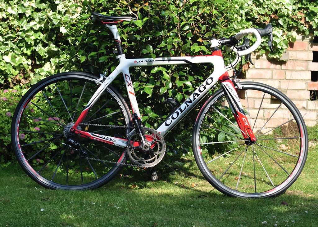
Here is my much loved 'nag with no less than 16 'Colnago' logo's on more or less every tube and component, and 'CX1-Evo' stamped on it in 6 places - thankfully apart from Ernsto Colnago's signature and a nod towards the fact that under the paintwork it's carbon that's all....!
pablo said:
Cube are terrible for writing loads of nonsense on their frames, "HPC SUPER", "SUPER COMPETITION RACING", there is more writing on the chainstay and some other nonsense on the top tube too! It's worse than those wish lists on the front wing of hot hatches driven by teenagers!
My Cube LTD had 'ready for race' on the frame in at least 2 places, then the seatpost and I think the saddle. One of the reasons I changed the seatpost and saddle soon after I got it.Great looking bikes but they need to realise that less is more

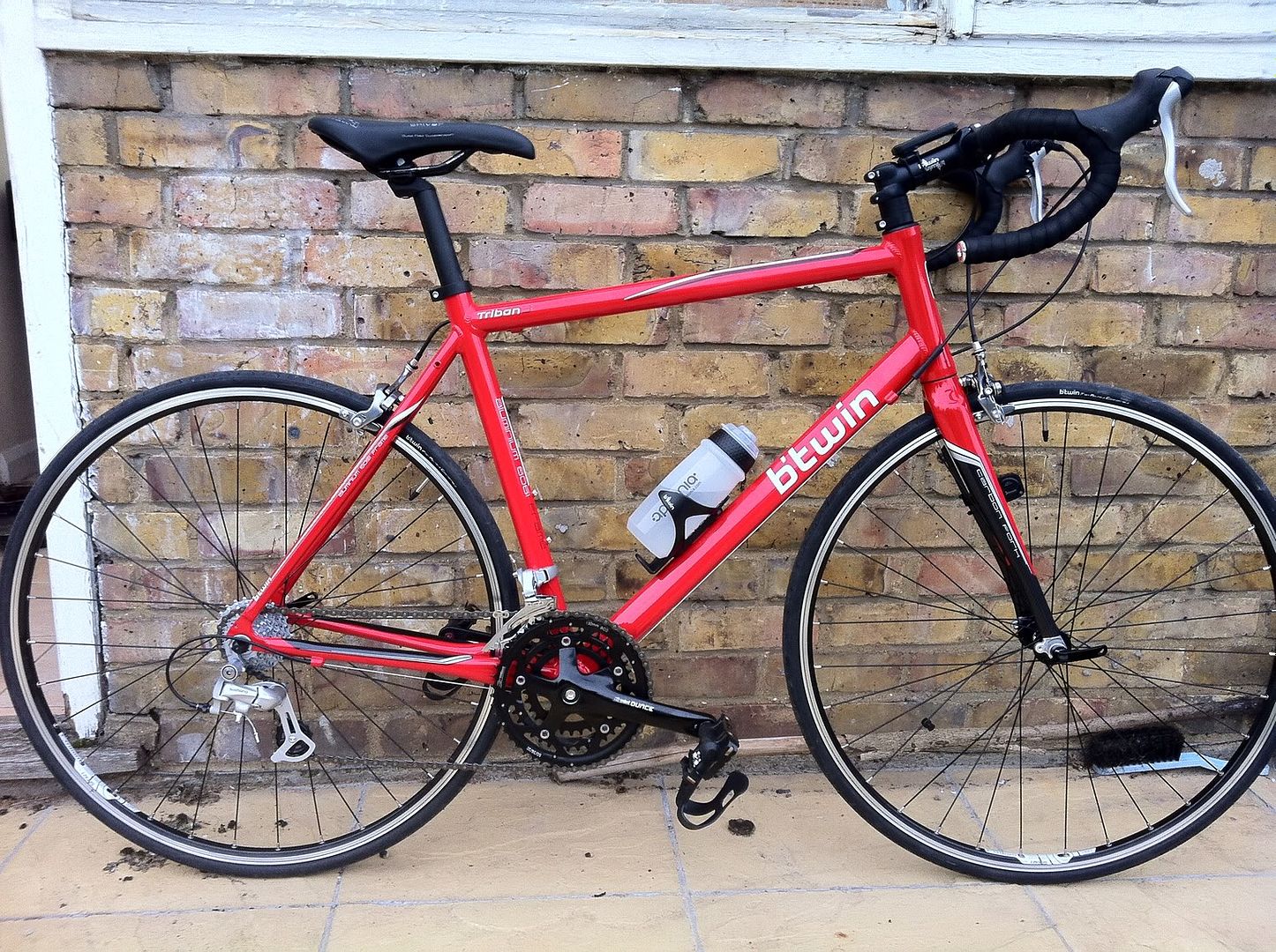
Love my Boardman, but my only criticism is the stupid acronyms all over the frame:
On the chain stays: DPT (in brackets next to it, so that people not wise enough can understand: "Direct Power Transfer")
On the top tube: DRC ("Dynamic Ride Concept")
And to top it off, next to the headtube, they have gone for the money shot with: "RPC/SLR/DRC/UDCM" but havent bothered with the translation. Ok, i know what some of those are, but not "RPC"...
daddy cool said:
Love my Boardman, but my only criticism is the stupid acronyms all over the frame:
On the chain stays: DPT (in brackets next to it, so that people not wise enough can understand: "Direct Power Transfer")
On the top tube: DRC ("Dynamic Ride Concept")
And to top it off, next to the headtube, they have gone for the money shot with: "RPC/SLR/DRC/UDCM" but havent bothered with the translation. Ok, i know what some of those are, but not "RPC"...
"really pretty carbon"On the chain stays: DPT (in brackets next to it, so that people not wise enough can understand: "Direct Power Transfer")
On the top tube: DRC ("Dynamic Ride Concept")
And to top it off, next to the headtube, they have gone for the money shot with: "RPC/SLR/DRC/UDCM" but havent bothered with the translation. Ok, i know what some of those are, but not "RPC"...
"rider pees caffeine"
"rides past Colnagos"
Jimboka said:
Thanks Sarkmeister for highlighting the tastefulness of the Genesis bikes. The Day 01 Alfine is now high up on my list.. Others may have got a look-in but I don't want a mobile advertising hoarding!
Cheers. Bizarrely enough I used to own a Genesis Day 01, about 5 or 6 years ago. Great bike. I did the London to Paris ride on it.
pablo said:
daddy cool said:
Love my Boardman, but my only criticism is the stupid acronyms all over the frame:
On the chain stays: DPT (in brackets next to it, so that people not wise enough can understand: "Direct Power Transfer")
On the top tube: DRC ("Dynamic Ride Concept")
And to top it off, next to the headtube, they have gone for the money shot with: "RPC/SLR/DRC/UDCM" but havent bothered with the translation. Ok, i know what some of those are, but not "RPC"...
"really pretty carbon"On the chain stays: DPT (in brackets next to it, so that people not wise enough can understand: "Direct Power Transfer")
On the top tube: DRC ("Dynamic Ride Concept")
And to top it off, next to the headtube, they have gone for the money shot with: "RPC/SLR/DRC/UDCM" but havent bothered with the translation. Ok, i know what some of those are, but not "RPC"...
"rider pees caffeine"
"rides past Colnagos"
ambuletz said:
This looks appaling

IMHO that looks pretty good. While it's far from standard the bits added to it go quite well with the pontless graphics - pointless in that, for me at least, as a good £300 bike it doesn't really need any go faster stripes. w
 ky acronyms are bad but I'll take those over the Finbar Saunders names in the MTB world - I'm looking at you Cove - probably great when selling bikes to teenage ravers in the 90s but a bit cringeworthy now.
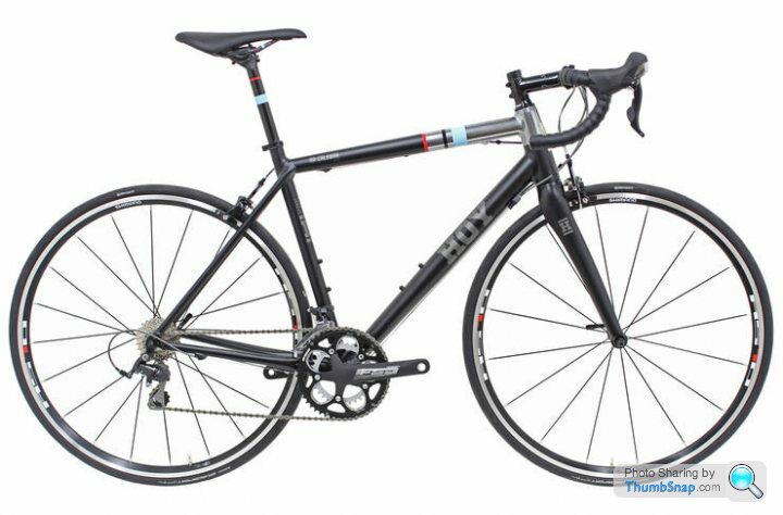
Gassing Station | Pedal Powered | Top of Page | What's New | My Stuff