The how to photograph watches thread
Discussion


JREwing said:
It's so sharp it makes my eyes hurt 

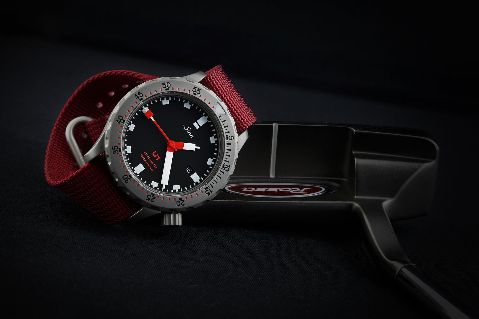
I like to use depth of field and keep it simple. No need for lots of lights. Although watch photos isn't what I specialise in I do like "different" product photos. This is my Bambino:

Simple setup, a single flash wirelessly triggered, bounced (trial to control lighting from different angles) and use manual exposure/aperture to control the rest of the image.
Simple setup, a single flash wirelessly triggered, bounced (trial to control lighting from different angles) and use manual exposure/aperture to control the rest of the image.
I've just put this on the main forum but guess it would be more appropriate here?
I'm a keen photographer but my tools (digital rangefinder) don't let me do any macro stuff so I used my iPhone for this shot.
Cheers
ped
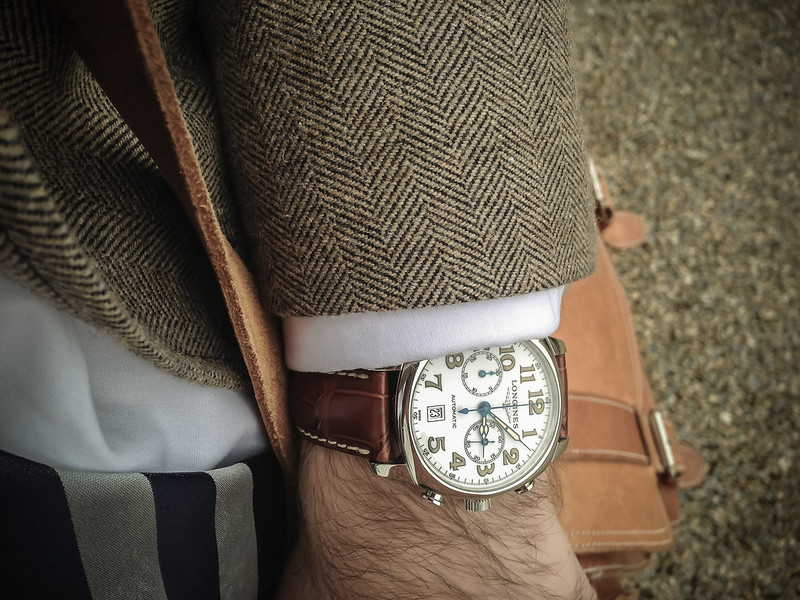 Longines Spirit Chronograph by chiscocks, on Flickr
I'm a keen photographer but my tools (digital rangefinder) don't let me do any macro stuff so I used my iPhone for this shot.
Cheers
ped
Longines Spirit Chronograph by chiscocks, on FlickrThis is a great thread, and good to see some of Andy's shots as I've always liked the consistency and "simplicity" (I mean in a good way) of his watch photos.
I've been taking quite a few shots over the last three years or so, and I'd say that it took me about two years to reach a point where I was happy with the results and had developed a kind of style that I could replicate fairly successfully more times than not. Most of my photos are on my blog at www.halfpastthehour.wordpress.com and if I was going to offer some advice it would be as follows.
1) Practice - loads. The more shots you take, the more you'll understand what works and what doesn't.
2) Use a tripod. The difference in achievable sharpness is substantial, and it also means you can shoot from angles that would otherwise be difficult.
3) Try to maximise the amount of light at your disposal (whether natural or artificial). This doesn't mean you have to end you with a bright photo (you only have to look at mine!) but it does mean that you have more options regarding shutter speed and aperture (i.e. more sharpness and depth of field).
4) Get rid of dust and fingerprints before you shoot - it's much easier than doing it afterwards.
5) Be aware of reflections, both on the crystal and the case. Using some kind of light tent or opaque material can help a lot and also softens/evens out the light nicely.
6) Have a play around with photo-editing software if you can get your hands on something. PS Elements can be brought pretty cheaply (especially versions that have been superseded) and even full versions of Photoshop are available as free downloads.
6) Practice - loads. The more shots you take, the more you'll understand what works and what doesn't. (Yes, that was deliberate )
)
I'm sure there's more, but hopefully there are a few pointers there that will be of use.
I've been taking quite a few shots over the last three years or so, and I'd say that it took me about two years to reach a point where I was happy with the results and had developed a kind of style that I could replicate fairly successfully more times than not. Most of my photos are on my blog at www.halfpastthehour.wordpress.com and if I was going to offer some advice it would be as follows.
1) Practice - loads. The more shots you take, the more you'll understand what works and what doesn't.
2) Use a tripod. The difference in achievable sharpness is substantial, and it also means you can shoot from angles that would otherwise be difficult.
3) Try to maximise the amount of light at your disposal (whether natural or artificial). This doesn't mean you have to end you with a bright photo (you only have to look at mine!) but it does mean that you have more options regarding shutter speed and aperture (i.e. more sharpness and depth of field).
4) Get rid of dust and fingerprints before you shoot - it's much easier than doing it afterwards.
5) Be aware of reflections, both on the crystal and the case. Using some kind of light tent or opaque material can help a lot and also softens/evens out the light nicely.
6) Have a play around with photo-editing software if you can get your hands on something. PS Elements can be brought pretty cheaply (especially versions that have been superseded) and even full versions of Photoshop are available as free downloads.
6) Practice - loads. The more shots you take, the more you'll understand what works and what doesn't. (Yes, that was deliberate
)I'm sure there's more, but hopefully there are a few pointers there that will be of use.


Can anyone give me some pointers on how to take some sales pictures of a watch using just a Panasonic Lumix point and shoot camera and an angle poise lamp (if required) please?
I've had a stab tonight and managed some fairly poor snaps. The dial shots have a reflection of the camera, most shots have a light reflected somewhere. The watch is as new, but the photos make it look less immaculate than it really is.
The camera has various "modes", none of which is "photograph watches". There are settings for fireworks, portrait, food, babies 1, 2 and 3, rapid burst, outdoor, candle light etc etc. None of them seems to help.
Pointers required please chaps.
Eleven said:
Can anyone give me some pointers on how to take some sales pictures of a watch using just a Panasonic Lumix point and shoot camera and an angle poise lamp (if required) please?
The camera has various "modes", none of which is "photograph watches". There are settings for fireworks, portrait, food, babies 1, 2 and 3, rapid burst, outdoor, candle light etc etc. None of them seems to help.
Pointers required please chaps.
Shoot outside, or close to a window with good natural light, but not direct sunlight.The camera has various "modes", none of which is "photograph watches". There are settings for fireworks, portrait, food, babies 1, 2 and 3, rapid burst, outdoor, candle light etc etc. None of them seems to help.
Pointers required please chaps.
Use macro setting.
Use a tripod, or otherwise hold the camera steady.
Use remote shutter release or timer.
Set the watch hands to 10:10 or thereabouts, so the dial logo is visible.
andy tims said:
Eleven said:
Can anyone give me some pointers on how to take some sales pictures of a watch using just a Panasonic Lumix point and shoot camera and an angle poise lamp (if required) please?
The camera has various "modes", none of which is "photograph watches". There are settings for fireworks, portrait, food, babies 1, 2 and 3, rapid burst, outdoor, candle light etc etc. None of them seems to help.
Pointers required please chaps.
Shoot outside, or close to a window with good natural light, but not direct sunlight.The camera has various "modes", none of which is "photograph watches". There are settings for fireworks, portrait, food, babies 1, 2 and 3, rapid burst, outdoor, candle light etc etc. None of them seems to help.
Pointers required please chaps.
Use macro setting.
Use a tripod, or otherwise hold the camera steady.
Use remote shutter release or timer.
Set the watch hands to 10:10 or thereabouts, so the dial logo is visible.
Efbe said:
hiscocks said:
what a beautiful watch!!!


Bit of a thread revival, I am going through my watches now photographing them (got a few) some nice, some not so nice - but I like all watches.
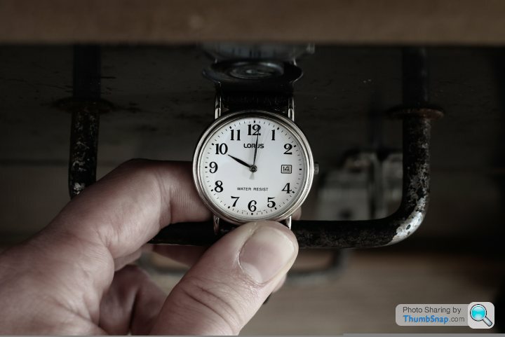
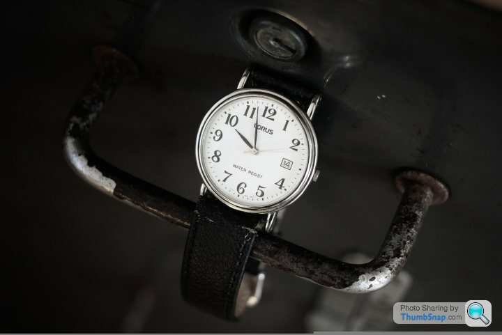
My grandads LORUS, not a exactly a showpiece, but it was given to me when he died, so sentimentality it means alot.
Other one is my Armani Chronograph I have had for a good 11 years. I have a few more watches, some vintage TIMEX, SLAVA and ENICARS which I am making my way through
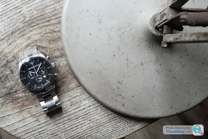
All taken on a Canon 60d SLR with a Canon Prime 40mm fixed lens (Primes are best) for complete sharpness, I try to pick appropriate not too fussy backgrounds.
My grandads LORUS, not a exactly a showpiece, but it was given to me when he died, so sentimentality it means alot.
Other one is my Armani Chronograph I have had for a good 11 years. I have a few more watches, some vintage TIMEX, SLAVA and ENICARS which I am making my way through
All taken on a Canon 60d SLR with a Canon Prime 40mm fixed lens (Primes are best) for complete sharpness, I try to pick appropriate not too fussy backgrounds.
Efbe said:
hiscocks said:
what a beautiful watch!!!

Gassing Station | Watches | Top of Page | What's New | My Stuff