The how to photograph watches thread
Discussion


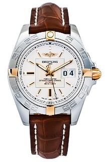
Ever wondered how those almost unreal press images of watches are taken, like this one?
Its a time consuming type of image to get, but nevertheless it is very possible to achieve without spending professional levels on your camera equipment.
It all starts with the lighting:

This complete lighting set can be assembled for less than £1000, yet will give excellent control and power for watch photography. The lighting kit is mainly Lencarta. The camera is a Nikon D90 with a Sigma 150mm macro lens.
The key to lighting a watch, particularly a curved, reflective one such as the Breitling Galaxy, is to do it in stages. First, we compose the shot by positioning the watch on our white paper background with c clips and white tack and framing it up on the camera. You can't see it in the image, but the dial of the watch is facing up.
We then use the two softboxes to light the sides of the case, using the modelling lamps to get an idea of the reflections caused. Set the camera to live view for a real time update of the lighting setup.
The third light with honeycomb grid is used to shine a spotlight on the watch from above and behind, lighting the dial. The translucent reflector diffuses the light - experiment with the angles to pick out detail on the dial and get the watch looking how you want.
We then use pieces of black and white card to minimise unwanted reflections on the watch and bounce light back onto the underside. Being curved and polished, it wants to reflect everything, so propping up the card will help us control that. We can't control every reflection, but we can minimise the amount of work we need to do in post production.
Lastly, we can use more pieces of white card held between the translucent reflector and the watch itself (known as a gobo) to add some gradients to the reflective surface. Holding a thin strip (long enough so your hands arent reflected), see how you can control the tone and gradient of the metal on the case and hands to create a pleasing shape to them.
Now we can take the shot. I shoot in RAW, using live view, and the camera set to manual, aperture around f16. The shutter speed and lighting power on the flashes is then adjusted to suit. A remote shutter release is handy, because it leaves your hands free to hold pieces of card, and you don't knock the camera when you shoot. Some press images are made up from several images, building up a composite of the dial and various elements of the case with varied lighting to create a perfect (although often unbelievable) image. In this instance, just the one shot was taken.
Once you're happy with the image, open it up in Camera RAW:
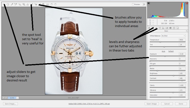
Adjust the sliders until you see the image 'pop.' RAW images are very flat, awaiting the adjustments to be made in post production, so don't be afraid to whack sliders like contrast and clarity right up.
The great thing about Camera RAW is the ability to edit the image non destructively, ie, the original data is never lost. Do as much work as you can in Camera RAW as it makes the workflow a lot simpler.
The spot tool in Camera RAW is great once you've got the hang of it, allowing the removal of dust blobs (which are inevitable) quickly and easily. I prefer it set to 'heal' mode rather than clone, as it blends the change in. It's a clever tool because if there is a definite line though the part you are trying to heal, as long as you set the target point as an area with the same line, it won't blur the line, but it will heal the dust blob.
The last part of Camera RAW to use is the brushes tool. This allows similar adjustments to the first part of Camera RAW, but in select areas, allowing some further adjustment to the image, again in a non destructive way.
Once happy, we can open the image in Photoshop:
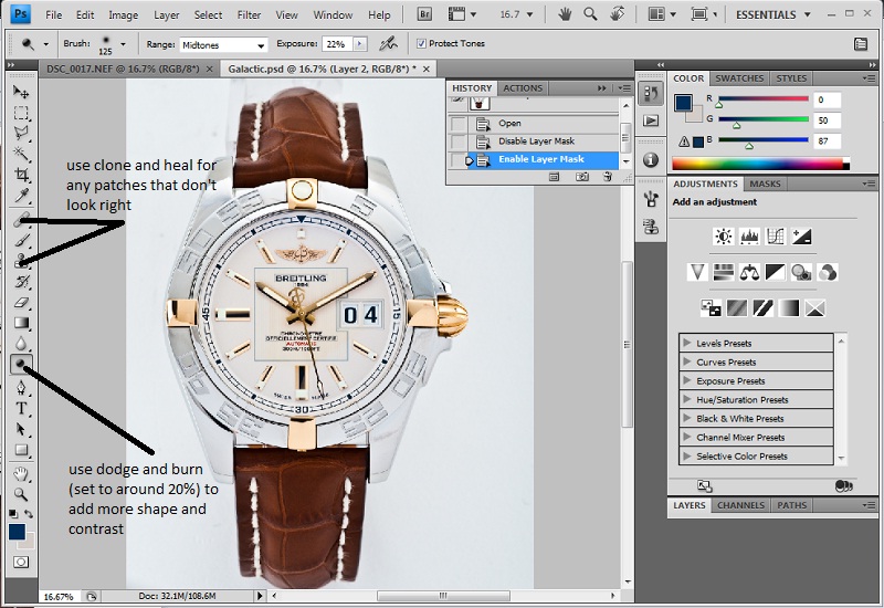
Use the clone and heal tools for any patches too complex for the Camera RAW tools. As well as dust, you can also use it to clean up any unwanted reflections too. Then you can use Dodge and Burn (set very low) to add some more shape and contrast to the watch, darkening the darker areas and lightening the lighter ones. Plain chrome can be quite flat, so it makes it pop a little more.
Next we cut the watch out:
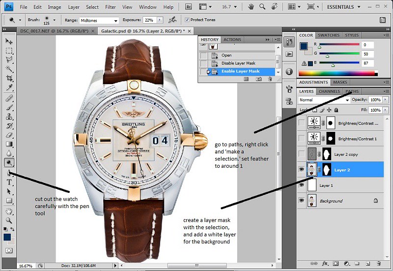
Set a solid white layer below your watch layer, then use the pen tool to carefully cut the watch out. The pen tool can be quite tricky to master, but the click and drag to create arcs makes it very quick and accurate when you get the hang of it. Once you've made your path, go to the 'Paths' tab, right click and 'make a selection' from it, with feather set to 1. Use the selection to make a layer mask, and voila, one cut out watch.
Now we can make the final tweaks:

For added definition and contrast, we create a high pass layer. Duplicate your watch cutout, layer mask and all, and desaturate it. Then, go to 'filter,' 'other,' 'high pass,' and select 10. Set the layer blending mode to 'soft light' and opacity to 50%.
Lastly, we can balance out the dial and case with two layer masked brightness/contrast adjustments, bringing them more into line.
And that's it!

Its a time consuming type of image to get, but nevertheless it is very possible to achieve without spending professional levels on your camera equipment.
It all starts with the lighting:
This complete lighting set can be assembled for less than £1000, yet will give excellent control and power for watch photography. The lighting kit is mainly Lencarta. The camera is a Nikon D90 with a Sigma 150mm macro lens.
The key to lighting a watch, particularly a curved, reflective one such as the Breitling Galaxy, is to do it in stages. First, we compose the shot by positioning the watch on our white paper background with c clips and white tack and framing it up on the camera. You can't see it in the image, but the dial of the watch is facing up.
We then use the two softboxes to light the sides of the case, using the modelling lamps to get an idea of the reflections caused. Set the camera to live view for a real time update of the lighting setup.
The third light with honeycomb grid is used to shine a spotlight on the watch from above and behind, lighting the dial. The translucent reflector diffuses the light - experiment with the angles to pick out detail on the dial and get the watch looking how you want.
We then use pieces of black and white card to minimise unwanted reflections on the watch and bounce light back onto the underside. Being curved and polished, it wants to reflect everything, so propping up the card will help us control that. We can't control every reflection, but we can minimise the amount of work we need to do in post production.
Lastly, we can use more pieces of white card held between the translucent reflector and the watch itself (known as a gobo) to add some gradients to the reflective surface. Holding a thin strip (long enough so your hands arent reflected), see how you can control the tone and gradient of the metal on the case and hands to create a pleasing shape to them.
Now we can take the shot. I shoot in RAW, using live view, and the camera set to manual, aperture around f16. The shutter speed and lighting power on the flashes is then adjusted to suit. A remote shutter release is handy, because it leaves your hands free to hold pieces of card, and you don't knock the camera when you shoot. Some press images are made up from several images, building up a composite of the dial and various elements of the case with varied lighting to create a perfect (although often unbelievable) image. In this instance, just the one shot was taken.
Once you're happy with the image, open it up in Camera RAW:
Adjust the sliders until you see the image 'pop.' RAW images are very flat, awaiting the adjustments to be made in post production, so don't be afraid to whack sliders like contrast and clarity right up.
The great thing about Camera RAW is the ability to edit the image non destructively, ie, the original data is never lost. Do as much work as you can in Camera RAW as it makes the workflow a lot simpler.
The spot tool in Camera RAW is great once you've got the hang of it, allowing the removal of dust blobs (which are inevitable) quickly and easily. I prefer it set to 'heal' mode rather than clone, as it blends the change in. It's a clever tool because if there is a definite line though the part you are trying to heal, as long as you set the target point as an area with the same line, it won't blur the line, but it will heal the dust blob.
The last part of Camera RAW to use is the brushes tool. This allows similar adjustments to the first part of Camera RAW, but in select areas, allowing some further adjustment to the image, again in a non destructive way.
Once happy, we can open the image in Photoshop:
Use the clone and heal tools for any patches too complex for the Camera RAW tools. As well as dust, you can also use it to clean up any unwanted reflections too. Then you can use Dodge and Burn (set very low) to add some more shape and contrast to the watch, darkening the darker areas and lightening the lighter ones. Plain chrome can be quite flat, so it makes it pop a little more.
Next we cut the watch out:
Set a solid white layer below your watch layer, then use the pen tool to carefully cut the watch out. The pen tool can be quite tricky to master, but the click and drag to create arcs makes it very quick and accurate when you get the hang of it. Once you've made your path, go to the 'Paths' tab, right click and 'make a selection' from it, with feather set to 1. Use the selection to make a layer mask, and voila, one cut out watch.
Now we can make the final tweaks:
For added definition and contrast, we create a high pass layer. Duplicate your watch cutout, layer mask and all, and desaturate it. Then, go to 'filter,' 'other,' 'high pass,' and select 10. Set the layer blending mode to 'soft light' and opacity to 50%.
Lastly, we can balance out the dial and case with two layer masked brightness/contrast adjustments, bringing them more into line.
And that's it!
RobbieKB said:
Well, there's your comprehensive response 
Thanks! The scary thing is, for a full blown Rolex/Breitling/Omega et al publicity shot, the workload goes up tenfold! They build up their images from many composite images, lighting each part of the case, strap and dial in sections and compiling them all into one image. The retouching is then much, much more extensive too, often repainting and retexturing entire areas. Some images end up looking like illustrations...Indeed Andrew, these pics
And the description of how they were taken:
"For those interested I maximised the depth of field
by taking multiple shots varying the focus and then combining
them in photoshop. In most cases an SLR lens achieves its best
results in terms of clarity with an f/stop (aperture) of 8.
Obviously the smaller the aperture the greater the depth of
field but image quality is compromised. This technique maintains
quality and achieves virtually any level of depth of field
(focus) you want. The first picture was a combination of 7
images and the second was 4. This technique is often seen in
commercial watch photography where the subject is pin sharp from
front to back. Digital photography and Photoshop CS5 have
changed the depth in depth of field forever."
It worked well, nice, sharp images. Combine that with changing the lighting per shot to pick out different aspects of the watch and then blending it all together, it begins to make sense why manufacturer press release images look so different to point and shoot!
It's a fascinating process, and one that I always keep learning more and more on.
It's a fascinating process, and one that I always keep learning more and more on.
As a follow up to my previous post and a response to discussions regarding composite photography, I have picked another example that required several shots to be lit and taken separately to complete the final image. I have assumed that you have read our previous tutorial, so I have not described the processes in as much detail. If you are unsure how to perform a certain step, the answer should be given in my previous post, however please do ask if you still aren't sure.
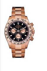
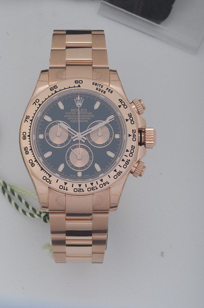
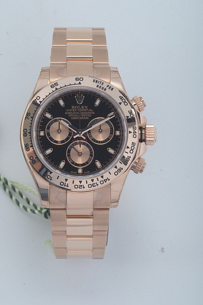
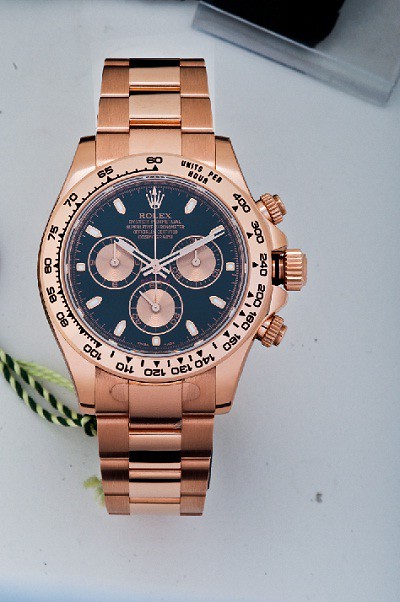
Anyway, today's subject is a Rolex Daytona in rose gold with a black dial. A black dial makes things more complex, because without the correct lighting, a black dial looks white and washed out with glare. The problem occurs when lighting to suit the dial; the lighting doesnt then suit the rest of the watch. The solution? Composite imagery. This will be the image we want to end up with:
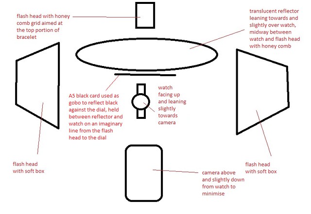
First of all, we need our images. The first shot I took was the for the case and bracelet, which is a mix of brushed and polished sections. With the watch on its back, angled slightly towards the camera which was held above and slightly below it to minimise reflecting itself, I used two softboxes on either side and one honey comb grid aimed from diagonally above and in front of the watch dial, pinpointed at the top portion of bracelet. This is so the direct light was not in the angle of incidence/reflection to glare directly onto the dial and cause horrible flares and artefacts in the image. Don't forget to pull the crown out too, otherwise compositing the images will impossible!
I then used a translucent reflector mid way between the honey comb grid and the watch, angled towards the watch to achieve the right 'softness' from the light. Moving it towards the light gives harder contrast and blown specular highlights, moving it away gives smoother gradients and transparent highlights. I wanted something inbetween the two.
I then used A4 pieces of white card above and below the watch (propped up on the table) to clean up the reflections on the watch, giving smooth gradients with no odd shapes. It takes a bit of fiddling to get the reflections right without blocking the light altogether, so don't forget that small imperfections can be edited out afterwards.
I also used two thin strips of black card, laid above and below the watch and slightly behind the return of the bracelet, to add a solid line of black on the polished bits and a dark gradient on the brushed bits, giving it shape and contrast. This is the setup and the resulting shot:

As you can see, the case looks ok, the bracelet looks ok, but the dial looks flat and washed out. This will form the basis of our next shot. The lighting setup is very similar, but this time we do away with all the card except for a single sheet of black. We use the black to catch a reflection in the dial, removing the glare and giving us a nice, deep colour (or absence of!). The area of reflection is found around the angle of incidence/reflection, a line mirrored from that between the camera and the reflective surface, which should be just slightly above the path of light coming from the honeycomb, which we aimed just a bit before the dial onto the bracelet. The setup and shot look like this:
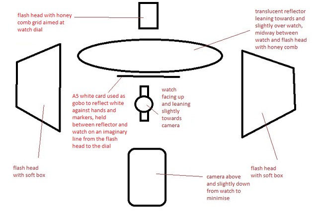
So now the dial is black, but the reflective hands and markers are too - we could use the hands and markers from the first image, but they are too flat, with no contrast, so a third image will be required.
This time we aim the honey comb directly at the dial, and use a white card instead of a black card to reflect against the markers, holding it in the same place as we did with the previous black card. This serves two purposes - we get a nice rich gold colour on the hands and markers, and we also use it as a gobo to block some of the light, cast a shadow and create a contrasting gradient on the underside of the hands and markers, removing the flatness we saw originally and giving the markers some shape. The setup and image end up like so:

Next we open the images up in Camera Raw and adjust the sliders to bring out the colour/contrast etc, and open them in photoshop.
Starting with the case, use clone/heal to tidy up dust/smears, remove any unwanted reflections and then use dodge/burn to bring out the shape even further. We then have this:
Before we move on to the dial, several issues need to be addressed first. The crown needs to moved in with some cutting and cloning, but more complicated is the lower part of the bracelet.
For a consistent look on the bracelet, it is easiest to copy and mirror the top half. The reflections are even and tidy on the top half compared to the bottom half, which is a little untidy. With the top half copied and mirrored, its a case of using transform and cloning/healing to make the bracelet fit correctly. Here is the result:
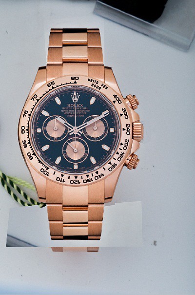
Next up is the dial. A simple bit of dust removal and a layer mask from a circular selection (feather of 1) sees the dial dropped in place:
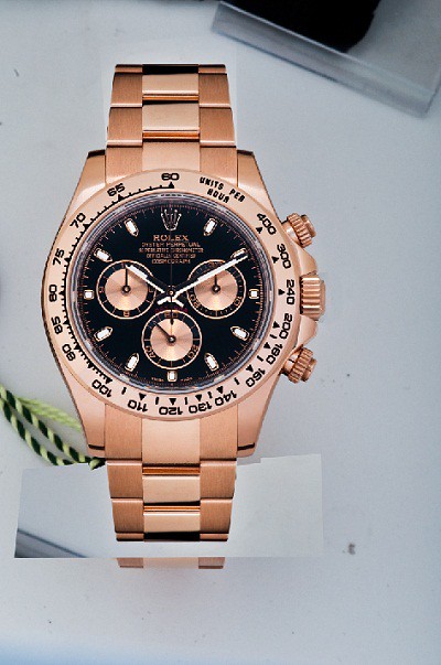
Then we add the hands and markers. Again, use a layer mask, using a brush to reveal the hands and markers on the dial, like so:

Last of all, we cut the watch out with the pen tool, creating a layer mask and adding a white layer below:

Done!
Anyway, today's subject is a Rolex Daytona in rose gold with a black dial. A black dial makes things more complex, because without the correct lighting, a black dial looks white and washed out with glare. The problem occurs when lighting to suit the dial; the lighting doesnt then suit the rest of the watch. The solution? Composite imagery. This will be the image we want to end up with:
First of all, we need our images. The first shot I took was the for the case and bracelet, which is a mix of brushed and polished sections. With the watch on its back, angled slightly towards the camera which was held above and slightly below it to minimise reflecting itself, I used two softboxes on either side and one honey comb grid aimed from diagonally above and in front of the watch dial, pinpointed at the top portion of bracelet. This is so the direct light was not in the angle of incidence/reflection to glare directly onto the dial and cause horrible flares and artefacts in the image. Don't forget to pull the crown out too, otherwise compositing the images will impossible!
I then used a translucent reflector mid way between the honey comb grid and the watch, angled towards the watch to achieve the right 'softness' from the light. Moving it towards the light gives harder contrast and blown specular highlights, moving it away gives smoother gradients and transparent highlights. I wanted something inbetween the two.
I then used A4 pieces of white card above and below the watch (propped up on the table) to clean up the reflections on the watch, giving smooth gradients with no odd shapes. It takes a bit of fiddling to get the reflections right without blocking the light altogether, so don't forget that small imperfections can be edited out afterwards.
I also used two thin strips of black card, laid above and below the watch and slightly behind the return of the bracelet, to add a solid line of black on the polished bits and a dark gradient on the brushed bits, giving it shape and contrast. This is the setup and the resulting shot:
As you can see, the case looks ok, the bracelet looks ok, but the dial looks flat and washed out. This will form the basis of our next shot. The lighting setup is very similar, but this time we do away with all the card except for a single sheet of black. We use the black to catch a reflection in the dial, removing the glare and giving us a nice, deep colour (or absence of!). The area of reflection is found around the angle of incidence/reflection, a line mirrored from that between the camera and the reflective surface, which should be just slightly above the path of light coming from the honeycomb, which we aimed just a bit before the dial onto the bracelet. The setup and shot look like this:
So now the dial is black, but the reflective hands and markers are too - we could use the hands and markers from the first image, but they are too flat, with no contrast, so a third image will be required.
This time we aim the honey comb directly at the dial, and use a white card instead of a black card to reflect against the markers, holding it in the same place as we did with the previous black card. This serves two purposes - we get a nice rich gold colour on the hands and markers, and we also use it as a gobo to block some of the light, cast a shadow and create a contrasting gradient on the underside of the hands and markers, removing the flatness we saw originally and giving the markers some shape. The setup and image end up like so:
Next we open the images up in Camera Raw and adjust the sliders to bring out the colour/contrast etc, and open them in photoshop.
Starting with the case, use clone/heal to tidy up dust/smears, remove any unwanted reflections and then use dodge/burn to bring out the shape even further. We then have this:
Before we move on to the dial, several issues need to be addressed first. The crown needs to moved in with some cutting and cloning, but more complicated is the lower part of the bracelet.
For a consistent look on the bracelet, it is easiest to copy and mirror the top half. The reflections are even and tidy on the top half compared to the bottom half, which is a little untidy. With the top half copied and mirrored, its a case of using transform and cloning/healing to make the bracelet fit correctly. Here is the result:
Next up is the dial. A simple bit of dust removal and a layer mask from a circular selection (feather of 1) sees the dial dropped in place:
Then we add the hands and markers. Again, use a layer mask, using a brush to reveal the hands and markers on the dial, like so:
Last of all, we cut the watch out with the pen tool, creating a layer mask and adding a white layer below:
Done!
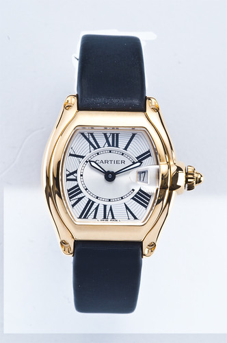
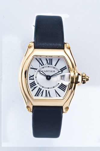
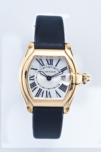
As an update to my two previous posts, I've gone a step further to create an image of a complex reflective shape using four separate images. Because of the nature of this watch - a Cartier Roadster - getting a clean shot all in one is virtually impossible, so I will demonstrate how composite imagery can be used to achieve the desired result. I'll skim over the nitty-gritty how-to in this guide, but if you want to understand further about a particular stage or technique, the two previous examples should give you all the detail you need. Alternatively, fire me a question and I'll be glad to answer.
Ok, so here are the four images I've taken on which to base the image:
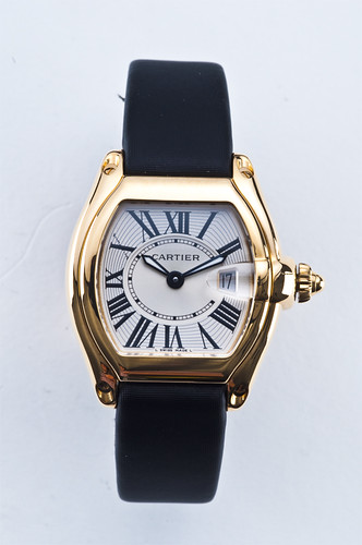
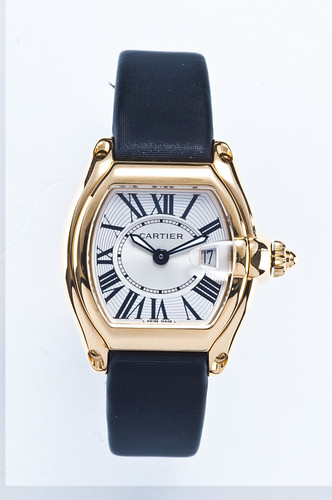
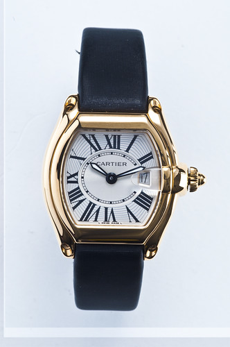

(Feel free to load these images up in photoshop and attempt the final image yourself - the majority of the work is done in post, so its a good bit of practice if you want it.)
So rather than try to light the watch all in one, I've lit the top, bottom, left and right parts of the watch separately. I used the same lighting setup as used in the Daytona image, but instead of using white card around the watch, I used a second diffuser, placing it on the side of the watch I wanted to light without needing to adjust any of the actual flash positions (to clarify - the use of two diffusers gives very smooth gradients on the polished metal without any harsh hotspots. Lighting the case at the bottom can be achieved either by using the diffuser to reflect the light from the current flash positions, or by moving one of the flash heads to light it directly, using the diffuser to soften the light. Technically this process is possible with just one off-camera flash and a diffuser, moving the flash around the watch and diffusing the lighting until you have enough images to make a full lit case image from.
Next comes the post. Tweak the levels in RAW to suit, bring them all into one photoshop file, overlay them and make sure they all line up. Next, using layer masks, we can paint in each part of each image that we want, building an image of the completely lit case layer by layer.
First, the bottom of the case is painted in over the top. I will also use the dial section from the first image, but depending on the watch, you may need to shoot a dedicated dial image to mitigate reflections and capture dial relief. A further image may even be required for the hands and markers if they are polished:
Then the left side of the case. Using a soft brush means you can play with the hard black reflections on the unlit portions and blend them in to the lit portions to introduce shape and volume:
And the right hand side of the case. Pick a crown from one of the images that looks good - that might not necessarily be the one lit from the right, and may even end up being a composite of a few crowns from the image selection:
Cut the image out, straighten it, touch out any unwanted reflections and dust etc, and do final levels. When all is good, do the high pass sharpening technique, and you are finished!
Ok, so here are the four images I've taken on which to base the image:
(Feel free to load these images up in photoshop and attempt the final image yourself - the majority of the work is done in post, so its a good bit of practice if you want it.)
So rather than try to light the watch all in one, I've lit the top, bottom, left and right parts of the watch separately. I used the same lighting setup as used in the Daytona image, but instead of using white card around the watch, I used a second diffuser, placing it on the side of the watch I wanted to light without needing to adjust any of the actual flash positions (to clarify - the use of two diffusers gives very smooth gradients on the polished metal without any harsh hotspots. Lighting the case at the bottom can be achieved either by using the diffuser to reflect the light from the current flash positions, or by moving one of the flash heads to light it directly, using the diffuser to soften the light. Technically this process is possible with just one off-camera flash and a diffuser, moving the flash around the watch and diffusing the lighting until you have enough images to make a full lit case image from.
Next comes the post. Tweak the levels in RAW to suit, bring them all into one photoshop file, overlay them and make sure they all line up. Next, using layer masks, we can paint in each part of each image that we want, building an image of the completely lit case layer by layer.
First, the bottom of the case is painted in over the top. I will also use the dial section from the first image, but depending on the watch, you may need to shoot a dedicated dial image to mitigate reflections and capture dial relief. A further image may even be required for the hands and markers if they are polished:
Then the left side of the case. Using a soft brush means you can play with the hard black reflections on the unlit portions and blend them in to the lit portions to introduce shape and volume:
And the right hand side of the case. Pick a crown from one of the images that looks good - that might not necessarily be the one lit from the right, and may even end up being a composite of a few crowns from the image selection:
Cut the image out, straighten it, touch out any unwanted reflections and dust etc, and do final levels. When all is good, do the high pass sharpening technique, and you are finished!
Chrisw26 said:
I'm a complete photo and watch amateur. Probably sacriledge to admit that my watch was bought to match my boat. Used the wife's Nikon D40X in a dark boat shed. 
Right, you can't just drop that into a thread here and expect to get away without providing more. 
We're definitely going to need closer up pictures of the watch, and further away pictures of the boat.


Sorry - seems t'other closer pictures are available via thumbsnap.
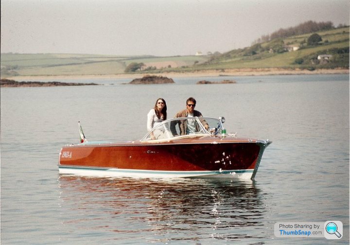
Boat pic below. She's a 1963 Riva Superflorida alledgedly capable of 50 knots and used for the waterskiing world championships pre fibreglass. I've done half that speed which is plenty fast enough thank you. Wouldn't fancy hanging onto a rope standing on piece of tree behind it, but the kids might when they're older.
Boat pic below. She's a 1963 Riva Superflorida alledgedly capable of 50 knots and used for the waterskiing world championships pre fibreglass. I've done half that speed which is plenty fast enough thank you. Wouldn't fancy hanging onto a rope standing on piece of tree behind it, but the kids might when they're older.
Chrisw26 said:
Sorry - seems t'other closer pictures are available via thumbsnap.
Boat pic below. She's a 1963 Riva Superflorida alledgedly capable of 50 knots and used for the waterskiing world championships pre fibreglass. I've done half that speed which is plenty fast enough thank you. Wouldn't fancy hanging onto a rope standing on piece of tree behind it, but the kids might when they're older.
Beautiful. Nice one.Boat pic below. She's a 1963 Riva Superflorida alledgedly capable of 50 knots and used for the waterskiing world championships pre fibreglass. I've done half that speed which is plenty fast enough thank you. Wouldn't fancy hanging onto a rope standing on piece of tree behind it, but the kids might when they're older.
slomax said:
excuse me if im being a retard. BUT, why are nearly all professional/semi-professional photos of watches taken with the hands in the 2:10 or 10:10 position.
It must have come from somewhere?
I've always assumed that it's for a number of practical reasons:It must have come from somewhere?
1. Logo tends to be at 12, with secondary detail often at 6. So hands at 10 to 2 don't obscure this.
2. Date tends to be at 3 or 6, so these too would be unobscured.
3. The hands are reasonably symmetrical on the face, so you can see the design well.

Gassing Station | Watches | Top of Page | What's New | My Stuff