Discussion


It's not about what the viewer likes or, in some instances, necessarily what the place looked like, it is how design and architecture solved a problem of restricted space.
I thought the roof light house was very clever and the interior space was really neat and surprisingly light.
Do I want to live there? no
Did I think it was visually pretty? no
However someone wanted to live in that space, and had extreme restrictions in terms of planning and how windrows could be used - and they solved that in a clever way.
Just coming back on some of the points on planners etc (I'm not a planner, just a powerfully built developer...).
The key to planners is to work with them They hate identikit Wimpy s te as much as the next person, however as has been said above, it is easy to define and list things that are bad (like out of hours working), not so easy to enforce something that is subjective like what constitutes 'good design'.
The corten scheme shows that you can build interesting and good contemporary design in conservation areas let alone normal areas. The histrionics about planners and the planning system makes for good drama in Grand Designs etc and is easy to get away with because it's very complicated so laypeople don't understand it. Bloody planners right? Take that attitude into a planning department and see how far you get. Unless of course you are Wimpy and simply steamroll them through because you are richer than the council and can afford to appeal etc etc.
The real issue with planners is that there aren't enough of them at the moment. The economy is turning and whilst we are all getting more active, the planning departments (having had little work through the recession) have been cut to the bone so simply cannot resource their new workloads.
Re boxes, that's an easy answer. They are cheaper to build than 'fancy' shapes, freeing more budget for materials or FFE. Also chairs, tables and beds tend to fit better in a square than a circle... This point was made in last night's programme when they discussed the odd leftover shapes in that garage infill scheme.
And to complete the circle (pun intended) I'm working on a number of schemes with an architect who's already been on GD and is currently filming another build due to be shown next summer. He specialises in 'Paragraph 55' houses, which is a planning policy that was established to build the next generation of one off country houses in locations that would otherwise never receive consent. Having seen the model of it, it is everything but square!
The key to planners is to work with them They hate identikit Wimpy s
te as much as the next person, however as has been said above, it is easy to define and list things that are bad (like out of hours working), not so easy to enforce something that is subjective like what constitutes 'good design'. The corten scheme shows that you can build interesting and good contemporary design in conservation areas let alone normal areas. The histrionics about planners and the planning system makes for good drama in Grand Designs etc and is easy to get away with because it's very complicated so laypeople don't understand it. Bloody planners right? Take that attitude into a planning department and see how far you get. Unless of course you are Wimpy and simply steamroll them through because you are richer than the council and can afford to appeal etc etc.
The real issue with planners is that there aren't enough of them at the moment. The economy is turning and whilst we are all getting more active, the planning departments (having had little work through the recession) have been cut to the bone so simply cannot resource their new workloads.
Re boxes, that's an easy answer. They are cheaper to build than 'fancy' shapes, freeing more budget for materials or FFE. Also chairs, tables and beds tend to fit better in a square than a circle... This point was made in last night's programme when they discussed the odd leftover shapes in that garage infill scheme.
And to complete the circle (pun intended) I'm working on a number of schemes with an architect who's already been on GD and is currently filming another build due to be shown next summer. He specialises in 'Paragraph 55' houses, which is a planning policy that was established to build the next generation of one off country houses in locations that would otherwise never receive consent. Having seen the model of it, it is everything but square!
Oh and whilst I'm on a rant, it's actually Highways that define the character of our new housing estates. Our built environment is dictated by the turning circle of a street sweeper. I kid you not.
Image below shows that not even heir to the throne can defeat our engineers (streetview of the loathsomely twee Poundbury scheme. You have been warned!)
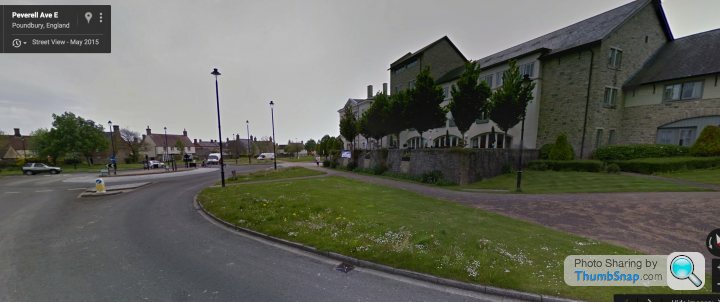
Image below shows that not even heir to the throne can defeat our engineers (streetview of the loathsomely twee Poundbury scheme. You have been warned!)
Seemed to be a weak selection this week. I did like one of the short-listed houses (Levring House) and would have not been surprised if they left it at just that one. I can't imagine how much that bronze cladding cost...
The other one, Maghera, really was one for the architects; the external form was very interesting, striking but as a house it all seemed to fall apart when you walked inside. The master bedroom with that forlorn looking bed in the middle of an expanse of gray two ways and the wife making a plaintive excuse about not finding bedside table(s) summed up it up nicely. Every room had that X-Factor style reverb which is the tell-tale for a lack of furnishing, too many hard surfaces and commercial space scale.
Next week seems to look at smaller projects which could be interesting; I do struggle with the notion that a "Grand Design" is grand because it's big, bigger, huge.
AJLintern said:
More stacked boxes... seems there's not much originality in architecture these days :-/
There was weathered steel. Oh wait...Last one (The mill) looks interesting. Similar idea to Astley Castle renovation by Landmark Trust.
Edited by marksx on Wednesday 25th November 21:42
Definitely the right place to win. Whilst personally I'd choose to live in Pobble house due to location and size there's no arguing that Flint House is special.
Of all the houses/homes shown it was the one that really pushed boundaries and wasn't "merely" a gentle evolution of standard themes. It also should pass the "PH hates two boxes test" as well as the "It's just another Audi showroom dismissal". I can see the usually too frequently used "important building" qualified being attached to it in the future.
Overall it was a good competition; plenty to offend almost everyone, architects in silly glasses talking "twaddle", questionable interior design taste and a lack of distracting totty to invite comments about Kevin McClouds "off-piste" activities.
GnuBee said:
Of all the houses/homes shown it was the one that really pushed boundaries and wasn't "merely" a gentle evolution of standard themes. It also should pass the "PH hates two boxes test" as well as the "It's just another Audi showroom dismissal". I can see the usually too frequently used "important building" qualified being attached to it in the future.
I think we should reserve judgement until we see the next generation of Audi Showrooms. 
GnuBee said:
Overall it was a good competition; plenty to offend almost everyone, architects in silly glasses talking "twaddle", questionable interior design taste and a lack of distracting totty to invite comments about Kevin McClouds "off-piste" activities.
I thought I saw Kev sire twins at the end 
Adam B said:
A worthy winner IMHO
We really got to see around it properly this time, and it is so imaginative and every room area and view is a bit special, I love the exterior and roof terrace areas too.
Furnishing was pretty awful though but that's not the architects fault
I thought the furnishings and pictures were pretty dire too. Did they ever mention how much it cost to build?We really got to see around it properly this time, and it is so imaginative and every room area and view is a bit special, I love the exterior and roof terrace areas too.
Furnishing was pretty awful though but that's not the architects fault
Gassing Station | TV, Film, Video Streaming & Radio | Top of Page | What's New | My Stuff