Climate change - the POLITICAL debate. Vol 3
Discussion


lenny007 said:
I expect he was just doing some research for his next novel.dickymint said:
Just managed to pause and rewind the Leader of the Greens getting slated about her election policies on Sky News. Something to do with an interview on LBC earlier today..... off to get some popcorn then enjoy 
 absolutely brilliant - can't wait to see Farage ripping her a new back door
 dickymint said:
^^^ somebody please please find the entire interview as apparently they didn't even play the "bad" bits on Sky!! Is LBC on catch up?
http://www.lbc.co.uk/incredibly-awkward-interview-...The second link on the page is the full interview.
Mr GrimNasty said:
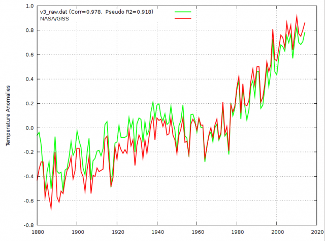
The complete axis info isn't in the news article, that is the point.
I've not made anything up, I've merely pointed out there is no way of knowing what it represents, no working/calculation method shown, and I've proposed one possibility and pointed out that a near flat line on this graph does not necessarily 'tell the truth'.
I've not claimed it is always in favour of increasing warmth in every instance, I said that is the overall effect, which is irrefutable (and by warmth, I meant warming trend - the EU/US data makes up the majority, in the main, the older it is, the more it is cooled, the newer, the more it is warmed up - actually the reverse of what you would expect as increasing UHI effect must be the largest factor requiring adjustment by far).
All this just shows what an unhelpful little graphic it is, and why it is irrelevant discussing it.
So why use this rather than hard examples, tit for tat, if they/you claim the skeptics are cherry picking adjusted sites that show a trend reversal from cooling to warming, pick some of these and provide the reasons for the adjustments and the calculation method, and cherry pick some others to prove it isn't across the board - should be easy to do both. And show some of the hundreds of sites that have/must require substantial adjustment because of increasing UHI effect?
What would me 'tit for tat' cherry-picking some cooled sites prove apart from our mutual foolishness? You need to look at the net effect of all station adjustments to get a good answer.I've not made anything up, I've merely pointed out there is no way of knowing what it represents, no working/calculation method shown, and I've proposed one possibility and pointed out that a near flat line on this graph does not necessarily 'tell the truth'.
I've not claimed it is always in favour of increasing warmth in every instance, I said that is the overall effect, which is irrefutable (and by warmth, I meant warming trend - the EU/US data makes up the majority, in the main, the older it is, the more it is cooled, the newer, the more it is warmed up - actually the reverse of what you would expect as increasing UHI effect must be the largest factor requiring adjustment by far).
All this just shows what an unhelpful little graphic it is, and why it is irrelevant discussing it.
So why use this rather than hard examples, tit for tat, if they/you claim the skeptics are cherry picking adjusted sites that show a trend reversal from cooling to warming, pick some of these and provide the reasons for the adjustments and the calculation method, and cherry pick some others to prove it isn't across the board - should be easy to do both. And show some of the hundreds of sites that have/must require substantial adjustment because of increasing UHI effect?
Here's another article comparing raw data with adjusted: http://variable-variability.blogspot.de/2015/02/ev...
plunker said:
Mr GrimNasty said:
The complete axis info isn't in the news article, that is the point.
I've not made anything up, I've merely pointed out there is no way of knowing what it represents, no working/calculation method shown, and I've proposed one possibility and pointed out that a near flat line on this graph does not necessarily 'tell the truth'.
I've not claimed it is always in favour of increasing warmth in every instance, I said that is the overall effect, which is irrefutable (and by warmth, I meant warming trend - the EU/US data makes up the majority, in the main, the older it is, the more it is cooled, the newer, the more it is warmed up - actually the reverse of what you would expect as increasing UHI effect must be the largest factor requiring adjustment by far).
All this just shows what an unhelpful little graphic it is, and why it is irrelevant discussing it.
So why use this rather than hard examples, tit for tat, if they/you claim the skeptics are cherry picking adjusted sites that show a trend reversal from cooling to warming, pick some of these and provide the reasons for the adjustments and the calculation method, and cherry pick some others to prove it isn't across the board - should be easy to do both. And show some of the hundreds of sites that have/must require substantial adjustment because of increasing UHI effect?
What would me 'tit for tat' cherry-picking some cooled sites prove apart from our mutual foolishness? You need to look at the net effect of all station adjustments to get a good answer.I've not made anything up, I've merely pointed out there is no way of knowing what it represents, no working/calculation method shown, and I've proposed one possibility and pointed out that a near flat line on this graph does not necessarily 'tell the truth'.
I've not claimed it is always in favour of increasing warmth in every instance, I said that is the overall effect, which is irrefutable (and by warmth, I meant warming trend - the EU/US data makes up the majority, in the main, the older it is, the more it is cooled, the newer, the more it is warmed up - actually the reverse of what you would expect as increasing UHI effect must be the largest factor requiring adjustment by far).
All this just shows what an unhelpful little graphic it is, and why it is irrelevant discussing it.
So why use this rather than hard examples, tit for tat, if they/you claim the skeptics are cherry picking adjusted sites that show a trend reversal from cooling to warming, pick some of these and provide the reasons for the adjustments and the calculation method, and cherry pick some others to prove it isn't across the board - should be easy to do both. And show some of the hundreds of sites that have/must require substantial adjustment because of increasing UHI effect?
Here's another article comparing raw data with adjusted: http://variable-variability.blogspot.de/2015/02/ev...
Adjustments reduce global warming says the link, when one result, land, is the opposite: temperatures in early decades are shown adjusted downwards, meaning that the claimed global warming trend is adjusted upwards.
The SST temperature appears to be adjusted upwards in earlier years, but the global plot looks suspiciously like a 60n-60S SST plot rather than global but it's possible they may actually be almost identical.
However the combination of land-ocean on offer at the link doesn't resemble e.g. NASA GISS where the global values are indeed adjusted downwards in earlier decades and upwards in recent years with the result that (non-human) warming is exaggerated. This is a comparable source where official data has been copied and used to create the graphic.
Even then, while homogenisation gets a mention at the link, there's still nothing there about how corrupted and made-up (substitution) some of the data is in the first place.
UAH LTT is still the place to look, satellites have far better sampling and don't rely on sensors near aircon outlets / airport tarmac / car parks / chimneys / trash burners, and there is nothing remotely alarming or carbon dioxide-related about the data for the last 30+ years.
Hopefully we can now leave corrupted near-surface databases and junkscience pinned on them to return to the far more interesting politics of the Pachauri Files.
turbobloke said:
However the combination of land-ocean on offer at the link doesn't resemble e.g. NASA GISS where the global values are indeed adjusted downwards in earlier decades and upwards in recent years with the result that (non-human) warming is exaggerated. This is a comparable source where official data has been copied and used to create the graphic.
The url indicates that's another land data graph TB.plunker said:
The url indicates that's another land data graph TB.
Where was the claim otherwise? I suggest you need to read what I posted more carefully. The point is all about what the public is presented with, are you saying that the claimed (non-human) warming trend oft-cited derives from SST? It's no use showing what can happen to some SST data if nobody uses it to scare politicians and the public.The BBC news site has the developing Pachauri story showing in its "thumbnails" section just above an item about some research (based on tree rings no less) concluding that rats were not the cause of Black Death Plague. Purely unfortunate co-location I am sure.
On the other hand the "Black Death cause" story is interesting for the comment that "they might have to re-write History".
It's interesting how science keeps coming up with new explanations for science that re-write or have a potential to re-write previous consensus. This is especially notable in, inter alia, human medicine where certain types of controlled experimental testing are clearly likely to be unacceptable reflecting the challenges of attempting analysis based on poorly collected or poorly available and unrepeatable data records.
Will we now see demands for world leaders to apologise to rats everywhere and offer compensation?
Carbon Dioxide has been vilified for years - if found to be largely innocent in a few years from now how will it be compensated?
turbobloke said:
plunker said:
The url indicates that's another land data graph TB.
Where was the claim otherwise? I suggest you need to read what I posted more carefully. The point is all about what the public is presented with, are you saying that the claimed (non-human) warming trend oft-cited derives from SST? It's no use showing what can happen to some SST data if nobody uses it to scare politicians and the public.plunker said:
turbobloke said:
plunker said:
The url indicates that's another land data graph TB.
Where was the claim otherwise? I suggest you need to read what I posted more carefully. The point is all about what the public is presented with, are you saying that the claimed (non-human) warming trend oft-cited derives from SST? It's no use showing what can happen to some SST data if nobody uses it to scare politicians and the public.In terms of what politicians and the public get, and what you're pretending has importance when it doesn't, there's also the point made mumerous times that the near-surface database is corrupted and unfit for purpose. UAH LTT avoides this game playing with homogenisation and substitution, has far superior sampling yet it's avoided in favour of the fudges like CRUTAR (suitably renamed by McIntyre in view of the importance of airport tarmac temperature readings).
Einion Yrth said:
chris watton said:
dickymint said:
turbobloke said:
lenny007 said:
Blimey.
chris watton said:
dickymint said:
^^^ somebody please please find the entire interview as apparently they didn't even play the "bad" bits on Sky!! Is LBC on catch up?
http://order-order.com/2015/02/24/natalie-bennetts-fuel-efficient-car-crash-on-lbc/Enjoy!
She's more than out of her depth, she's in the middle of the bloody ocean...
For more hearty mirth, see her performance v Andrew Neil. Start at 4:09. Deep joy...

https://www.youtube.com/watch?v=5dFn8RIXOBE
The worry here is that most environmentalists won't see the red beyond the green. I shudder to contemplate these planks having any kind of influence in government.

dickymint said:
Nice quote from Choo Choo Patch
"what ever capacity I work. For me the protection of planet Earth, the survival of all species and sustainability of our ecosystems is more than my mission, it is my religion."
........and my Nice Little Earner..."what ever capacity I work. For me the protection of planet Earth, the survival of all species and sustainability of our ecosystems is more than my mission, it is my religion."

Choo choo Patch...
...I'm going to steal that.Religion...Is he really so stupid that he doesn't see that's a monumental gaffe?
mybrainhurts said:
Religion...Is he really so stupid that he doesn't see that's a monumental gaffe?
Unlikely.The BBC piece has a snap of him with Algore collecting the alleged Nobel and then a more recent one.
Compare the hair.
I don't think spotting monumental gaffes, especially his own, are allowed by his personal self awareness system.
Gassing Station | News, Politics & Economics | Top of Page | What's New | My Stuff