Climate Change - The Scientific Debate (Vol. II)
Discussion


deeen said:
Ridiculous "graph" is ridiculous!
1) The Earth has never had zero C02 emissions (well, not for a few biliion years, anyway).
2) Cumulative? How much was absorbed?
3) Dates? (As mentioned above)... How about cumulative CO2 emissions since the Moon left us, for example?
Where does the graph say zero CO2 emissions?1) The Earth has never had zero C02 emissions (well, not for a few biliion years, anyway).
2) Cumulative? How much was absorbed?
3) Dates? (As mentioned above)... How about cumulative CO2 emissions since the Moon left us, for example?
As you cannot even read the graph properly not sure why your point 2 asks a question when you don't understand the basis beforehand.
The Moon? Keith Moon from Pink Floyd or the one in the sky?
Have you been drinking?
mko9 said:
Gandahar said:
Arctic reduction against CO2
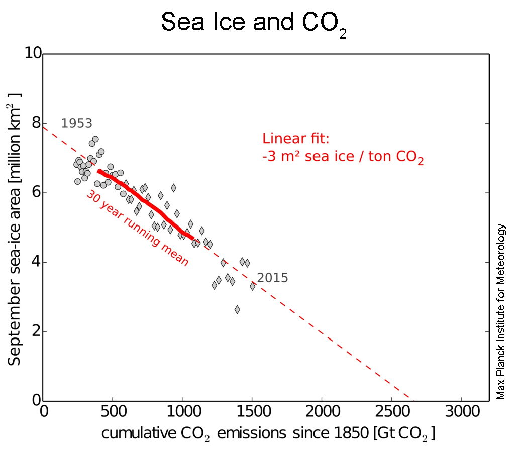
While both datasets may reflect reality, the overlay of the two is complete bullsEdited by Gandahar on Thursday 8th December 20:49
 t. You can take any two datasets with the same trend (upwards or downwards) and make them align by simply adjusting the scales on the X and Y axis. There is no rational basis for the scaling of either axis in that plot, except to make them align perfectly. Science!
At least you are sober and thoughtful.
 I meant Abba.
Gandahar said:
deeen said:
Ridiculous "graph" is ridiculous!
1) The Earth has never had zero C02 emissions (well, not for a few billiion years, anyway).
2) Cumulative? How much was absorbed?
3) Dates? (As mentioned above)... How about cumulative CO2 emissions since the Moon left us, for example?
Where does the graph say zero CO2 emissions?1) The Earth has never had zero C02 emissions (well, not for a few billiion years, anyway).
2) Cumulative? How much was absorbed?
3) Dates? (As mentioned above)... How about cumulative CO2 emissions since the Moon left us, for example?
As you cannot even read the graph properly not sure why your point 2 asks a question when you don't understand the basis beforehand.
The Moon? Keith Moon from Pink Floyd or the one in the sky?
Have you been drinking?
The graph says "Cumulative emissions from...", but the Earth's CO2 emissions existed long before the date picked, and still continue... why does the graph ignore the majority of CO2? Could it be that the dots would not then line up to give the required result?
"Cumulative" is irrelevant, you need to deduct what is absorbed to arrive at the actual amount of CO2 in the air. But of course, then you would have to include all CO2.
And yes of course, drinking at regular intervals is healthy... try not drinking for a week, and see how you get on?
May be of interest: http://notrickszone.com/2016/12/22/the-hockey-stic...
DibblyDobbler said:
May be of interest: http://notrickszone.com/2016/12/22/the-hockey-stic...
Just a note of caution: that website has a habit of listing xx papers that aren't what the headline says they are.Headlines are great for clickbait, and often all that people read, so I would suggest people make sure they delve further.
durbster said:
DibblyDobbler said:
May be of interest: http://notrickszone.com/2016/12/22/the-hockey-stic...
Just a note of caution: that website has a habit of listing xx papers that aren't what the headline says they are.Headlines are great for clickbait, and often all that people read, so I would suggest people make sure they delve further.
Gandahar said:
Current Antarctic sea ice extent

Arctic reduction against CO2
Not sure I understand the point you are trying to make with your two graphs - they appear to contradict one another.Arctic reduction against CO2
The first shows sea ice extent trending upwards (blue line) - yet your second shows an apparent decrease in sea ice extent with cumulative CO2 emission (which would increase over time)
The second chart I also have a problem with - why cumulative CO2? By counting only CO2 emission and not CO2 re-absorption - you miss half of the cycle. It'd be like plotting the sea ice extent against cumulative rainfall (without considering the other half of the water cycle). You'd end up with a pretty similar chart too.
Edited by Moonhawk on Thursday 22 December 17:27
Moonhawk said:
Not sure I understand the point you are trying to make with your two graphs - they appear to contradict one another.
The first shows sea ice extent trending upwards (blue line) - yet your second shows an apparent decrease in sea ice extent with cumulative CO2 emission (which would increase over time)
The second chart I also have a problem with - why cumulative CO2? By counting only CO2 emission and not CO2 re-absorption - you miss half of the cycle. It'd be like plotting the sea ice extent against cumulative rainfall (without considering the other half of the water cycle). You'd end up with a pretty similar chart too.
Different regions hence different values. I made no point, just put up the graphs.The first shows sea ice extent trending upwards (blue line) - yet your second shows an apparent decrease in sea ice extent with cumulative CO2 emission (which would increase over time)
The second chart I also have a problem with - why cumulative CO2? By counting only CO2 emission and not CO2 re-absorption - you miss half of the cycle. It'd be like plotting the sea ice extent against cumulative rainfall (without considering the other half of the water cycle). You'd end up with a pretty similar chart too.
Edited by Moonhawk on Thursday 22 December 17:27
This is an interesting graph
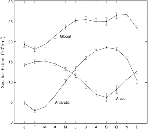
It shows how the bounce in sea ice extent in the Arctic is quicker in September than the reduction in Antarctic sea ice towards it's summer melt from the same time period.
Got to love scientific abstracts -->
Results yield a global annual sea ice cycle more in line with the high-amplitude Antarctic annual cycle than the lower-amplitude Arctic annual cycle but trends more in line with the high-magnitude negative Arctic trends than the lower-magnitude positive Antarctic trends.
hmmm, amplitude and magnitude... negative and positive.
time for
Gandahar said:
Got to love scientific abstracts -->
Results yield a global annual sea ice cycle more in line with the high-amplitude Antarctic annual cycle than the lower-amplitude Arctic annual cycle but trends more in line with the high-magnitude negative Arctic trends than the lower-magnitude positive Antarctic trends.
hmmm, amplitude and magnitude... negative and positive.
time for
The Antarctic is greater in both amplitude and magnitude so that does not make a lot of sense to me either. This assumes they mean amplitude is the differential and magnitude is the absolute peak and valley values.Results yield a global annual sea ice cycle more in line with the high-amplitude Antarctic annual cycle than the lower-amplitude Arctic annual cycle but trends more in line with the high-magnitude negative Arctic trends than the lower-magnitude positive Antarctic trends.
hmmm, amplitude and magnitude... negative and positive.
time for
Following on from the XKCD https://xkcd.com/1732/
https://wattsupwiththat.files.wordpress.com/2016/0...
Which shows the global temperature as being relatively stable for the last 10,000 years, but with changes of similar rapidity and much larger scope than we see recently occurring previously in the timeline. What is confusing is that they all use the same or similar datasets. Is it possible that the climate has been unusually stable recently and rapid changes are really the norm? Despite a US judge proclaiming that it is against some teenagers' human rights for the climate to vary I'm not sure the planet will pay much attention.
Gassing Station | Science! | Top of Page | What's New | My Stuff