Car launch 2017
Discussion


Personally, I'm liking a lot of the liveries but they are far from classic and I have a theory why.
A lack of headline / consumer brand sponsors.
If you think of the classic racing liveries, most were driven by the sponsor that were historically well known, consumer brands. Those companies invested a huge amount and applied a lot science to their brand identities that were migrated to the team's cars they sponsored.
Think: JPS Lotus, Marlboro McLaren, etc. Even washing machine maker Candy created a striking livery for Tyrrell.
With the exception of Williams, I think a lot of this brand skill has been replaced by the subjectivity of committees that determine if something looks 'cool'. And a camel is a horse drawn by a committee.
It dose make you wonder though....
All that money...
Hugely skilled airbrushing artists
but in most cases a fundamental lack of imagination in the base colouring...what a waste of money that was.
Mercedes understand it.
But even Ferrari whose job is made relatively simple....it's red... end up with weird broken up segments and sponsors loaded into a shotgun and fired at it.
They are mobile billboards I get that, they're not on track to 'look good'...but I've seen countless photoshops done by students, kids, and fans that are a MUCH better compromise than the stuff so far unveiled...
Speed Badger said:
Spyker Mclaren
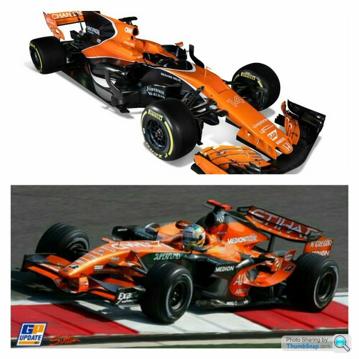
His Ronness always said that returning to orange would be going backwards and McLaren was all about going forwards, and they would never use orange whilst he was in charge. So it doesn't greatly surprise me that the first thing McLaren have done after ousting Ron is to go back to orange.Quickmoose said:
It dose make you wonder though....
All that money...
Hugely skilled airbrushing artists
but in most cases a fundamental lack of imagination in the base colouring...what a waste of money that was.
Mercedes understand it.
But even Ferrari whose job is made relatively simple....it's red... end up with weird broken up segments and sponsors loaded into a shotgun and fired at it.
They are mobile billboards I get that, they're not on track to 'look good'...but I've seen countless photoshops done by students, kids, and fans that are a MUCH better compromise than the stuff so far unveiled...
If you just want to show off your adverts, having all these random bits different colours like the mclaren makes the logos harder to see. All that money...
Hugely skilled airbrushing artists
but in most cases a fundamental lack of imagination in the base colouring...what a waste of money that was.
Mercedes understand it.
But even Ferrari whose job is made relatively simple....it's red... end up with weird broken up segments and sponsors loaded into a shotgun and fired at it.
They are mobile billboards I get that, they're not on track to 'look good'...but I've seen countless photoshops done by students, kids, and fans that are a MUCH better compromise than the stuff so far unveiled...
I think all these cars lol a bit rubbish. All too busy with flashes and swoops of colour making them look like 80s shell suits.

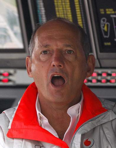

The unveiling did make me smile. Presumably keen to emphasise the days of autocracy are over Mclaren. Had what was it - four/five tiers of faceless management sat behind desks?
Looked like the politburo.
Design by committee sprung to mind.
Really wanted to like the Mclaren. The nicest thing I can say is the Force India looks like they copied the mclaren, based on a dodgy image sent over by fax, and built it in a shed.
Looked like the politburo.
Design by committee sprung to mind.
Really wanted to like the Mclaren. The nicest thing I can say is the Force India looks like they copied the mclaren, based on a dodgy image sent over by fax, and built it in a shed.
Gassing Station | Formula 1 | Top of Page | What's New | My Stuff