Car launch 2017
Discussion


ncr69 said:
The unveiling did make me smile. Presumably keen to emphasise the days of autocracy are over Mclaren. Had what was it - four/five tiers of faceless management sat behind desks?
Looked like the politburo.
Design by committee sprung to mind.
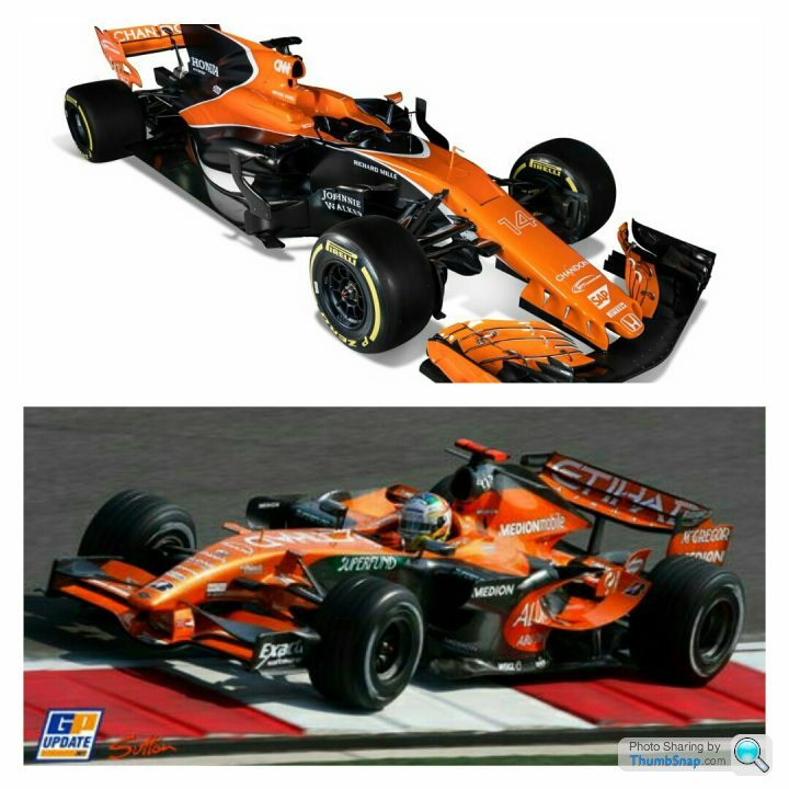
Really wanted to like the Mclaren. The nicest thing I can say is the Force India looks like they copied the mclaren, based on a dodgy image sent over by fax, and built it in a shed.
Did look a room full of atmosphere!Looked like the politburo.
Design by committee sprung to mind.
Really wanted to like the Mclaren. The nicest thing I can say is the Force India looks like they copied the mclaren, based on a dodgy image sent over by fax, and built it in a shed.

Vocal Minority said:
I can't remember what is launching next
But I already know what you lot think of it!
My problem is with the regs rather than the teams. Of course they're going to slap on any bit of aero they can to claw back. The Ferrari looks like the suspensions gonna collapse under the "kitchen sink" approach to throwing buisness at it.But I already know what you lot think of it!
I for one wouldn't have an issue if Mercedes and Red Bull I hope have packaged sufficiently to run and hide without recourse to a bloody great windbreak on the back.
I'd rather see the rest of grid, minus fins, all over the place. These fins are crude fixes.
Very low-key Castrol sponsorship on the McLaren.
Fuel technology contributes a lot to the performance of the leading cars - Ferrari reckoned they were getting 25% of their in-season BHP gains via improved fuel technology.
Makes you wonder how much Honda are missing out on by not having a big oil company on board.
Fuel technology contributes a lot to the performance of the leading cars - Ferrari reckoned they were getting 25% of their in-season BHP gains via improved fuel technology.
Makes you wonder how much Honda are missing out on by not having a big oil company on board.
StevieBee said:
Personally, I'm liking a lot of the liveries but they are far from classic and I have a theory why.
A lack of headline / consumer brand sponsors.
If you think of the classic racing liveries, most were driven by the sponsor that were historically well known, consumer brands. Those companies invested a huge amount and applied a lot science to their brand identities that were migrated to the team's cars they sponsored.
Think: JPS Lotus, Marlboro McLaren, etc. Even washing machine maker Candy created a striking livery for Tyrrell.
With the exception of Williams, I think a lot of this brand skill has been replaced by the subjectivity of committees that determine if something looks 'cool'. And a camel is a horse drawn by a committee.
I absolutely agree.A lack of headline / consumer brand sponsors.
If you think of the classic racing liveries, most were driven by the sponsor that were historically well known, consumer brands. Those companies invested a huge amount and applied a lot science to their brand identities that were migrated to the team's cars they sponsored.
Think: JPS Lotus, Marlboro McLaren, etc. Even washing machine maker Candy created a striking livery for Tyrrell.
With the exception of Williams, I think a lot of this brand skill has been replaced by the subjectivity of committees that determine if something looks 'cool'. And a camel is a horse drawn by a committee.
DarthtaterM16 said:
StevieBee said:
Personally, I'm liking a lot of the liveries but they are far from classic and I have a theory why.
A lack of headline / consumer brand sponsors.
If you think of the classic racing liveries, most were driven by the sponsor that were historically well known, consumer brands. Those companies invested a huge amount and applied a lot science to their brand identities that were migrated to the team's cars they sponsored.
Think: JPS Lotus, Marlboro McLaren, etc. Even washing machine maker Candy created a striking livery for Tyrrell.
With the exception of Williams, I think a lot of this brand skill has been replaced by the subjectivity of committees that determine if something looks 'cool'. And a camel is a horse drawn by a committee.
I absolutely agree.A lack of headline / consumer brand sponsors.
If you think of the classic racing liveries, most were driven by the sponsor that were historically well known, consumer brands. Those companies invested a huge amount and applied a lot science to their brand identities that were migrated to the team's cars they sponsored.
Think: JPS Lotus, Marlboro McLaren, etc. Even washing machine maker Candy created a striking livery for Tyrrell.
With the exception of Williams, I think a lot of this brand skill has been replaced by the subjectivity of committees that determine if something looks 'cool'. And a camel is a horse drawn by a committee.
If the sport wasn't just in its own bubble and could attract large sponsors again we'd bet some nice liveried cars once more. As that's not the case let's at least hope the racing is close. I've still got high hopes of the Red Bull being a good looking car though, so far my 2 favourites are Sauber and Renault.
bobbo89 said:
Crafty_ said:
to b h and moan about a 2017 F1 car because it doesn't look like a Lotus 49 or a F92A Ferrari is plain daft.
I was just about to say the same. I think the cars look awesome, not pretty, but awesome and purposeful! h and moan about a 2017 F1 car because it doesn't look like a Lotus 49 or a F92A Ferrari is plain daft.Even the FI with its frankly ridiculous looking shark fin, it's still the work of genius minds that made the call to do that. They didn't stick that on the back without reason, something somewhere indicated to the engineers that it might work.
I really don't understand all the hate. It'll will all be proved on the track and that's where it matters.
Speed Badger said:
It's a Midland! 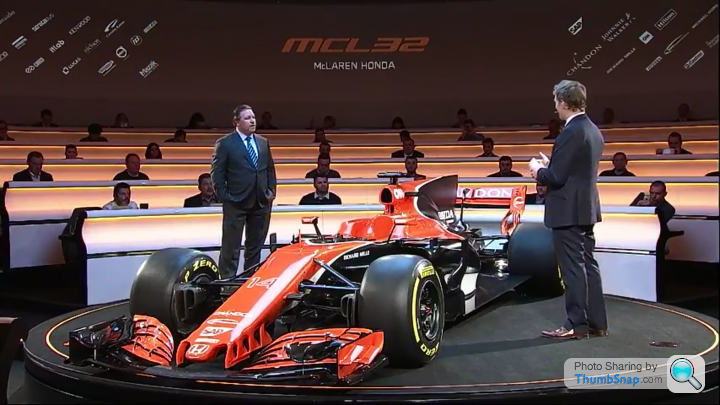
WOW.As mentioned by nearly everyone it is pretty terrible.
If they had the black replaced by white for Honda it would have been a bit better but it just looks wrong.
Hopefully the car is fast enough to win this season but it will make a terrible picture.
Is it just me or has all the slower teams gone for the same design of having a huge "tail/shark fin" above the engine cover.
It seems to be all the slow teams of 2016 going with this design.
Edited by anonymous-user on Friday 24th February 15:09
They say a picture paints a thousand words.
The key launches are interesting in terms of the over riding image left.
Mercedes - orderly, in a racing environment. Drivers and Wolff - buisness as usual. Clear communication of where leadership rests.
Mclaren - racing by committee
ferrari - the car and the drivers. Management shrinking into the background - almost like they don't want to take responsibility..
Edited by ncr69 on Friday 24th February 15:07
TheExcession said:
bobbo89 said:
Crafty_ said:
to bh and moan about a 2017 F1 car because it doesn't look like a Lotus 49 or a F92A Ferrari is plain daft.
I was just about to say the same. I think the cars look awesome, not pretty, but awesome and purposeful! h and moan about a 2017 F1 car because it doesn't look like a Lotus 49 or a F92A Ferrari is plain daft.Even the FI with its frankly ridiculous looking shark fin, it's still the work of genius minds that made the call to do that. They didn't stick that on the back without reason, something somewhere indicated to the engineers that it might work.
I really don't understand all the hate. It'll will all be proved on the track and that's where it matters.
Let em sink or swim!
ELUSIVEJIM said:
Speed Badger said:
It's a Midland!
WOW.If they had the black replaced by white for Honda it would have been a bit better but it just looks wrong.
The white on the car in the picture is to represent Honda's corporate colour...
What that thin stripe? really? and the black represents what?
Orange over white might've been better...
Is it that black hides the intricacies of the aero and the horrors of poorly thought out additions?
kambites said:
The one thing that's struck me so far is how much more detailed the Mercedes looks around the barge board area than any of the other cars. If this just a question of other manufacturers being afraid to show their hand too early?
none, some or all of that detail could be duff though right?complexity where it's not needed, holes where they're not needed, wings where you won't have them....just to put the others off the scent...
It will be interesting to see how close to final these release shots are...
Gassing Station | Formula 1 | Top of Page | What's New | My Stuff