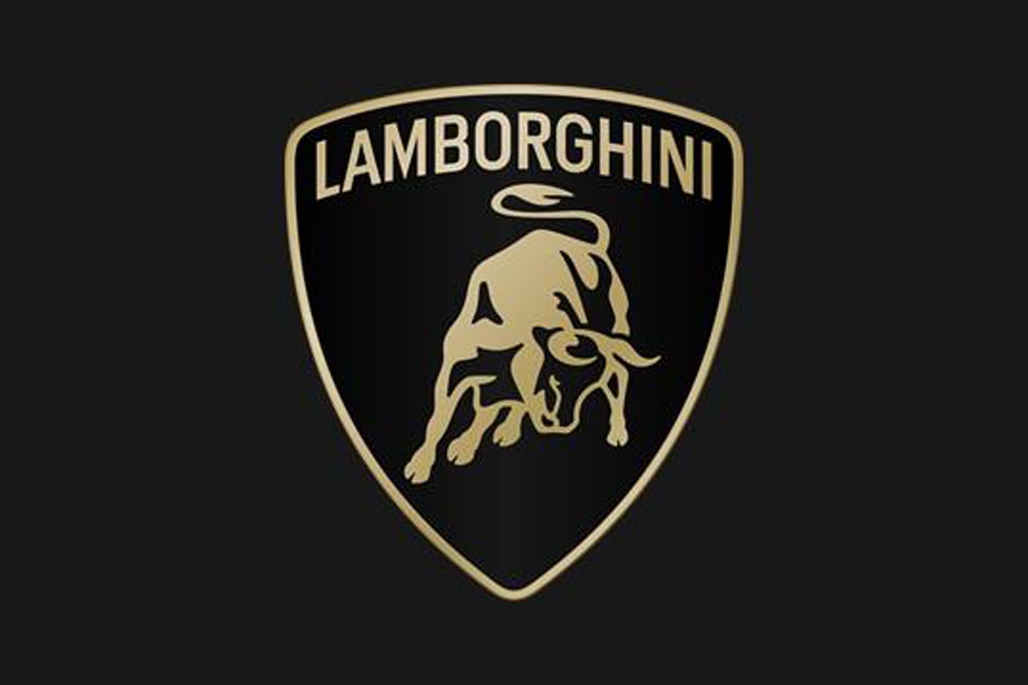
Check out the new Lamborghini badge
Seem familiar? That's intentional - but renewal speaks to Lambo's 'evolution'
Anyone who’s experienced the business end of a company rebrand will know the extraordinary amount of time and energy that goes into making fractional adjustments, so we’ll forgive the minimal difference between old and new when it comes to Lamborghini’s new logo. In point of fact, it’s said to be the first refresh in more than twenty years, and the manufacturer reckons it’s ‘driven by a new strategy that involves adapting the brand’s visual expression to better reflect the “brave”, “unexpected” and “authentic” values of its mission.’ Got that? Good.
Truthfully, of course, while it’s always admirable for a firm to carefully consider its corporate identity, the Lamborghini badge is so instantly recognisable (and irrefutably cool) that the firm is never likely to tweak it too much, no matter how keen it is to shout about a ‘new trajectory focused on sustainability and decarbonization.’ Thus we get a subtle change in typeface - it’s broader and has been chosen to echo the ‘lines and angularity of the cars’ - and a colour rethink, which includes the introduction of the gold accent (though yellow will also continue, along with the primary choice of black and white).
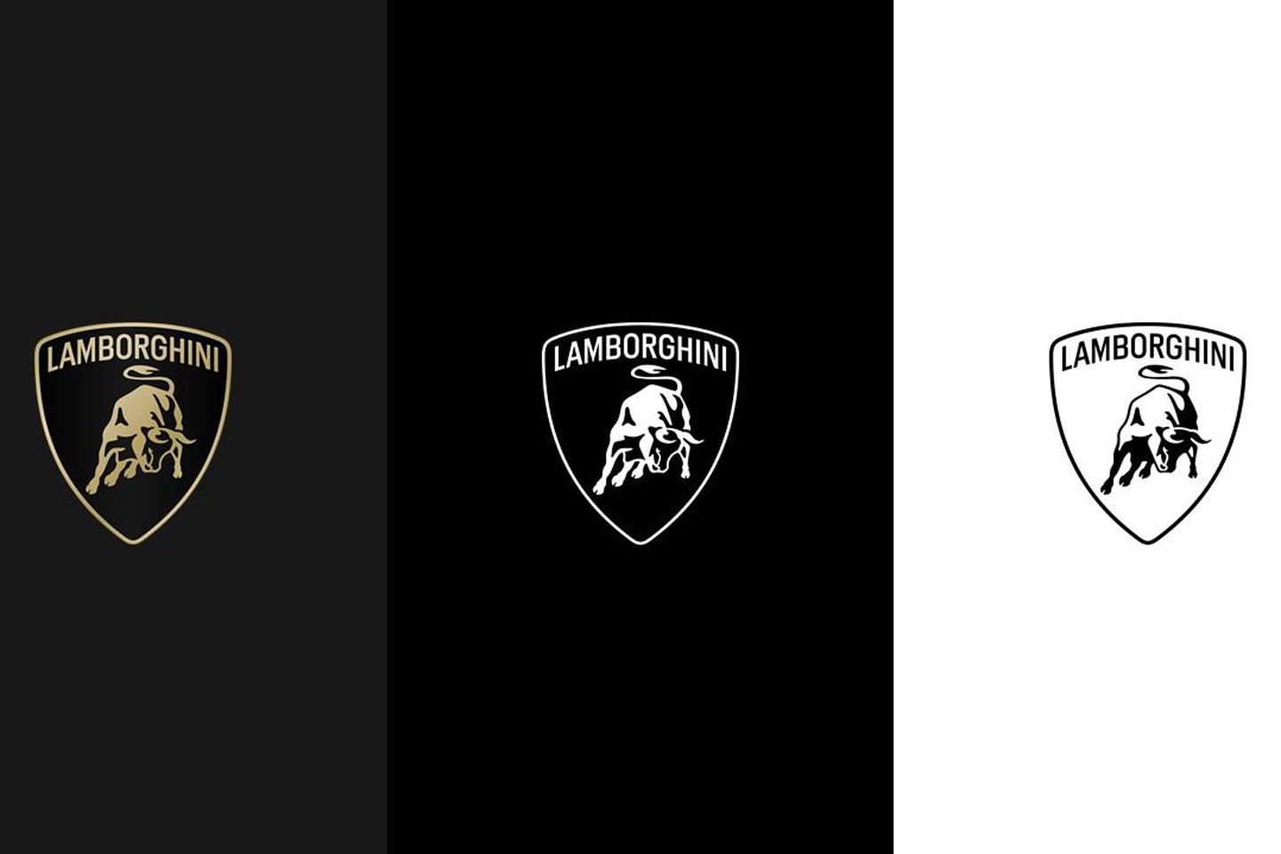
Obviously this is set to appear on future models, although a slightly more interesting facet of the refresh is that for the first time Lamborghini is willing to separate its ‘iconic bull’ from the shield entirely for use on the company’s ‘digital touchpoints’. This change you can see for yourself immediately by visiting the main UK customer website (it’s in the top left-hand corner) and for what it’s worth - like Nike using the swoosh on its own - we think it looks pretty good.
Whether or not it ‘embodies innovation and determination’ we'll leave up to you, but clearly Lamborghini considers it visual evidence of the holistic shift contained in the Direzione Cor Tauri strategy, one that attempts to rewrite the manufacturer’s culture and values in a fast-changing world. So the fact that it looks basically the same, and will be mounted to cars that still feature very loud V12 and V8 engines, is something of a win for anyone (i.e. Lamborghini’s core customers) reading this.


 t aside........it looks great. Not too much, simple, elegant.
It instantly dates anything with the old logo on so then they tell the Dealers they have to get new signage, etc.
What mugs.

Gassing Station | General Gassing | Top of Page | What's New | My Stuff