RE: Check out the new Lamborghini badge
Discussion


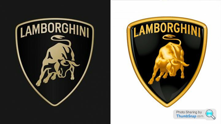
It seems to me the first thing someone would want to see is how it compares to the previous logo... so why not include an image?
I think this is a really good update of the logo. It's not a rebranding so I think people shouldn't get too excited about how similar it is, but it looks to be nicely simplified.
I think this is a really good update of the logo. It's not a rebranding so I think people shouldn't get too excited about how similar it is, but it looks to be nicely simplified.
chrisironside said:
It seems to me the first thing someone would want to see is how it compares to the previous logo... so why not include an image?
I think this is a really good update of the logo. It's not a rebranding so I think people shouldn't get too excited about how similar it is, but it looks to be nicely simplified.
Is the one on the right the old one?I think this is a really good update of the logo. It's not a rebranding so I think people shouldn't get too excited about how similar it is, but it looks to be nicely simplified.
It looks better IMO. Not sure what the end point is of every single logo getting steadily simpler with each iteration.
The same is happening with football club badges.
Every brand with their name in Aerial size 12 on a white background.

ChocolateFrog said:
chrisironside said:
It seems to me the first thing someone would want to see is how it compares to the previous logo... so why not include an image?
I think this is a really good update of the logo. It's not a rebranding so I think people shouldn't get too excited about how similar it is, but it looks to be nicely simplified.
Is the one on the right the old one?I think this is a really good update of the logo. It's not a rebranding so I think people shouldn't get too excited about how similar it is, but it looks to be nicely simplified.
It looks better IMO. Not sure what the end point is of every single logo getting steadily simpler with each iteration.
The same is happening with football club badges.
Every brand with their name in Aerial size 12 on a white background.
chrisironside said:
It seems to me the first thing someone would want to see is how it compares to the previous logo... so why not include an image?
I think this is a really good update of the logo. It's not a rebranding so I think people shouldn't get too excited about how similar it is, but it looks to be nicely simplified.
Coming from 33 years experience in the business: the real effort is making sure the new logo is OK on all bits where it sits.I think this is a really good update of the logo. It's not a rebranding so I think people shouldn't get too excited about how similar it is, but it looks to be nicely simplified.
It's not just on a car and above the factory entrance you know...
ChocolateFrog said:
Porsche seem to be one of the few that have gone the other way and it looks all the better for it.
Not really. The new Porsche logo lost all the textural elements that would not be reproduced in digital spaces. Further simplification has seen the “Stuttgart” text changed to black, instead of embossed, which obviously doesn’t translate to screen.It’s a bit silly to think that manufacturers are somehow being persuaded by brand agencies to follow a trend to simplify. That need has come about because brands now have to communicate across a far more diverse range of touch points. As with Porsche, this isn’t a rebrand (nor would it cost millions of pounds), its brand refinement.
Don’t get me wrong, I’ve been a brand consultant and designer for 20+ years, and I’m old enough to remember the days of beautifully printed car brochures, but the simple fact is that brands need to exist in a completely different environment these days.

 the real effort is making sure the new logo is OK on all bits where it sits.
ambuletz said:
what a boring logo, why are so many brands changing their logo to these flat, basic coloured things that look like it was done using microsoft paint on windows 95?
You wouldn't believe the number of people who stroll up to a Lamborghini showroom, see the signage and then shout "Oh hell no! I'm not buying a car with a bit of shading on the badge, I'm heading down the road to get a Ferrari instead!"I mean, that's definitely the defining feature of a monumental V12 supercar isn't it - whether or not the badge has a bit of shading on it.
Gassing Station | General Gassing | Top of Page | What's New | My Stuff