New Homepage test starting Tuesday 20th September
Discussion


No ad-blocker at work (assuming the top section would classify as an ad), meaning I don't actually see any content whatsoever on my monitor without scrolling!
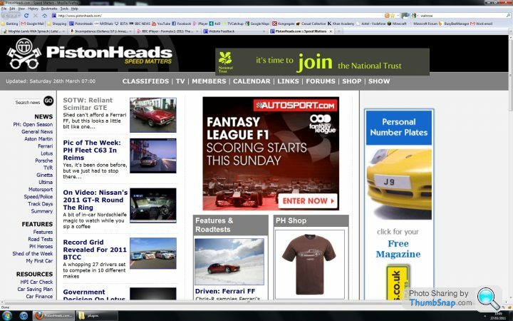
There also seems to be a serious resolution issue with the thumbnails of the articles when you get to them, only the Mini JCW Clubman thumbnail looks remotely passable.
There also seems to be a serious resolution issue with the thumbnails of the articles when you get to them, only the Mini JCW Clubman thumbnail looks remotely passable.
Edited by ukaskew on Wednesday 21st September 12:36

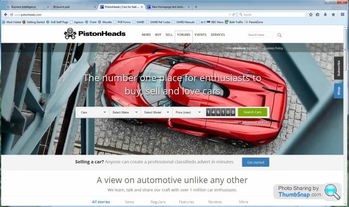
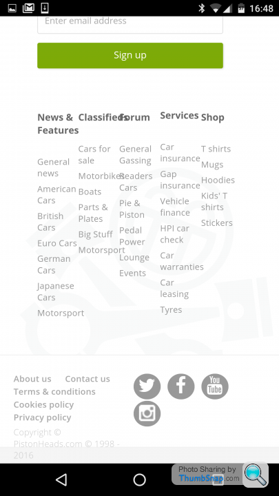
The new homepage is an ad for the classifieds. It doesn't link the forums, editorial and classifieds more closely, as you have to scroll down to see anything other than the giant ad for the classifieds. I think the new homepage signals the priority of the classifieds over anything else the site has to offer, which isn't good.
hornetrider said:
What's a homepage?
Exactly, my bookmark is http://www.pistonheads.com/gassing/I never go to this mythical homepage.
Matt_N said:
I wouldn't normally but don't have the site bookmarked at work, so happened to open it today to see a full screen advert for the classifieds.Will revert to opening the forum directly, what a terrible, terrible homepage.
Can you get rid of that slideshow at the top of the page? If you must use all of those pictures maybe just make it so a different one loads each time you load the page, but then remains static. One of the things I like about the old site is that it's relatively discreet and work-friendly. Giant flashing slideshow banner is neither, and will consequently see fewer visits, from me at least.
Unexpected Item In Bagging Area said:
"A view on automotive unlike any other"
It don't make no sense
Quite. Automotive what? Adjective is meaningless without noun.It don't make no sense
When I first opened the homepage I had a picture filling the whole screen and for a split second thought the website had been hijacked then I realised hijackers would not have put up such relevant photo. My next thought was to look for a notice saying the website was down for essential maintenance and would be back shortly or that there was a technical fault and that someone is working on it. Either way at no time did the thought enter my head 'wow fantastic new website big improvement'. It's rubbish.
The whole page is taken up by effectively an advert for the classifieds, if you didn't know better you would think it was just another autotrader type website and nothing to with news/articles/forums. It's a no from me.
The whole page is taken up by effectively an advert for the classifieds, if you didn't know better you would think it was just another autotrader type website and nothing to with news/articles/forums. It's a no from me.
I can take or leave the formatting but reading it on a mobile a couple of observations.
1) I wouldnt know it was anything other than a classified site as a new user. I scrolled down and found the other stuff but only because I assumed it must be there somewhere. A new user may not bother looking
2) Making the menu button only work once every 20 clicks or so is pissing me right off.
3) formatting wise the bottom of the home page is a right mess with overlapping text
4) I keep getting trapped on the b d home page because the menu button is a lie.
1) I wouldnt know it was anything other than a classified site as a new user. I scrolled down and found the other stuff but only because I assumed it must be there somewhere. A new user may not bother looking
2) Making the menu button only work once every 20 clicks or so is pissing me right off.
3) formatting wise the bottom of the home page is a right mess with overlapping text
4) I keep getting trapped on the b
d home page because the menu button is a lie. Edited by waterwonder on Wednesday 21st September 22:55
Has PH been taken over by Taboola? Because the new design looks incredibly like every single other clickbait spammy nonsense page on the interwebs. Square after square image with a short bit of text: Yes, it's sharp and accurate, but copying clickbait is not screaming quality to me.
You want to promote the classifieds? Fine, I get that, after all the site doesn't pay for itself. Does it need 3/4 of the sodding page to do so though?! The others are right: Someone new would be very likely to think this is a purely classifieds site, and then maybe scroll down and see the clickbait-style pics and quickly move on.
The 'automotive' and 'craft' wording is just dire. It's like someone wrote something sensible in English, then translated to Turkish, then Japanese, then back to English again. Stop trying to be poncy: That's not what people love about PH. We love it because you're one of us, not because you're all flash with fancy words.
The shocking HTML has already been mentioned. Worth saying again though, as it's desperately poor.
Positives? I'm struggling. I guess the fact there's much less empty useless space than before (Win10, FF, AB on) makes it look smarter, but then clickbait style yada yada yada. I really, really hope you guys didn't pay good money for this, I really do.
ukaskew said:
No ad-blocker at work (assuming the top section would classify as an ad), meaning I don't actually see any content whatsoever on my monitor without scrolling!
There also seems to be a serious resolution issue with the thumbnails of the articles when you get to them, only the Mini JCW Clubman thumbnail looks remotely passable.
The bad news is the screen looks like that even with the an adblock, funnily enough the autotrader site uses exactly the same concept so no guessing the target market these days.There also seems to be a serious resolution issue with the thumbnails of the articles when you get to them, only the Mini JCW Clubman thumbnail looks remotely passable.
Edited by ukaskew on Wednesday 21st September 12:36

anonymous said:
[redacted]
Just a few quick points:1) Please don't shoot the messenger,

2) I'm sure the dev team have a plan, and all I personally can do is have faith in them
3) If you do not feel that it is worth giving feedback then that is fair enough and you shouldn't feel obliged to give us any, especially given that you've previously had a negative experience (I'm afraid I don't have any knowledge of what you're referring to, it must be before my time?)
thanks
JD
OK so I've just been served the new homepage on my android mobile.
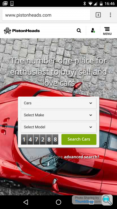
All I see is classifieds. Really? I mean, really? This is your home page.
Also, 'enthusiasts' plural. And centre the text under the classifieds box.
OK let's scroll down.
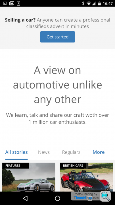
The appalling spelling and grammar has already been covered but is sadly symptomatic of the general approach to the site.
Let's scroll further down, because scrolling is fun, right?
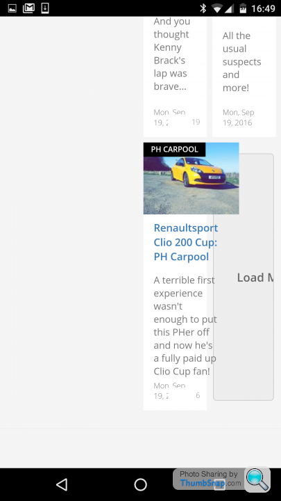
Look at it. An embarrassing mess of overlapping text. Let's scroll some more.
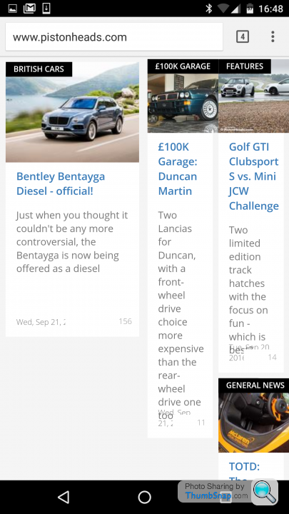
Nice formatting. Got to really pay attention here as these articles all look suspiciously like clickbait. I'm not inclined to click them at all.
My thumb is aching but we're not at the bottom yet, let's continue. Well tap 'more stories'.
Wonderful.
Seriously. You guys are releasing this stuff onto a live platform? Have you learnt no lessons from the previous clusterfks?
Come on, get it together.
All I see is classifieds. Really? I mean, really? This is your home page.
Also, 'enthusiasts' plural. And centre the text under the classifieds box.
OK let's scroll down.
The appalling spelling and grammar has already been covered but is sadly symptomatic of the general approach to the site.
Let's scroll further down, because scrolling is fun, right?
Look at it. An embarrassing mess of overlapping text. Let's scroll some more.
Nice formatting. Got to really pay attention here as these articles all look suspiciously like clickbait. I'm not inclined to click them at all.
My thumb is aching but we're not at the bottom yet, let's continue. Well tap 'more stories'.
Wonderful.
Seriously. You guys are releasing this stuff onto a live platform? Have you learnt no lessons from the previous clusterf
ks?Come on, get it together.
Lets not forget
Jumping adverts
Skins that are developed (still broken) on the fly in a live environment
the Cookie fiasco
Me "You would be bonkers to let that go live" of the classifieds and then having (eventually) to roll it back (twice)
Bad formatting on Ipad for adverts
and on and on ad nauseam
But you're just not listening (fair enough if you are happy with an appalling broken site)
Who pushed for this new homepage, who developed it and why was it released?
Gassing Station | Website Feedback | Top of Page | What's New | My Stuff