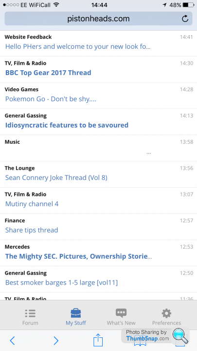
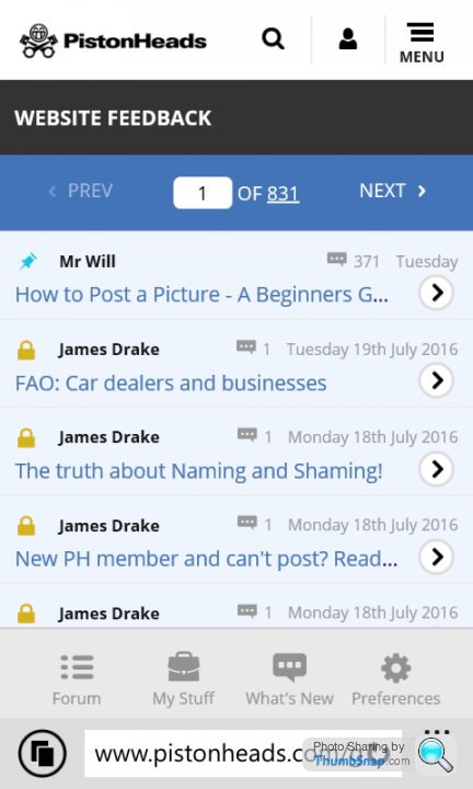
Hello PHers and welcome to your new look forums!
Discussion


Another step in the wrong direction I'm afraid. The loss of the links up top is counter-intuitive and it all genuinely looks like a step back five or more years 
A community this big and this busy, something which the whole brand is built around, should be cutting edge and pushing boundaries with design. Not reverting back to web 1.1.
Just my 2p.
A community this big and this busy, something which the whole brand is built around, should be cutting edge and pushing boundaries with design. Not reverting back to web 1.1.
Just my 2p.


 t sandwich...


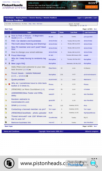
There are numerous issues with the look and feel of the GTI skin, some of which have already been pointed out, but there's many more that were raised when it was first introduced. I simply can't believe they haven't been resolved before switching off the alternatives. Absolutely terrible decision. What kind of mugs are in charge here?
zarjaz1991 said:
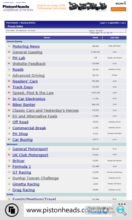
For those that were using PH Classic before, is it really massively different?
Bit more spacing in places
Slightly different font
Fancier quote boxes
I'm genuinely not seeing much else and it all looks fine to me.
Yes, on my tablet it is very difficult to read. This is the only website I've ever come across that has the problem so presumably it hasn't been fully tested on all formats. Perhaps it's time to get some professional web designers on the job ?Bit more spacing in places
Slightly different font
Fancier quote boxes
I'm genuinely not seeing much else and it all looks fine to me.
Gassing Station | Website Feedback | Top of Page | What's New | My Stuff