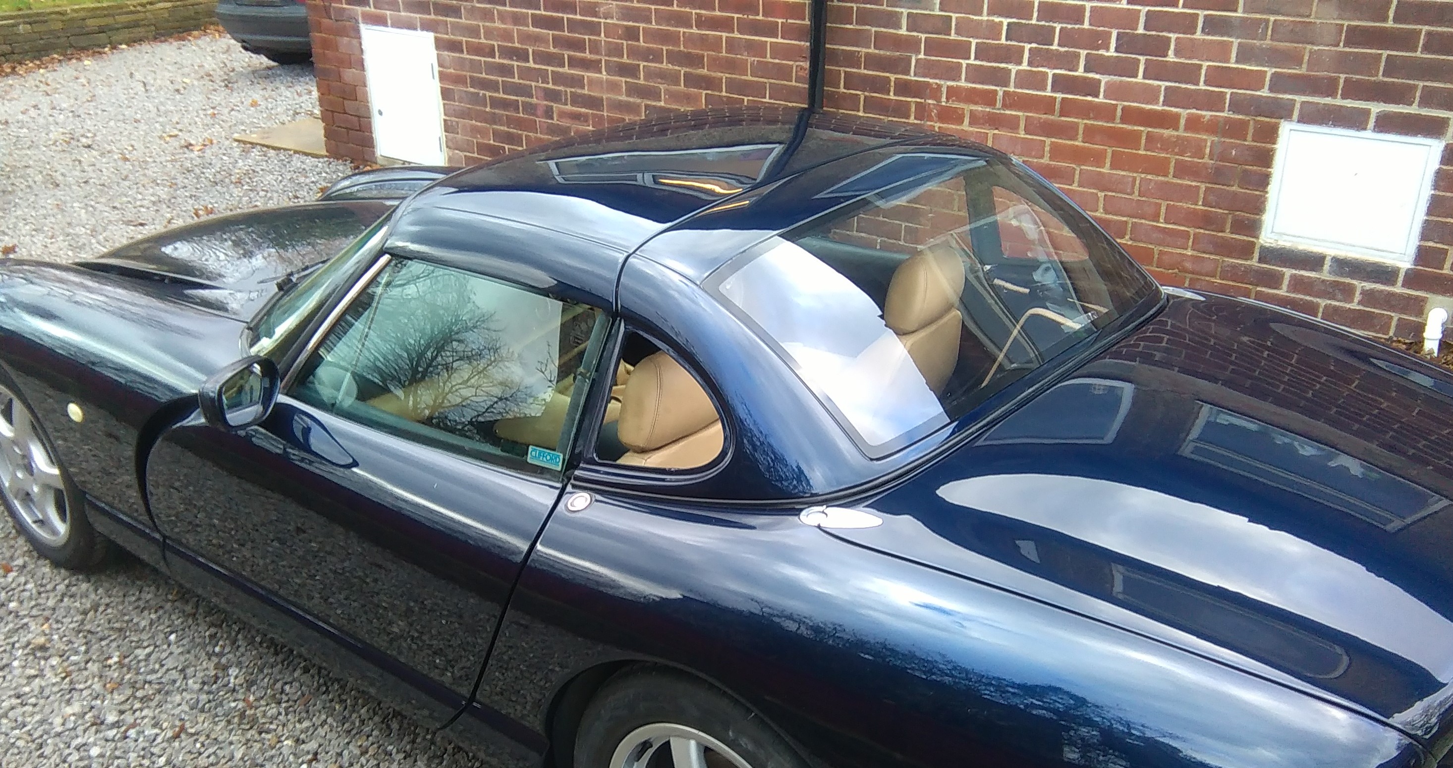
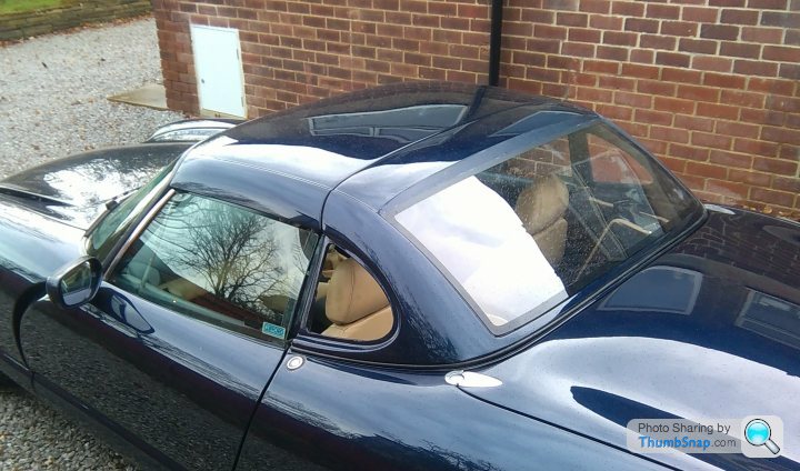
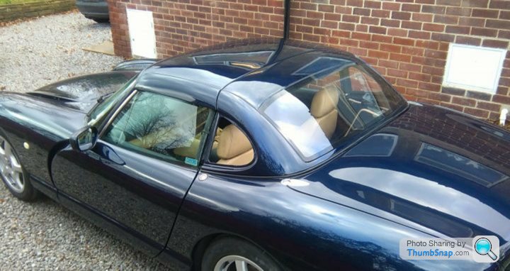
Chim Hard Top Pics
Discussion


Thanks for all the feedback guy's, very much appreciated.
The rear screen height is actually very easy to alter, It's a doddle to lower it.
The question is - by how much??
To make it more Cerb-like, I reckon the screen height needs around 50mm removing - which I know is hard to judge precisely on-screen, but that would be in-keeping with the side window heights and look proportionally like the Cerb I think.
50mm doesn't sound much, but if it's removed from the screen height it gets added to the roof area, so the proportions between the two areas can change a fair bit just with a relatively minor design adjustment.
Is anyone any good with Photoshop who could alter the pics, or at least put a horizontal line across where the top of the screen should be to get opinions?
Cheers.
Edited by Steve-Edwards on Thursday 19th November 05:48
Edited by Steve-Edwards on Thursday 19th November 05:57

Think Philup and Olevix's mockups seem to work well...
The higher the window, the shorter the roof looks (optical illusion caused by receding blue area) - too little blue-painted roof makes it appear too short to the degree of looking out of proportion with the length of the body.
IMO the Cerb looks good because the roof is low and long, and the red malaysian hardtop achieved a similar result through judicious (accidental?) use of a sticker that matches the red/white colour scheme...
For a block colour road car where we are not going to be stickering it up, I reckon the longer painted roof is required to achieve the same look with a simpler, standard colour scheme.
All IMO,
Dom
Philup said:
Quick and dirty attempt: higher or lower?

I like this, it's only a subtle change but it looks good.Ole Vix pic looks good too but the screen corners appear to drop away a bit more on that one.
I think I prefer the look of this one personally just because it looks to retain the same profile - except lower, although I can make the screen follow which ever profile seems most popular.
At the moment, the top edge of the screen runs parallel to the joint line to the targa panel - so optically, when viewed from the rear, the corners appear to drop down a little and it appears to bow upwards/forwards at the top centre of the screen - which may be making it look higher than it does from other angles.
I can keep the top edge of the screen parallel to the targa joint but just drop the whole thing rearwards/lower, or it can be given a gentler curve if needed.
I think I like the way the top corners of the screen seem to drop away slightly (not too much) as this prevents the top edge of the screen looking too straight when view straight on at the rear.
I think gentle curves and edges complement the Chimaeras shape.
I tried experimenting with a slightly different screen shape earlier to see how it looked from different angles but i'm undecided...
This was created with blue masking tape, and a strip of black insulation tape to replicate the black border.
I looked fine from some angles, but maybe a little too flat when view directly from the rear.
This was created with blue masking tape, and a strip of black insulation tape to replicate the black border.
I looked fine from some angles, but maybe a little too flat when view directly from the rear.
Steve-Edwards said:
At the moment, the top edge of the screen runs parallel to the joint line to the targa panel - so optically, when viewed from the rear, the corners appear to drop down a little and it appears to bow upwards/forwards at the top centre of the screen - which may be making it look higher than it does from other angles.
I think the reason it looks too high is because the rear window is/appears considerably higher than the side windows, more so than in the Cerb (or than in the "look" created by the window sticker on the red malaysian car we are all scrutinising) - and this height difference makes it look a little odd to my eye... (Edited to add disclaimer: this might be due to the photo angle, looking downwards at the rear 3/4 angle - unsure...)
I would have thought it would look more cohesive if the window finished at a comparable height to the side windows, as you say probably running parallel to the targa line...
IMO etc
Dom
Edited by Dominic TVRetto on Thursday 19th November 14:48

Steve-Edwards said:
I tried experimenting with a slightly different screen shape earlier to see how it looked from different angles but i'm undecided...
This was created with blue masking tape, and a strip of black insulation tape to replicate the black border.
I looked fine from some angles, but maybe a little too flat when view directly from the rear.
We need to be careful not to detract from a fantastic job by Steve here by nitpicking at the screen height, saying that I guess Steve created this post because he wanted all feedback from his potential customer base.This was created with blue masking tape, and a strip of black insulation tape to replicate the black border.
I looked fine from some angles, but maybe a little too flat when view directly from the rear.
For what its worth I also felt the rear screen went too far up, but from a aesthetic point of view it would also be worth looking at how far down the rear screen is positioned in the rear section.
To my mind the painted band of hardtop that separates the bottom of the screen from the rear deck should be broader.
The one key rule with aesthetic design is that the human brain subconsciously draws invisible lines following the imaginary paths of existing lines within an object. This is why Steve's new hard top design is so pleasing to the eye, additional swage lines have been introduced that clearly work in harmony with the existing lines on the Chimaera.
In this case your eye is drawn to the upward sweeping line of the rear quarter light lower edge, it is clearly impractical to do so but what the eye seeks is a lower rear screen edge that follows this line. However by raising the rear screen away from the rear deck I believe a more harmonious line will be created.
I summary the top of the rear screen should be lowered as we see here:
Clearly this means a smaller rear screen but that just adds to an illusion of a lower profile, and our brains are already trained to see lower profile objects as less wind resistant so more sporty in appearance.
A small front screen is part of the trick TVR pulled off to make the Cerbera look so mean & low, granted rear screen depth is less important than that of the front but the same rules still apply, just to a lesser extent.
If someone with PhotoShop skills can alter the rear screen size to create a broader rear deck band on the rear section I think it would show an improvement, if at the same time the corners of that screen could be rounded off slightly these curves should also prove harmonious with the other curves of both the car and the rear quarter lights, but care should be taken not to interfere with the swage line over the roof as this is a very pleasing line to the eye.
The key rules of aesthetic design are:
1. Follow the imaginary lines you dont even realise your brain is drawing over an object
2. Repeat curves and straight line visual references that already exist in other areas of your design (all car designers use the repetition trick)
3. Respect the rules of symmetry
4. On an object intended to move (like a car) reduce or use tricks to fool the brain into perceiving that object's wind resistance has been reduced (reduction in overall height, frontal area, rear area ect)
5. Use and repeat the lines we see in the natural world (a cheetah is a fast animal, it has forward bias rake, this is why subconsciously our brain sees a car or motorcycle with forward bias rake as more aggressive and sporty IE faster)
Just some suggestions based on knowledge given to me by an well respected industrial designer friend

None of it should be viewed as negative as I really love Steve's new hardtop design so I hope my comments are viewed as constructive?
Finally while there are known rules taught to designers the world over aesthetics remain a very personal thing, one man's beautiful object is anther's unpleasing to the eye.
So it doesn't matter what you do, you'll never 100% please everyone!
Great work Steve

Edited by ChimpOnGas on Thursday 19th November 15:11
UP front - just let me say I think this is a work of art and am so glad Steve is making them. NOt trying to detract, just (as you said) trying to provide feedback...
Dave - agree with what you say from a psychological (is this the right science?!) point-of-view - but both the Cerb and the Malaysian hardtop have NO border underneath, and both of these look utterly amazing and give the cars a character significantly different from (and superior to IMO) other manufacturers softtop-derived hardtop designs...
IMO etc...
Following on from Dom's and COG's comments I've tried a comparison with a blue Cerb to see how much difference there is. This is one picture I found:
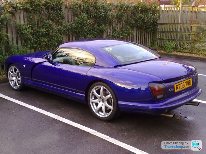
And Steve's version for comparison:

Steve's version is pretty close I think? Anyway, I seriously like it and would be very interested in the finished article.
And Steve's version for comparison:
Steve's version is pretty close I think? Anyway, I seriously like it and would be very interested in the finished article.
N7GTX said:
Following on from Dom's and COG's comments I've tried a comparison with a blue Cerb to see how much difference there is. This is one picture I found:
And Steve's version for comparison:
Steve's version is pretty close I think? Anyway, I seriously like it and would be very interested in the finished article.
Thats not Steve's version - thats Philups (IIRC, or Olevix's). That's the one I think looks just right...And Steve's version for comparison:
Steve's version is pretty close I think? Anyway, I seriously like it and would be very interested in the finished article.
Edited by Dominic TVRetto on Thursday 19th November 16:38
Dominic TVRetto said:
N7GTX said:
Following on from Dom's and COG's comments I've tried a comparison with a blue Cerb to see how much difference there is. This is one picture I found:
And Steve's version for comparison:
Steve's version is pretty close I think? Anyway, I seriously like it and would be very interested in the finished article.
Thats not Steve's version - thats Philups (IIRC, or Olevix's). That's the one I think look right...And Steve's version for comparison:
Steve's version is pretty close I think? Anyway, I seriously like it and would be very interested in the finished article.
Dominic TVRetto said:
UP front - just let me say I think this is a work of art and am so glad Steve is making them. NOt trying to detract, just (as you said) trying to provide feedback...
Dave - agree with what you say from a psychological (is this the right science?!) point-of-view - but both the Cerb and the Malaysian hardtop have NO border underneath, and both of these look utterly amazing and give the cars a character significantly different from (and superior to IMO) other manufacturers softtop-derived hardtop designs...
IMO etc...
Actually that's pretty conclusive, you're right & I'm wrong.Dave - agree with what you say from a psychological (is this the right science?!) point-of-view - but both the Cerb and the Malaysian hardtop have NO border underneath, and both of these look utterly amazing and give the cars a character significantly different from (and superior to IMO) other manufacturers softtop-derived hardtop designs...
IMO etc...
As you rightly point out the Malaysian rear screen follows the same rules as that of the Cerbera.
Looking at the rear screens on these two examples again I can now see why, what TVR did with the Cerbera is essentially another clever trick like reducing the height of the front screen.
TVR ran the Cerbera rear screen all the way down to the rear deck, this fools your brain into seeing the screen as laying flatter.
A flatter rear screen in turn is perceived as lower, and lower seems faster to the brain because we are all conditioned to see lower objects as faster.
This is where PhotoShop comes in to prove or disprove the various theories so avoiding a massive amount of physical changes.
Like I say.. "beauty is in the eye of the beholder", and everyone it seems is an amateur designer so ultimately Steve will need to listen to his own gut feeling.
At the end of the day it's a brilliant job as it is... making the details surrounding the rear screen somewhat academic.
Gassing Station | Chimaera | Top of Page | What's New | My Stuff