Critique my site please?
Discussion


As an electrical contractor myself..... very impressive site, work and brand. Video was a bit slow/boring but impressive work!
We've been around 30+ years and are primarily commercial, but my sparks could learn a thing or two from you!
I think you should get the quick quote back onto the new style site though.
We've been around 30+ years and are primarily commercial, but my sparks could learn a thing or two from you!
I think you should get the quick quote back onto the new style site though.
I'm sure that this might come over as pedantry but there are several mistakes on the home page alone.
AN potentially awkward - should be 'a'.
needs completely renovatED - should be RENOVATING.
I also found an 'its' that should have been an 'it's'.
It depends how bothered you are. Some people don't notice these things but if I were you I'd have someone proofread the copy; you can't rely on spellcheckers.
Jamster123 said:
Thanks Sparky. I debated with the quick quote form, but in all honestly I didn't get much coming through it so left out.
I assume the images should link somewhere? they don't on mine anyhow.like the b&w photoshopped pic at the top

only thing would be to have a section about price. it's certainly the first thing I would want to know.
yeah read post, this is basic template plenty of errors but this is really to get a feel for the design at the moment. Be pretty silly going to this effort to leave those spelling mistakes in!
This is the home page, the images will all link to other pages, which Ill begin working on soon wondering peoples thoughts as to whether big improvement on last site ?
The old site will stay but will be focused on the property side of things and new site will be solely for rewiring.
This is the home page, the images will all link to other pages, which Ill begin working on soon wondering peoples thoughts as to whether big improvement on last site ?
The old site will stay but will be focused on the property side of things and new site will be solely for rewiring.
Edited by Jamster123 on Thursday 26th June 22:52
Edited by Jamster123 on Thursday 26th June 22:53
Wondered if anyone might lend an opinion on the site at this stage ?
Text is not final so yes will be errors and 1 or 2 links not working and quit a few pics missing on some pages.
I go on holiday next week which is when I really going to push on with it so looking for any major changes anyone thinks I should make.
More concerned with the layout etc, would appreciate any designers opinions.
Having to scroll down on my screen at least, is that an issue for other users ? Everything looks very big and bold, again not sure if thats just my screen.
Thanks!
http://macwebsolutions.co.uk/clients/jrc/
Edited by Jamster123 on Wednesday 27th August 20:00
I know orange is your colour but I would prefer it if you gave the text a hint of grey or something on that main block on the front page to make the writing slightly easier to read. I think you should have your location prominent on the front page eg 'Serving the York area' or wherever as a strapline. When I look at your contacts info I have no idea where Crookston is, which I find a bit annoying.
Your Google, Twitter and Facebook buttons don't work.
See the following links to get the correct code.
https://developers.google.com/+/web/+1button/
https://dev.twitter.com/docs/tweet-button
https://developers.facebook.com/docs/plugins/like-...
The page "What our customers say" add the place names for better organic search results, people search for using their place names not post codes. e.g. Bishopbriggs rather than G64.
Excellent, Exactly the pointers Im after, I knew about the Facebook links.
The orange text is a tough one Ive tried a few different colours and can't decide what is best here. I looked at a few other sites and most seem to go for the white text.
Im taking most of my inspiration from here http://spyrestudios.com/33-brilliant-orange-websit...
The orange text is a tough one Ive tried a few different colours and can't decide what is best here. I looked at a few other sites and most seem to go for the white text.
Im taking most of my inspiration from here http://spyrestudios.com/33-brilliant-orange-websit...
Couple of things Im keen to add, and keen to get feedback on..
1- when you hover over the NICEIC badge, Id like some text to pop up like "Why NICEIC"? Then clicking takes you to the NICEIC site - doable?
2 - All logos are Jpeg or smiler at moment, they will be redone in better files, to create sharper images.
3 - Currently working a new video, current one a bit amateur.
4 - Recent projects - originally, I had this page displaying 3 different jobs, my designer suggested it would be better as a blog. Blog is basic at moment but Ill tart that up shortly. Thoughts on the blog idea over basic pics?
5 - scrolling down, is the page too big ? will folk forget to scroll down ?
6 - How are we portrait ? is is obvious what we do ? We mostly rewire houses, although those pics can be boring so Ive tried adding interesting pics, good move or bad move ? I have few more to add such as exterior lighting and other cool projects
Should add I pretty much designed the whole thing on my own using sketchbook! designer has just coded it up. So any basic design errors id be pleased to hear about.
Edited by Jamster123 on Wednesday 27th August 20:50
My humble opinion.....
Less text (headline statements only)
Photos (on the carousel) suggest a little to much industrial, corporate world
Video is good, but not sure what I am supposed to take away from it
these guys design stuff for a living, check out their web site, it might be at the opposite extreme end of the spectrum when it comes to web sites, however this plain, large statement, clear language is the design language most are heading too.
http://method.com
Imagine someone only spends 30 seconds on you site, what do you want them to take away from it.
Edited to add
Overall it is a very good site, lots of good stuff, quality, images, navigation, much better than most,
Edited by Wilmslowboy on Wednesday 27th August 21:14
Wilmslowboy said:
My humble opinion.....
Less text (headline statements only)
Photos (on the carousel) suggest a little to much industrial, corporate world
Video is good, but not sure what I am supposed to take away from it
these guys design stuff for a living, check out their web site, it might be at the opposite extreme end of the spectrum when it comes to web sites, however this plain, large statement, clear language is the design language most are heading too.
http://method.com
Imagine someone only spends 30 seconds on you site, what do you want them to take away from it.
Originally I had envisioned the site very basic and very minimal like you suggest, but my concern is SEO. We are a small business so need exposure, so how would a site like the one you posted fair with SEO if there is hardly any text ?Less text (headline statements only)
Photos (on the carousel) suggest a little to much industrial, corporate world
Video is good, but not sure what I am supposed to take away from it
these guys design stuff for a living, check out their web site, it might be at the opposite extreme end of the spectrum when it comes to web sites, however this plain, large statement, clear language is the design language most are heading too.
http://method.com
Imagine someone only spends 30 seconds on you site, what do you want them to take away from it.
Method appears multinational so Im guessing they are not massively fussed about "getting known" now but how would that work for me ?
IMHO if your main market is house rewires the site does not convey that message at all - it looks very corporate
You really need to optimise:
59 requests for a simplish home page ?
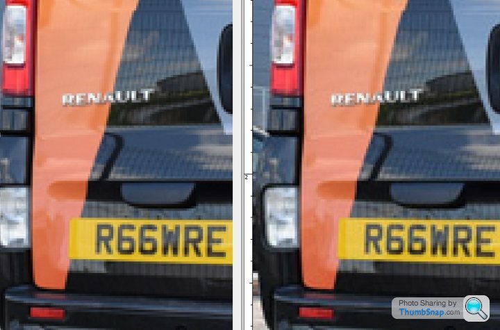
images e.g the vans picture can go from 160Kb to 52Kb with no loss of quality
You might consider omitting the bar under the logo since there is a lot of repetition there
HTH
You really need to optimise:
59 requests for a simplish home page ?
images e.g the vans picture can go from 160Kb to 52Kb with no loss of quality
You might consider omitting the bar under the logo since there is a lot of repetition there
HTH
cuneus said:
IMHO if your main market is house rewires the site does not convey that message at all - it looks very corporate
You really need to optimise:
59 requests for a simplish home page ? - Sorry for my ignorance, assuming this is to do with loading time ?
images e.g the vans picture can go from 160Kb to 52Kb with no loss of quality
You might consider omitting the bar under the logo since there is a lot of repetition there
HTH
Sorry for my ignorance, assuming the requests is to do with loading time ?You really need to optimise:
59 requests for a simplish home page ? - Sorry for my ignorance, assuming this is to do with loading time ?
images e.g the vans picture can go from 160Kb to 52Kb with no loss of quality
You might consider omitting the bar under the logo since there is a lot of repetition there
HTH
Can the pics be reduced with absolutely no loss in quality ?
I see what you mean about the repetition, perhaps I could change intro line to "Welcome to JRC"
Im concerned about the corporate feel, Im I overdoing it!?
I have a few pics to add still on the slider that show us actually rewiring houses so maybe that will help. Ive been trying to stay away from usual sparky pics of sockets and bits of cable , like everyone has.
Jamster123 said:
1- when you hover over the NICEIC badge, Id like some text to pop up like "Why NICEIC"? Then clicking takes you to the NICEIC site - doable?
Dead easy, wrap it in a link with the page destination, add the 'title' tag to include your pop-up text. That's just basic HTML - I'm sure you could probably do some java-y thing these days that makes it much more flash, but at the expense of download time and possible incompatibility.Jamster123 said:
4 - Recent projects - originally, I had this page displaying 3 different jobs, my designer suggested it would be better as a blog. Blog is basic at moment but Ill tart that up shortly. Thoughts on the blog idea over basic pics?
Don't forget if you do stuff that is date-related, whether it's as a blog or just as 'recent projects', you have to keep adding stuff to it. If you don't add a 'recent project' for twelve months, viewers will think you haven't done any. Worst thing is a 'news' page where the latest news is from a year ago.Jamster123 said:
5 - scrolling down, is the page too big ? will folk forget to scroll down ?
I don't think it's a case of them forgetting to scroll down, but you have to give them a reason in the top half to scroll down to the bottom half. It's not as bad as sideways scrolling, but it's better if you can get the main content without scrolling.Obiviously you know about all the spelling stuff. I can't really comment on the design as it's not something I've ever really got on with.
Thanks, Ive made a few points to my designer that had been suggested above. Working on it now.
Made some changes to the opening text, trying to explain a bit more about what we do?
Welcome to JRC.
We are a NICEIC Approved electrical contractor, based in Glasgow and specialising in domestic rewiring. With over 15 years experience in rewiring JRC are the number one choice to rewire your property.
Our business model is to reduce the upheaval and hassle expected when rewiring your home. We have formed an elite team of electricians, and associated trades, all with extensive experience in this area.This allows us to rewire properties in minimal time. Typically, an occupied three bedroom house can be completely rewired in 1-2 days, including all plasterwork, repairs and NICEIC certification. Our average cost for this service is £2200+VAT.
Our unique service takes us all over Scotland as private homeowners realise rewiring no longer needs to be a long drawn out process. We are confident our service is unrivalled for both speed and quality.
Rewiring aside, JRC undertake all types of electrical work, from garden lighting to electrical condition reports. We recently installed the main power supply for the 2014 Commonwealth Games BBC TV Studio. Each electrical job we undertake is backed and guaranteed by the NICEICs six year "Platinum Promise" guarantee.
We hope you enjoy the information throughout our site, please don’t hesitate to call for a chat. JRC offer free visual inspections to all potential clients.
Edited by Jamster123 on Saturday 30th August 23:32
Gassing Station | Business | Top of Page | What's New | My Stuff