Critic Van Design.
Discussion


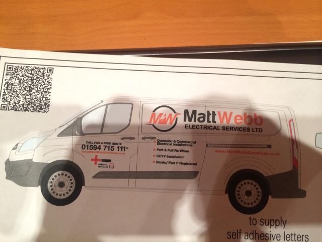
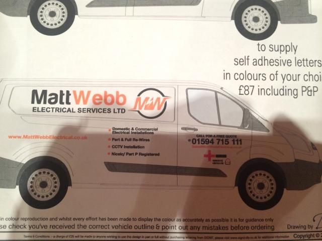
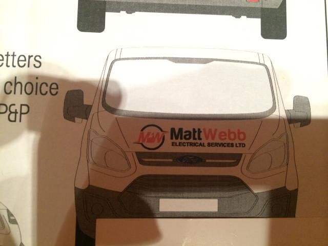
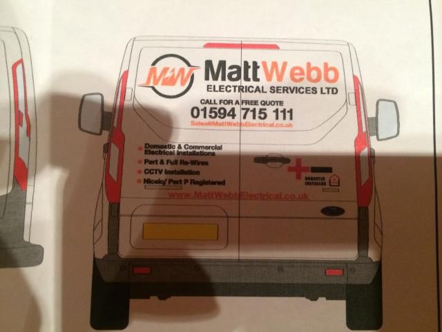
Have got a new van due soon, and want to get the decals/sign writing right to give the right/professional impression.
I am not very good with words etc, so thought I would put my designs so far up, to see any recommendations etc, as I know a few of you guys are very good at this sort of thing.
Your thoughts on the wording and arrangements all much appreciated.
Cheers
I am not very good with words etc, so thought I would put my designs so far up, to see any recommendations etc, as I know a few of you guys are very good at this sort of thing.
Your thoughts on the wording and arrangements all much appreciated.
Cheers

Simpo Two said:
Looks fine to me but the red cross makes it look like you do first aid too.
Maybe the bullet points could be a bit bigger.
Thats the logo of the trade body the OP belongs to so pretty essential Maybe the bullet points could be a bit bigger.

Looks good I think full wraps with full colour photos are the way to go with van liveries now though.
Not entirely keen on the logo - sorry!
Perhaps you could create some sort of waveform shape - M+sinewave+W - so overall the M would be the positive part of the wave and the W negative, ie, M above the zero crossing, sinewave through one cycle, then the W below the zero crossing - but keeping it encapsulated inside the circle.
Maybe something like ye olde Plessey logo?
Bullet points drive me nuts. Everyone knows what a spark does, we don't need reminded. What a potential customer needs to know is why they should go with you as opposed to one of the other hundred on Google.
I'd sack them and have a line in the biggest lettering that fits describing your USP, or how you can solve their problem. Or have a big photo of you. People will remember that and it gives credibility that you'll put your face to your business.
The NICEIC thing too, I know it's an industry standard and not everyone has it but 99.99999999% of customers won't have a clue what it is. Something for the website but imo wasted space on a van. A guy in my BNI mentions it every week and I'm still none the wiser.
Or to put it another way have a look at other sparks vans, if you can change the name/logo only and the rest still makes sense with your competitors names instead then you're not offering anything different to the customer.
Gassing Station | Business | Top of Page | What's New | My Stuff