Editing for crappy monitors
Discussion


Over the holidays, I have been visiting family and friends, and showing them some of my photos on their PC's/Laptops.
It has been a real eye opener - the quality of their screens are horrific. The bottom end of the black scale is usually invisible. The top end highlights all blend into one bright highlight. The colors are often horribly oversaturated, instead of smooth shades of colour they render them as one oversaturated glowing area, or just plain wrong.
Is there a consensus ? Is it better to compress the histogram and desaturate the images for public consumption so they are viewable correctly ?
I feel its almost like mastering music for poor quality speakers.
It's a big problem.. Especially with people judging a photographers work via facebook or their website these days. If their monitor is set up crap, they'll see crap.
Nothing you can do about it really apart from do your best to make it look right for you. Luckily, the general public seem to like over saturated, over contrasty images, so what you've seen may work in your favour anyway.
Nothing you can do about it really apart from do your best to make it look right for you. Luckily, the general public seem to like over saturated, over contrasty images, so what you've seen may work in your favour anyway.
james_tigerwoods said:
I use a 2007 MacBook with Lightroom and Windows 7and it's pretty good, but I don't know how to calibrate the screen properly....
Something like a Spyder screen calibrator isn't too expensive and is very easy to use. Both my Macbook and iMac screens are quite blue without calibration. If you want to be sure what you see on the screen really represents the image then it's worth doing.Above anything else, when publishing to the web, always have the colour space in sRGB as a final 'web ready' image. I found this out after some ProPhoto weirdness using a colour managed program which looked horrific on a website.
As for people's monitors, cant control it, just gotta go with what looks right to the original, everything else will be too blue on an uncalibrated screen so it's kind of relative to what people get used to seeing
As for people's monitors, cant control it, just gotta go with what looks right to the original, everything else will be too blue on an uncalibrated screen so it's kind of relative to what people get used to seeing
I think I have found a reasonable way to compress the Histogram so that lower quality monitors can view it properly.
Change Image mode to LAB Colour, then add a curves layer, then drag the white point down 5% and and black point up 5%
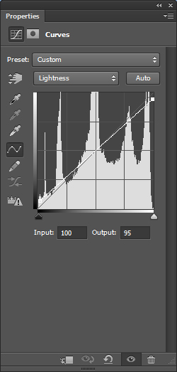
This raises the black point and lowers the white point in a liner fashion across the image without affecting the colours.
Compressing the saturation is little more complicated. In RGB mode
Create two layers
Set the top layer to mode difference, then desaturate it.
Then merge the two layers together, and desaturate the resulting layer.
Then auto level the black and white layer.
This gives you a black and white mask of the most saturated areas of the image. Select all and copy.
You can then create a new hue/saturation adjustment layer, then press alt key to select the mask of this new layer, and paste the black and white saturation mask as its mask. Set the saturation of this layer to -5
This allows you to desaturate only the most saturated parts of the image, leaving the rest of it untouched.
I did a few tests and it appears to greatly improve the view quality of images on poor quality monitors.
Change Image mode to LAB Colour, then add a curves layer, then drag the white point down 5% and and black point up 5%
This raises the black point and lowers the white point in a liner fashion across the image without affecting the colours.
Compressing the saturation is little more complicated. In RGB mode
Create two layers
Set the top layer to mode difference, then desaturate it.
Then merge the two layers together, and desaturate the resulting layer.
Then auto level the black and white layer.
This gives you a black and white mask of the most saturated areas of the image. Select all and copy.
You can then create a new hue/saturation adjustment layer, then press alt key to select the mask of this new layer, and paste the black and white saturation mask as its mask. Set the saturation of this layer to -5
This allows you to desaturate only the most saturated parts of the image, leaving the rest of it untouched.
I did a few tests and it appears to greatly improve the view quality of images on poor quality monitors.
Gassing Station | Photography & Video | Top of Page | What's New | My Stuff