Help and ideas please...
Discussion


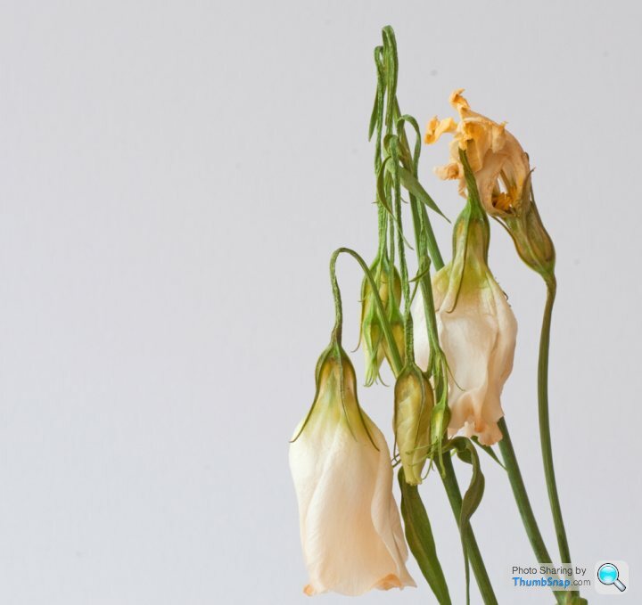
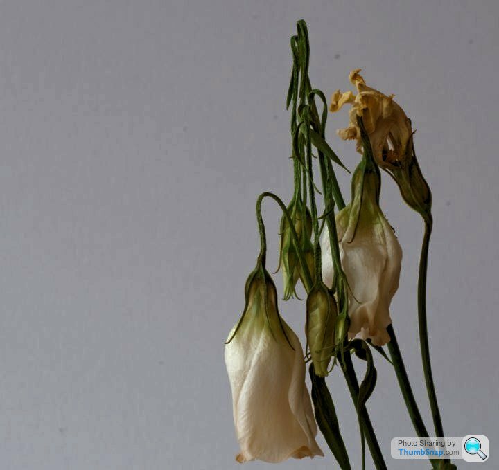
I have kept this image as its one I want to use to show that flowers are not always the beauties we normally think of.
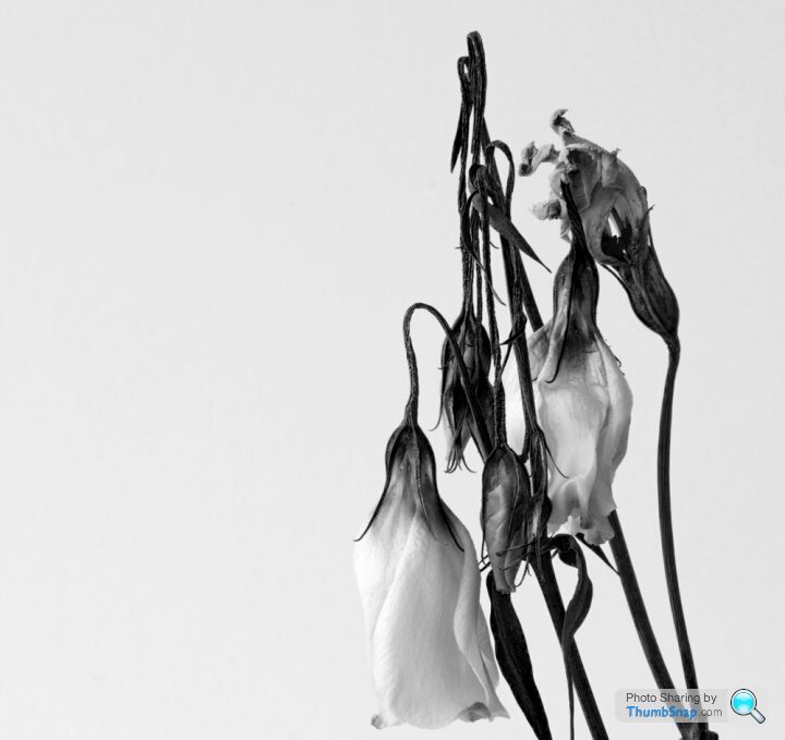
I have tried to pp it in B&W,but that doesnt give the image Im after.
Any ideas please?
I think the image Im trying to portray is one of aging beauty,or maybe dying beauty, Im not entirely sure.
Have a play and let me know your thoughts please chaps.
I have tried to pp it in B&W,but that doesnt give the image Im after.
Any ideas please?
I think the image Im trying to portray is one of aging beauty,or maybe dying beauty, Im not entirely sure.
Have a play and let me know your thoughts please chaps.

MysteryLemon said:
are you using photoshop?
If so, try using the black and white adjustment rather than just desaturate. You get a lot more control over the levels for different colours and can create some nice effects.
Use Elements 8, played around with lots of stuff.If so, try using the black and white adjustment rather than just desaturate. You get a lot more control over the levels for different colours and can create some nice effects.
May be the idea just hasnt got legs.
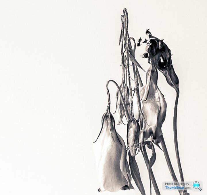
As Simpo says - I would tend to favour white background, not grey. The dust spots have to go. You can impart a slight "aged" feeling with split toning.
But the right think to do will be convert it - whatever programme - by controlling how the different colours reproduce as greyscale. My inclination was to lighten greens and darken red/orange.
Still it depends upon what YOU were trying to visualise - I just did this to show there are different things that can be done in three minutes of play....


Simpo Two said:
Back to the drawing board!
I'd agree, there's probably something you can take from the original shot to learn from and do another. You need more story. Flowers have this thing about them, they dont care for the opinions of other flowers, they just bloom anyway. They're alone and on their own, but we tend not to see them in isolation, so that's why other than a single red rose you tend to get a bunch of flowers. For better impact they'd need to be each on their own, lying down and shot horizontally to camera. Then's the time to look at your post processing (it's going to be black and white/shades of grey)
The issue you've had on the camera is that it's exposed white as grey (because that's what it's told to do, you need to step in and over expose the background or add light to the subject) and it's not composed in a way that could tell a story quicker / more effectively. But the bigger issue is that it's not the right type of shot to tell the story IMO
Gassing Station | Photography & Video | Top of Page | What's New | My Stuff