Feedback welcome!
Discussion


So I have been what I would call a 'Happy Snapper' for a bit taking photos with my phone and normal digital camera.
As some may know I was asking about online courses and if they were worth it, I am going through one at the moment as it was on a Amazon deal so at the price there wasn't much to loose.
So After borrowing what I would call a good camera from parents (Canon eos) I have come up with some shots.
Just though I would share and any feedback is welcome.
Just a phone camera picture that I don't think turned out too bad.
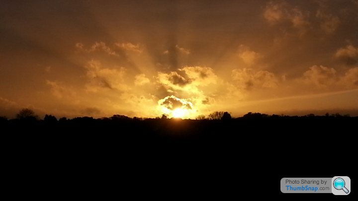

As I say, nothing special at the moment but a vast improvement on what I have taken in the past.
As some may know I was asking about online courses and if they were worth it, I am going through one at the moment as it was on a Amazon deal so at the price there wasn't much to loose.
So After borrowing what I would call a good camera from parents (Canon eos) I have come up with some shots.
Just though I would share and any feedback is welcome.
Just a phone camera picture that I don't think turned out too bad.
As I say, nothing special at the moment but a vast improvement on what I have taken in the past.

Great pic
As above - excellent
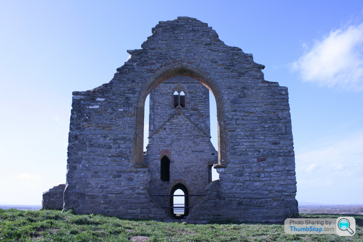
Hmm - not enough going on for me, needed a better sky maybe? Also there's a blueish tinge to the stones I think? Could look to adjust the white balance.
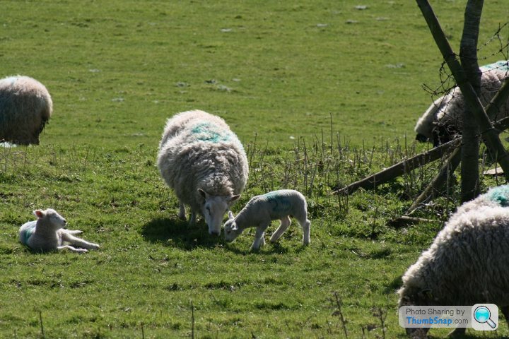
Composition a bit cluttered - could maybe crop in a bit and lose most of the right hand side? The sheep are a wee bit dull I think also.
All in all good work, keep snapping

Shaw Tarse said:

I have to say that's a rather pleasing effect.
The sunset is nice with the rays, but you could lose the bottom 20%. The big chunk of black isn't adding anything and the wider screen look would be more striking.
Cat OK but top of head has sunlight on it.
Church - too blue, looks distorted. Leaning to right?
Sheep - lighting too fierce/contrasty, composition messy.
HTH!
Cat OK but top of head has sunlight on it.
Church - too blue, looks distorted. Leaning to right?
Sheep - lighting too fierce/contrasty, composition messy.
HTH!
Have a look at this recent thread, all the advice is relevant here too.
With the shots you posted, I notice that the "point of interest" is always in the middle. It doesn't have to be, and (in my personal opinion) is better not to be, unless it's really essential for the composition. Remember too that if something in the image doesn't add to the composition, you might consider not including it (the barbed wire and broken fence in the sheep image, and the half-sheep on the left). To me, the interest is the ewe and lamb in the middle and the lamb lying to the left. Try cropping-out everything except those and then clone out the half-sheep. "Compare and contrast" the two images. You'll see that the three subjects are all looking at the same point in the image and that this will be on a "third". That generally, is more pleasing to the eye.
With the shots you posted, I notice that the "point of interest" is always in the middle. It doesn't have to be, and (in my personal opinion) is better not to be, unless it's really essential for the composition. Remember too that if something in the image doesn't add to the composition, you might consider not including it (the barbed wire and broken fence in the sheep image, and the half-sheep on the left). To me, the interest is the ewe and lamb in the middle and the lamb lying to the left. Try cropping-out everything except those and then clone out the half-sheep. "Compare and contrast" the two images. You'll see that the three subjects are all looking at the same point in the image and that this will be on a "third". That generally, is more pleasing to the eye.
Gassing Station | Photography & Video | Top of Page | What's New | My Stuff