991 Racing Yellow - The Money Shots
Discussion


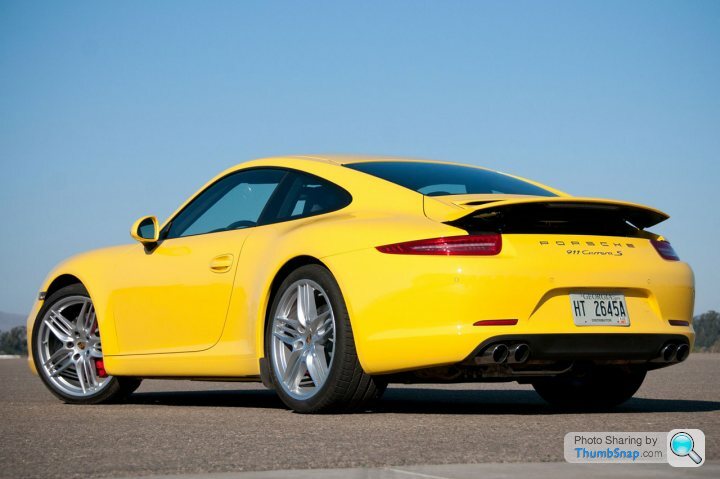

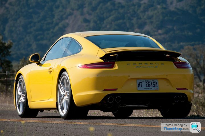


Wheel design most certainly isn't my choice and I'm not a fan of the rear badging at all, however I think it's truly stunning piece of design. That said, the front lower end does look strange, like you've driven over a centralised speed bump a tad too fast and ended up with a speed-bump shaped gap in your splinter (speaking from experience...)
You lot are boring b ds
ds 
It looks great! A nice refresh and welcome improvement over the tired looking 997 imho. I still can't think of a better / more purposeful looking premium sports car for less than 100k! I can't believe some people are knocking it for a few (easy to remove) badges on it's arse, and rims that have yet to be seen in the flesh (which there are a choice of 4 ffs)
ds It looks great! A nice refresh and welcome improvement over the tired looking 997 imho. I still can't think of a better / more purposeful looking premium sports car for less than 100k! I can't believe some people are knocking it for a few (easy to remove) badges on it's arse, and rims that have yet to be seen in the flesh (which there are a choice of 4 ffs)

I'm sad to say this but it looks seriously ugly. The yellow paintwork just distracts you from the basic design. maybe it is meant to. The earlier images looked better, not sure why, maybe they were photoshop assisted.
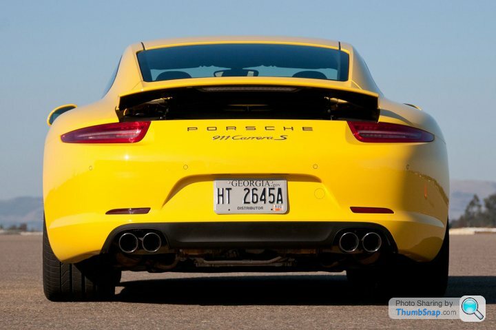
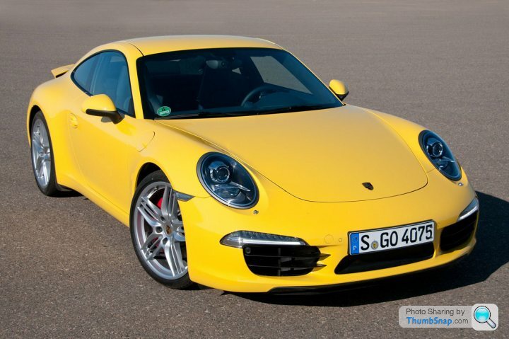
It looks as if someone has thrown a blanket over a go-kart. In that respect it has something in common with the 956 I suppose. None of the design details work, from the silly little eyebrows over the front airscoops to the spoiler at the back and the over fussy rear badges, which remind me of nothing so much as the VW Variant circa 1969. The driver looks embarrassed. It is the most cowardly piece of styling dressed up with gimmicks that I think that I have ever seen.
What this does illustrate is that the company may produce fine engineering, but Porsche Design is an Emperor with no clothes. The company was saved by the brilliant Harm Lagaay and his Boxster and 996 concept. Then, encouraged by feedback from 'enthusiasts' (you know who you are, and you only have yourselves to blame) they compromised the 996 design with retro features and gave us the 997, which was fine but a step backwards. Any wonk in accounts could have done that and probably did. The Cayenne and Panamera are badge and electronic engineering, but seem to have worked commercially. Now the accountants are doing the designing, boys, because they think that anything with the Zuffenhausen badge on the nose is going to sell like hot cakes.
Well done, Porsche. Now there isn't a single product I really want to buy, because however good they are dynamically, I want something that looks the part. If Ian Callum hadn't fouled up with the XJ, Jaguar would have wiped the floor with them. Anyone who bought a 997 GTS, well done!
 You made the right call.
Its hard to put my finger on the 'wrongness' but studying again;
- Rear lights too high up leaving too much 'panel'.
- Rear lights too narrow
- Front axle too far forward causing too little space between arch and headlamp. From side on it ruins the proportions making it look big at the back and small at the front.
- Front sidelights extend too far (Trying to make front look bigger?)
- Headlamps not quite right - Too elongated?
- Wheels ridiculously big which means arch circumference is far too large.
Rear 3/4 seems to be the best angle.
MTR
Edited by mollytherocker on Saturday 12th November 11:32
Talk about focussing on the negatives! It's a difficult task to keep reinventing the same basic shape decade after decade, and while it's not perfect it's pretty fine effort. It's a great looking car IMO, with the performance to match by most reports. I don't think the wheels look too big at all - definitely not for those arches anyway.
I'm not seeing a lot wrong in this picture (other than the spoiler being up when it's stationery). I'll have one!

I'm not seeing a lot wrong in this picture (other than the spoiler being up when it's stationery). I'll have one!
freedman said:
No doing it for me, at least so far, the badging is truly horrifc
Though I have little doubt the car will look better in the flesh, and grow with time
A minor point, by why on earth have they moved back to door mounted mirrors?
.....the word "horrific" might be not be strong enough.....WTF are they thinking?.....Though I have little doubt the car will look better in the flesh, and grow with time
A minor point, by why on earth have they moved back to door mounted mirrors?
Gassing Station | Porsche General | Top of Page | What's New | My Stuff