Random Photos : Part 4
Discussion


DibblyDobbler said:
Thanks for the comments LQ - I'm not sure to be honest... a lot of pretty average looking tourist snaps is what I am seeing. I think a lot of the scenes maybe don't translate well to the camera... or else I don't know how to do it!
Personally I think the problem is that they lack emotional content. You were there enjoying the sights, sounds and atmosphere but the pictures don't really convey that, IMO. You should of course do the postcard stuff but as well as that maybe get in closer for some pictures and look for scenes, angles and people that illustrate the feeling of being there. easier said than done, as I am well aware
DibblyDobbler said:
LongQ said:
Looks almost like a fresco on the bridge rather than structures.
Do you find you end up with many images that mean something to you and that you quite enjoy both as images and technically but that you don't think would appeal to many others? Or maybe images that probably would appeal to many others but don't appeal so much to you - possibly because they have been "done before" or something along those lines looks very familiar?
Or is it maybe that the results look OK but not as special as you expected based on what you saw "in the light that was present at the time?".
On a number of occasions when I have produced a set of images for someone and offered them a select from which to choose they almost invariably pick more of the boring, just about adequate "filler" images than the shots that are more dynamic, or vibrant or technically interesting or possessed some other criteria that just makes them look "better" images to me.
Maybe it's the "tourist" light? You can't always have around until you get the light that you know must be there somewhere?
Can post-processing lift things? (The curse of expectations in the digital age - or is it the joy of expectations in the digital age?)
Thanks for the comments LQ - I'm not sure to be honest... a lot of pretty average looking tourist snaps is what I am seeing. I think a lot of the scenes maybe don't translate well to the camera... or else I don't know how to do it! Do you find you end up with many images that mean something to you and that you quite enjoy both as images and technically but that you don't think would appeal to many others? Or maybe images that probably would appeal to many others but don't appeal so much to you - possibly because they have been "done before" or something along those lines looks very familiar?
Or is it maybe that the results look OK but not as special as you expected based on what you saw "in the light that was present at the time?".
On a number of occasions when I have produced a set of images for someone and offered them a select from which to choose they almost invariably pick more of the boring, just about adequate "filler" images than the shots that are more dynamic, or vibrant or technically interesting or possessed some other criteria that just makes them look "better" images to me.
Maybe it's the "tourist" light? You can't always have around until you get the light that you know must be there somewhere?
Can post-processing lift things? (The curse of expectations in the digital age - or is it the joy of expectations in the digital age?)
And yes the WB was a bit off I thought on a few of them but I have attempted to fix it myself...
The lovely colours of the structures will probably mislead the in camera WB effort in some odd ways. Our eyes (or rather our brains) would offer multiple versions of white balance at the time depending on what caught our attention. (Although one also gets other responses from ambient colour tints especially with that sort of subject matter at specific times of the day if sunny.)
For example the sky is relatively strong on red and weak in blue. i.e. the red spectrum is more exposed than the blue.
This is also visible in the few white (or presumed "intended to be white when the walls were painted" spots of the image) when I set up some spot colour readouts.
So using the white areas to set the WB gives what I think are better blues for the sky and reflections in the river. It also changes the other values - but mostly they look good and balance well. Some yellowish walls might be a little too yellow for the artistic result one might aspire to with the reddish walls but that can be adjusted easily. Or one could simply apply the WB correction just to the sky and related areas.
After one has that balance the image can then be more readily toned in shadows, midtones and highlights to taste. (Selectively if necessary.)
It's quite easy to make the bridge scene "pop" of course - but then that might not be how you want to portray it. But whatever you wish to do the chances are that the subtle but noticeable WB tweaks would be a good catalyst to a result that would satisfy you more.
That said Singlecoil makes good points.
Have you got enough resolution in the source file(s) to apply some deep crops? There seem to be some interesting possibilities if you have.
singlecoil said:
Personally I think the problem is that they lack emotional content. You were there enjoying the sights, sounds and atmosphere but the pictures don't really convey that, IMO. You should of course do the postcard stuff but as well as that maybe get in closer for some pictures and look for scenes, angles and people that illustrate the feeling of being there.
Thanks for the feedback. The shots above are actually the best of the bunch so if you don't like these I hate to think what you'd make of the others! Your comments are accurate though - I do tend to go for the postcard type shot and getting in closer would have helped I think easier said than done, as I am well aware

LongQ said:
Well now - can these "tourist snaps" be given a little extra life I wonder?
The lovely colours of the structures will probably mislead the in camera WB effort in some odd ways. Our eyes (or rather our brains) would offer multiple versions of white balance at the time depending on what caught our attention. (Although one also gets other responses from ambient colour tints especially with that sort of subject matter at specific times of the day if sunny.)
For example the sky is relatively strong on red and weak in blue. i.e. the red spectrum is more exposed than the blue.
This is also visible in the few white (or presumed "intended to be white when the walls were painted" spots of the image) when I set up some spot colour readouts.
So using the white areas to set the WB gives what I think are better blues for the sky and reflections in the river. It also changes the other values - but mostly they look good and balance well. Some yellowish walls might be a little too yellow for the artistic result one might aspire to with the reddish walls but that can be adjusted easily. Or one could simply apply the WB correction just to the sky and related areas.
After one has that balance the image can then be more readily toned in shadows, midtones and highlights to taste. (Selectively if necessary.)
It's quite easy to make the bridge scene "pop" of course - but then that might not be how you want to portray it. But whatever you wish to do the chances are that the subtle but noticeable WB tweaks would be a good catalyst to a result that would satisfy you more.
That said Singlecoil makes good points.
Have you got enough resolution in the source file(s) to apply some deep crops? There seem to be some interesting possibilities if you have.
Hmm - it was me that made it red The lovely colours of the structures will probably mislead the in camera WB effort in some odd ways. Our eyes (or rather our brains) would offer multiple versions of white balance at the time depending on what caught our attention. (Although one also gets other responses from ambient colour tints especially with that sort of subject matter at specific times of the day if sunny.)
For example the sky is relatively strong on red and weak in blue. i.e. the red spectrum is more exposed than the blue.
This is also visible in the few white (or presumed "intended to be white when the walls were painted" spots of the image) when I set up some spot colour readouts.
So using the white areas to set the WB gives what I think are better blues for the sky and reflections in the river. It also changes the other values - but mostly they look good and balance well. Some yellowish walls might be a little too yellow for the artistic result one might aspire to with the reddish walls but that can be adjusted easily. Or one could simply apply the WB correction just to the sky and related areas.
After one has that balance the image can then be more readily toned in shadows, midtones and highlights to taste. (Selectively if necessary.)
It's quite easy to make the bridge scene "pop" of course - but then that might not be how you want to portray it. But whatever you wish to do the chances are that the subtle but noticeable WB tweaks would be a good catalyst to a result that would satisfy you more.
That said Singlecoil makes good points.
Have you got enough resolution in the source file(s) to apply some deep crops? There seem to be some interesting possibilities if you have.
 It just didn't look right to me before so I fiddled with it and this seemed to me to give the best result - who knows. Anway - I'm going to have a look at the rest and will bear your comments in mind - thanks.
DibblyDobbler said:
LongQ said:
Well now - can these "tourist snaps" be given a little extra life I wonder?
The lovely colours of the structures will probably mislead the in camera WB effort in some odd ways. Our eyes (or rather our brains) would offer multiple versions of white balance at the time depending on what caught our attention. (Although one also gets other responses from ambient colour tints especially with that sort of subject matter at specific times of the day if sunny.)
For example the sky is relatively strong on red and weak in blue. i.e. the red spectrum is more exposed than the blue.
This is also visible in the few white (or presumed "intended to be white when the walls were painted" spots of the image) when I set up some spot colour readouts.
So using the white areas to set the WB gives what I think are better blues for the sky and reflections in the river. It also changes the other values - but mostly they look good and balance well. Some yellowish walls might be a little too yellow for the artistic result one might aspire to with the reddish walls but that can be adjusted easily. Or one could simply apply the WB correction just to the sky and related areas.
After one has that balance the image can then be more readily toned in shadows, midtones and highlights to taste. (Selectively if necessary.)
It's quite easy to make the bridge scene "pop" of course - but then that might not be how you want to portray it. But whatever you wish to do the chances are that the subtle but noticeable WB tweaks would be a good catalyst to a result that would satisfy you more.
That said Singlecoil makes good points.
Have you got enough resolution in the source file(s) to apply some deep crops? There seem to be some interesting possibilities if you have.
Hmm - it was me that made it red The lovely colours of the structures will probably mislead the in camera WB effort in some odd ways. Our eyes (or rather our brains) would offer multiple versions of white balance at the time depending on what caught our attention. (Although one also gets other responses from ambient colour tints especially with that sort of subject matter at specific times of the day if sunny.)
For example the sky is relatively strong on red and weak in blue. i.e. the red spectrum is more exposed than the blue.
This is also visible in the few white (or presumed "intended to be white when the walls were painted" spots of the image) when I set up some spot colour readouts.
So using the white areas to set the WB gives what I think are better blues for the sky and reflections in the river. It also changes the other values - but mostly they look good and balance well. Some yellowish walls might be a little too yellow for the artistic result one might aspire to with the reddish walls but that can be adjusted easily. Or one could simply apply the WB correction just to the sky and related areas.
After one has that balance the image can then be more readily toned in shadows, midtones and highlights to taste. (Selectively if necessary.)
It's quite easy to make the bridge scene "pop" of course - but then that might not be how you want to portray it. But whatever you wish to do the chances are that the subtle but noticeable WB tweaks would be a good catalyst to a result that would satisfy you more.
That said Singlecoil makes good points.
Have you got enough resolution in the source file(s) to apply some deep crops? There seem to be some interesting possibilities if you have.
It just didn't look right to me before so I fiddled with it and this seemed to me to give the best result - who knows. Anway - I'm going to have a look at the rest and will bear your comments in mind - thanks.Long time ago I bought some "Professional" Kodak film to take some holiday snaps on Malta. It was the sort of film that one was supposed to keep in the fridge.
Compared to the pleb's film pushed at the time is produced really nice colours. Especially great skies.
However looking at the results with hindsight one realised that after processing the effect and the lovely skies were on relative "beauty" not absolute. The primary ambient colour, as per the stonework in Tuscany, was a sort of sandstone colour and the sky ended up probably accurate but not quite are remembered and certainly not as it would have looked in reality in the middle of the day. Artistic interpretation of the time of day would have been OK.
The thing is that the better starting point is probably a reasonably realistc WB - after that one can do what one wants with the end result.
I have no criticism of the reddish architecture which I think suits the subject well - just the blue sky seems overly compromised. And I think that is where some of your disappointment might stem from.
LongQ said:
No problem with the tint DD - for the buildings I think it works. Just not for the sky, perhaps?
Long time ago I bought some "Professional" Kodak film to take some holiday snaps on Malta. It was the sort of film that one was supposed to keep in the fridge.
Compared to the pleb's film pushed at the time is produced really nice colours. Especially great skies.
However looking at the results with hindsight one realised that after processing the effect and the lovely skies were on relative "beauty" not absolute. The primary ambient colour, as per the stonework in Tuscany, was a sort of sandstone colour and the sky ended up probably accurate but not quite are remembered and certainly not as it would have looked in reality in the middle of the day. Artistic interpretation of the time of day would have been OK.
The thing is that the better starting point is probably a reasonably realistc WB - after that one can do what one wants with the end result.
I have no criticism of the reddish architecture which I think suits the subject well - just the blue sky seems overly compromised. And I think that is where some of your disappointment might stem from.
Understood - once again, appreciate the comments Long time ago I bought some "Professional" Kodak film to take some holiday snaps on Malta. It was the sort of film that one was supposed to keep in the fridge.
Compared to the pleb's film pushed at the time is produced really nice colours. Especially great skies.
However looking at the results with hindsight one realised that after processing the effect and the lovely skies were on relative "beauty" not absolute. The primary ambient colour, as per the stonework in Tuscany, was a sort of sandstone colour and the sky ended up probably accurate but not quite are remembered and certainly not as it would have looked in reality in the middle of the day. Artistic interpretation of the time of day would have been OK.
The thing is that the better starting point is probably a reasonably realistc WB - after that one can do what one wants with the end result.
I have no criticism of the reddish architecture which I think suits the subject well - just the blue sky seems overly compromised. And I think that is where some of your disappointment might stem from.
noell35 said:
I initially misread the caption as 'wastewater' and thought something along the lines of "they wouldn't get away with discharging wastewater to a lake like that here, well I hope they're at least treating it properly first". 
Nice photo anyway
GravelBen said:
noell35 said:
I initially misread the caption as 'wastewater' and thought something along the lines of "they wouldn't get away with discharging wastewater to a lake like that here, well I hope they're at least treating it properly first". Nice photo anyway

A few more from Tuscany
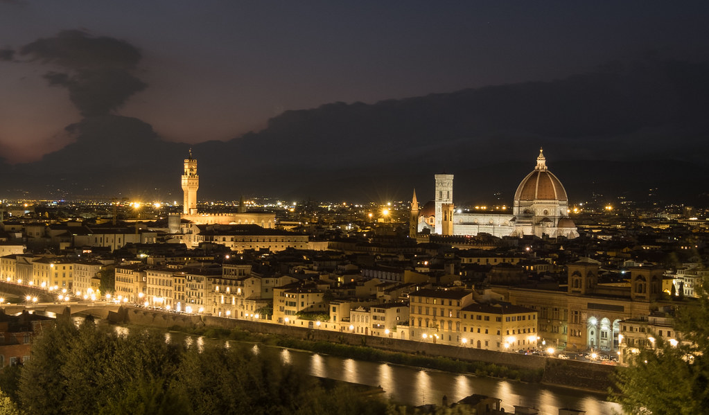
Florence By Night by Mike Smith, on Flickr
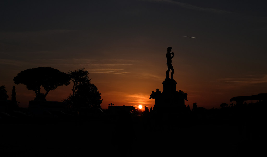
Piazzale Michelangelo by Mike Smith, on Flickr
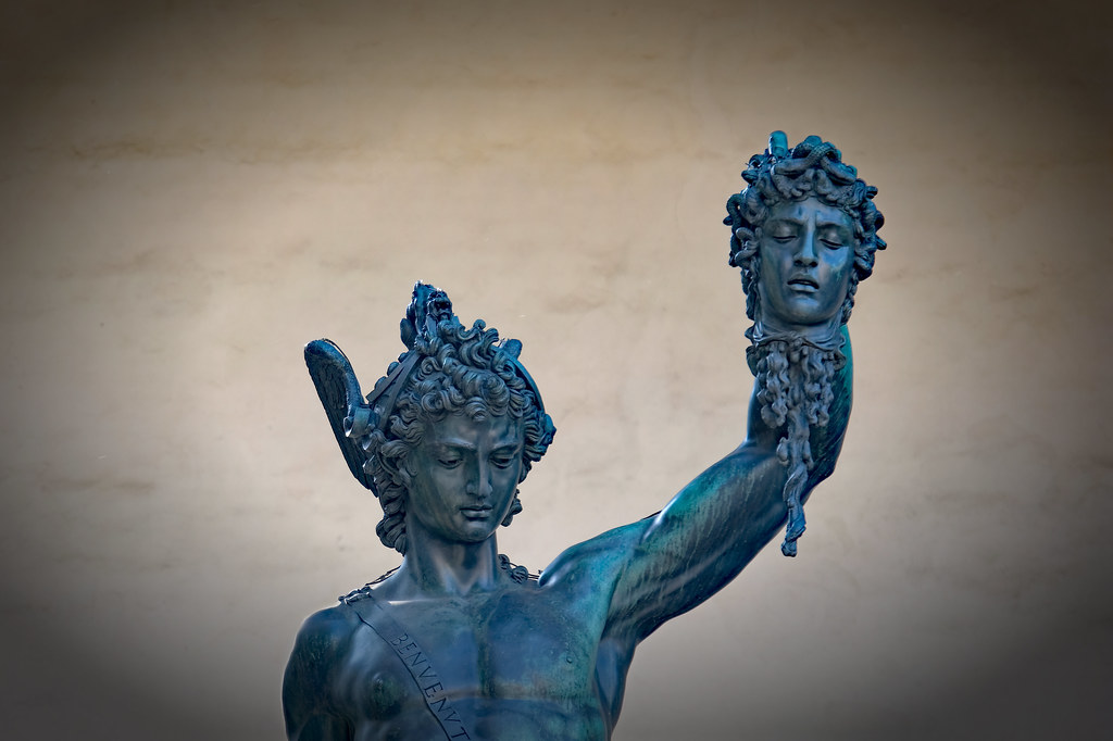
Perseus and Medusa by Mike Smith, on Flickr
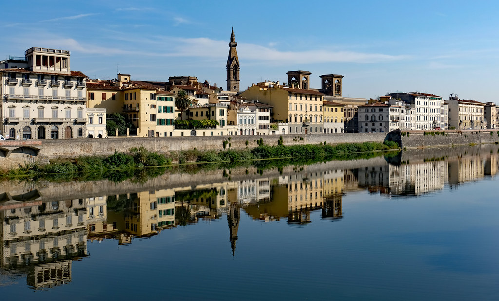
Florence Reflections by Mike Smith, on Flickr
Symmetry by Mike Smith, on Flickr
Florence Mono by Mike Smith, on Flickr
Florence By Night by Mike Smith, on Flickr
Piazzale Michelangelo by Mike Smith, on Flickr
Perseus and Medusa by Mike Smith, on Flickr
Florence Reflections by Mike Smith, on Flickr
Symmetry by Mike Smith, on Flickr
Florence Mono by Mike Smith, on Flickr
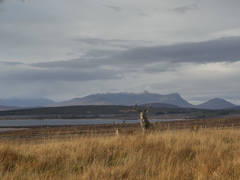
The only moose I saw in Canada was standing by the road in the rain and was gone by the time I stopped, but some Caribou were more cooperative.
 Caribou (3) by Ben, on Flickr
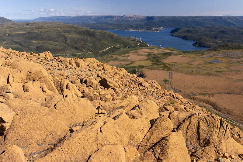 Tablelands by Ben, on Flickr
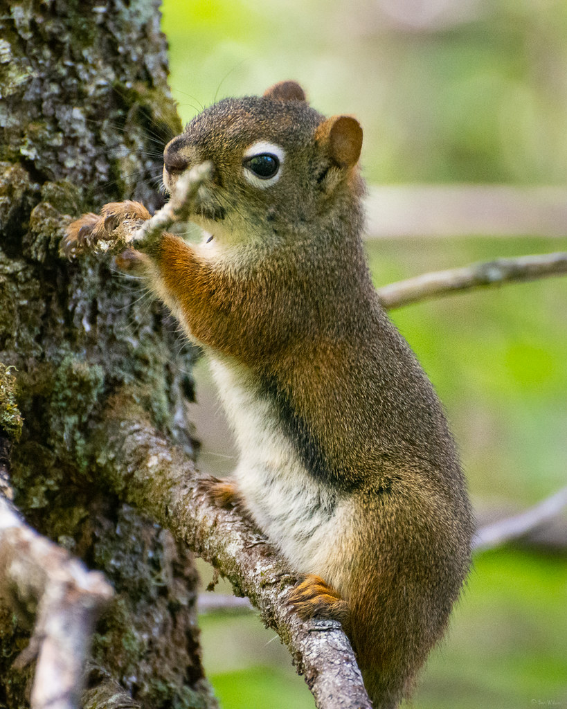
 Squirrel munching by Ben, on Flickr
Caribou (3) by Ben, on FlickrTablelands by Ben, on FlickrSquirrel munching by Ben, on FlickrEdited by GravelBen on Wednesday 31st October 06:20
RobDickinson said:
Every time with out fail ! I'm beginning to dislike you Rob

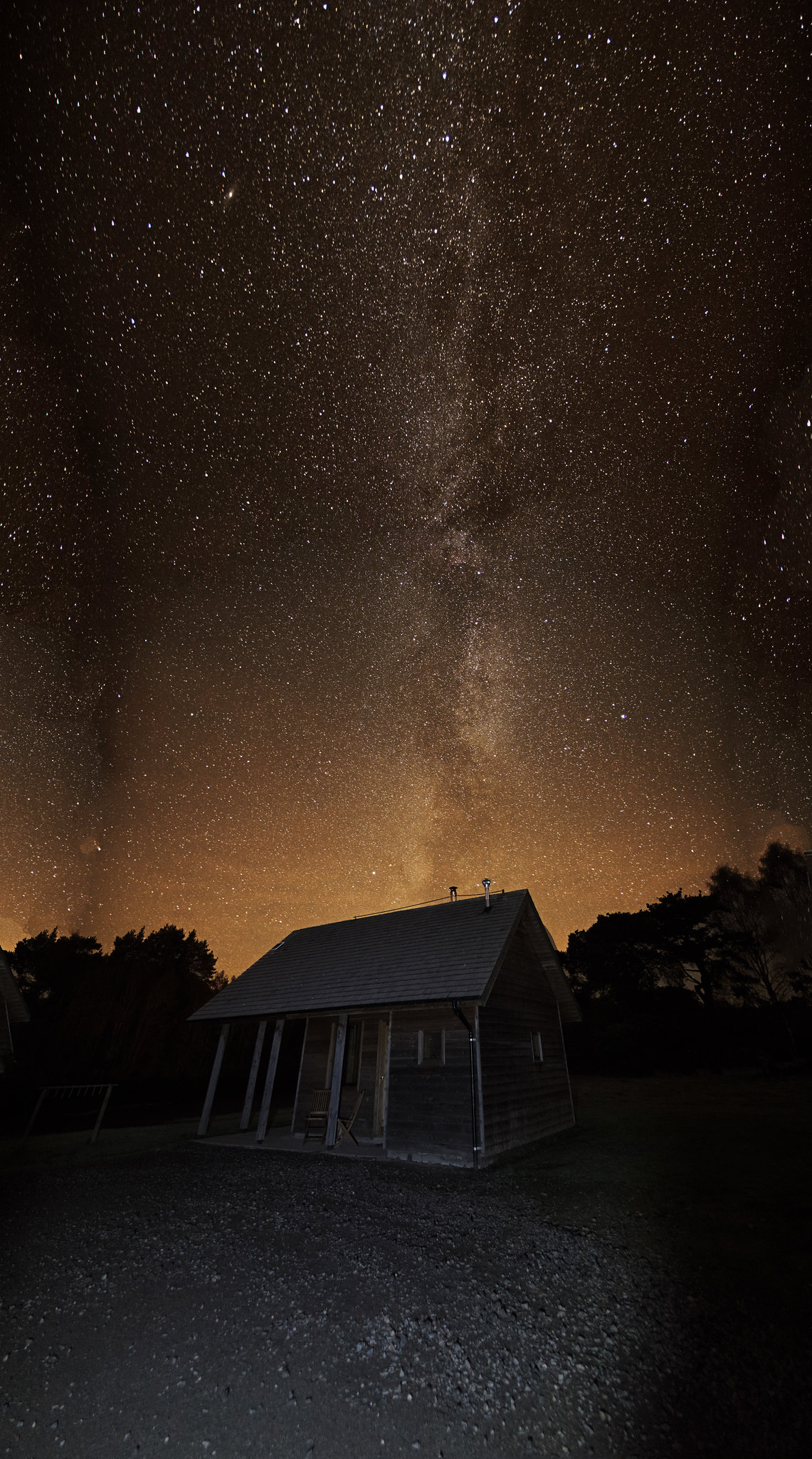
First attempt at taking a picture of the Milky Way last night, there was still quite a bit of light pollution around but quite chuffed how it came out. Miles off the standard posted in here but not bad for a first go.
The MW was directly above my head so only managed to get the tail of it
 Milky Way K'ON3 by justinking1986, on Flickr
The MW was directly above my head so only managed to get the tail of it
Milky Way K'ON3 by justinking1986, on FlickrGassing Station | Photography & Video | Top of Page | What's New | My Stuff