Only the Brave - Honest Photography Feedback
Discussion


Thanks chaps, it's actually very useful to be able to get other people to have a look at one's pictures, especially pictures that are intended for prints. Much better to get shortcomings and strange stuff dealt with before it goes off. I will lighten those leaves and I will also lighten the area under the shelf. It was actually that dark in the original picture but that darkness does make it difficult to see that it's a shelf. I already knew it was a shelf, or course, which made it difficult for me to see it how others would.
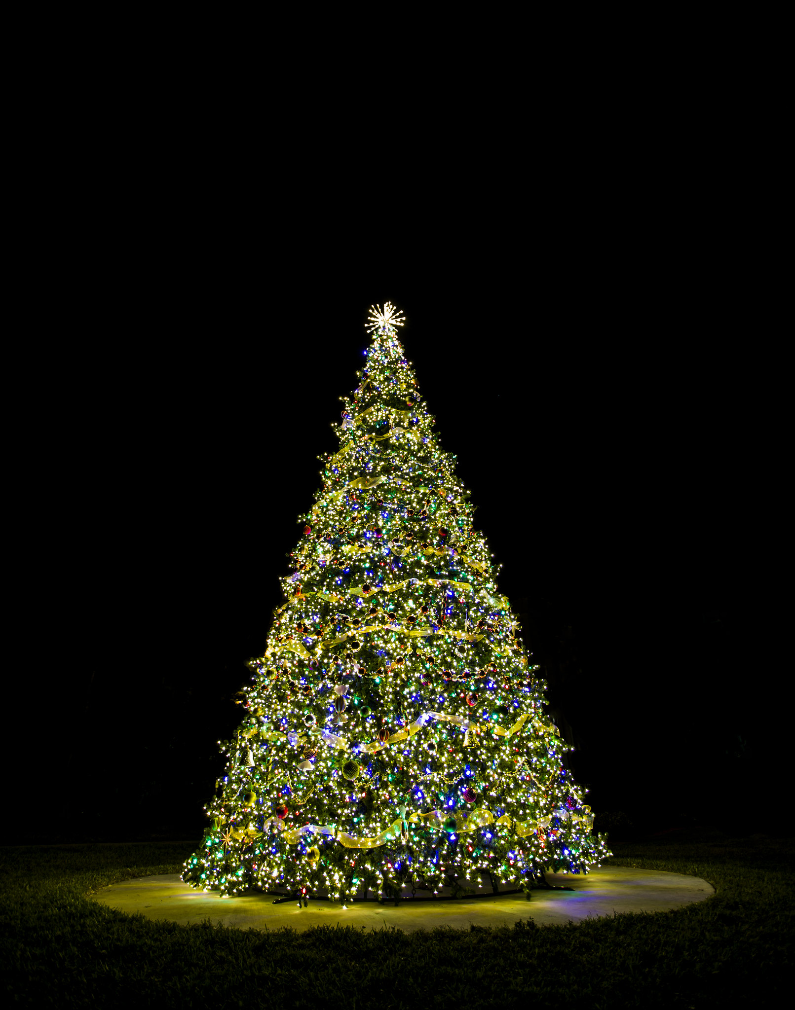
The Christmas tree appears to be leaning to the left a bit. I would have been inclined to tidy up around the base, lose the tree supports etc, and maybe darken the ring down a bit. Good picture though.
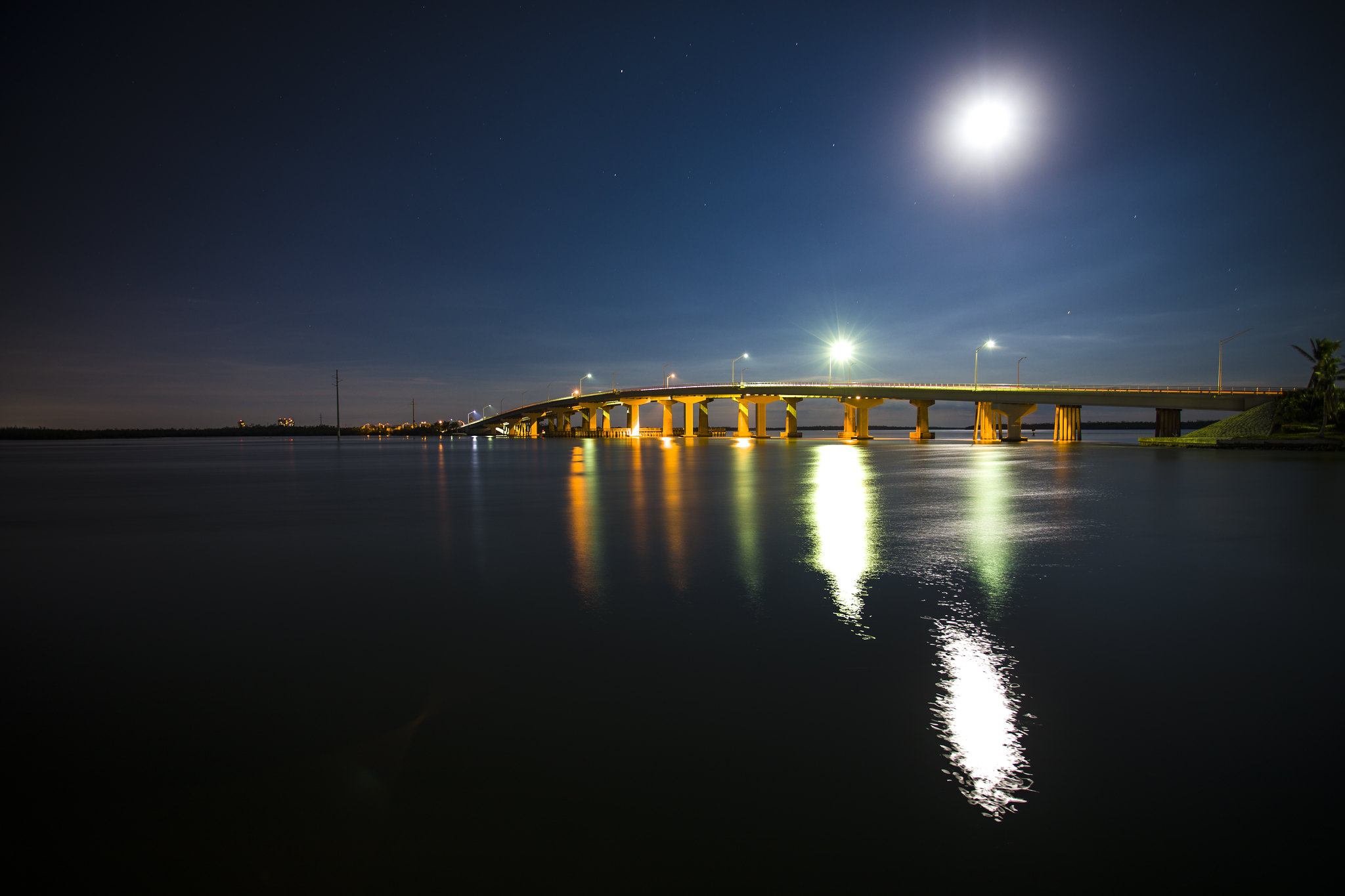
The bridge looks to me like it would benefit from a big crop, removing the tree on the right and a lot of the negative space in the bottom left hand corner. Maybe lose the reflection of the moon altogether. All the foregoing in my opinion, of course. Good picture too. I'd have been inclined to say where it was taken.
The bridge looks to me like it would benefit from a big crop, removing the tree on the right and a lot of the negative space in the bottom left hand corner. Maybe lose the reflection of the moon altogether. All the foregoing in my opinion, of course. Good picture too. I'd have been inclined to say where it was taken.
Spent a very pleasant day on Saturday in the NHM and V&A with my lady friend on Saturday.
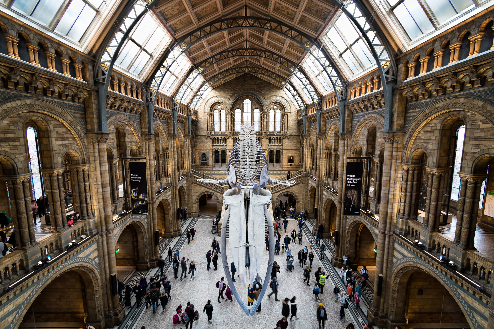
I took this photo which I'm generally very happy with but I'm annoyed by the roof skylights being blown out. I was hand-held (which I think I did well at 1/8th handheld, on purpose to show the movement of the crowds - very good VR on that lens!) so I had limited opportunities for bracketing etc.
What could I have done better?
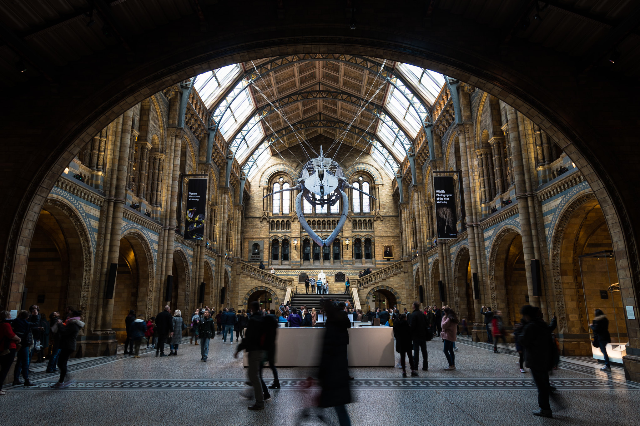 Natural History Museum - Hintze Hall by Scott Thomson, on Flickr
I took this photo which I'm generally very happy with but I'm annoyed by the roof skylights being blown out. I was hand-held (which I think I did well at 1/8th handheld, on purpose to show the movement of the crowds - very good VR on that lens!) so I had limited opportunities for bracketing etc.
What could I have done better?
Natural History Museum - Hintze Hall by Scott Thomson, on FlickrGroundEffect said:
What could I have done better?
Gone a year ago when Bronte the Brontosaurus was still there?But seriously, I'm not sure being under the dark arch would have helped much, though it does make a frame. I spent ages trying to take decent pics in the NHM hall and they almost all sucked. It's one of those places that's so amazing you think it'd be impossible to take a bad photo but I managed it almost every time

Nik da Greek said:
GroundEffect said:
What could I have done better?
Gone a year ago when Bronte the Brontosaurus was still there?But seriously, I'm not sure being under the dark arch would have helped much, though it does make a frame. I spent ages trying to take decent pics in the NHM hall and they almost all sucked. It's one of those places that's so amazing you think it'd be impossible to take a bad photo but I managed it almost every time

I also took one without a frame, but I like the way the frame also leads you in to the hall.
A different view:
 A Whale of a Time by Scott Thomson, on Flickr
 ks, of course she was
I think the second photo is so much better. I don’t mind the distorted verticals, it adds to the sense of drama but I would be tempted to rotate it slightly as it’s off to the left at the moment. It’s a shame the people underneath are directly under the jaw bone but they could be edited out.
I like the idea of the frame on the first photo but find it too domineering not helped as the overall scene lacks a focal point. I'm not sure what I should be looking at, the whale is too lost and the blurred people in the centre at the front are quite distracting
I like the idea of the frame on the first photo but find it too domineering not helped as the overall scene lacks a focal point. I'm not sure what I should be looking at, the whale is too lost and the blurred people in the centre at the front are quite distracting
This thread disappoints me.
Photography should not rely on feedback to what is good.
It is like saying Beethoven's 9th symphony is only good if you hear it live, or through a high end audio system. No, that is good when played on a bontempi organ.
Photography is purely a snapshot in time.
The image should not be judged on it's quality but how it drags you there.
I do realise I am an outlier on this. Same with my cooking on the FDR. It's all in the taste and the journey.
Not sure I want to get in to this *argument but for Beethoven's 9th symphony to be the best it can be then it should be played by a symphony orchestra, not a bontempi organ.
The analogy fails a little anyway as it would be the writing of the symphony. How do you know that Beethoven didn't seek advice from fellow musicians when writing it?
ETA *should say 'discussion'
The analogy fails a little anyway as it would be the writing of the symphony. How do you know that Beethoven didn't seek advice from fellow musicians when writing it?
ETA *should say 'discussion'
Gandahar said:
This thread disappoints me.
Photography should not rely on feedback to what is good...
Having a second (third, fourth etc) pair of eyes looking at your stuff can be invaluable. When taking a picture the photographer may well not notice certain aspects that could be improved on.Photography should not rely on feedback to what is good...
And in any case, there's really no such thing as 'good' in this context unless it's been judged good by a sufficient number of other people. A photo may well satisfy its taker but that doesn't in itself make it good.
Gandahar said:
This thread disappoints me.
Photography should not rely on feedback to what is good.
I thought the point was to get some considered advice on what would improve your shots? Ideally from the few people around here who know what they're doing.Photography should not rely on feedback to what is good.
If your picture only needs to be hung on a wall to be done, this isn't the thread.
First real venture into editing (used Lightroom on this one) so wanted some feedback on how it look and if there is anything I should work on?
Thing I find the hardest is trying to figure out how I want the photo to look and what I need to do to make it like that but I guess that comes with practice & tutorials
Original:
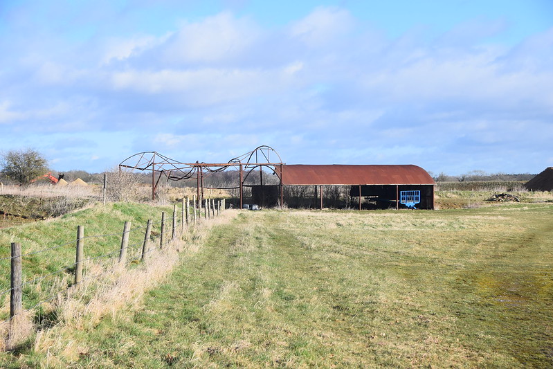 DSC_0384 by ShortFalls, on Flickr
Edited:
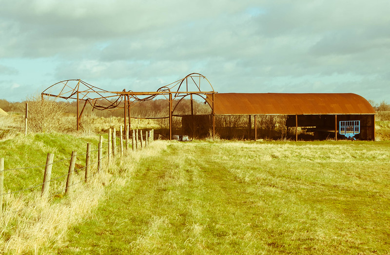 Decay by ShortFalls, on Flickr
Thing I find the hardest is trying to figure out how I want the photo to look and what I need to do to make it like that but I guess that comes with practice & tutorials
Original:
DSC_0384 by ShortFalls, on FlickrEdited:
Decay by ShortFalls, on Flickrbobski1 said:
First real venture into editing (used Lightroom on this one) so wanted some feedback on how it look and if there is anything I should work on?
Thing I find the hardest is trying to figure out how I want the photo to look and what I need to do to make it like that but I guess that comes with practice & tutorials
Original:
DSC_0384 by ShortFalls, on Flickr
Edited:
Decay by ShortFalls, on Flickr
I prefer the first one! - no need to over edit! or edit for the sake of it... Thing I find the hardest is trying to figure out how I want the photo to look and what I need to do to make it like that but I guess that comes with practice & tutorials
Original:
DSC_0384 by ShortFalls, on FlickrEdited:
Decay by ShortFalls, on FlickrGassing Station | Photography & Video | Top of Page | What's New | My Stuff