New F1 logo.....
Discussion


mcholeboy_59 said:
Yano what they say... if it ain't broke... etc etc
Haha try telling most companies, councils, governments this.But agree with your statement. And seems madness to change something thats nothing is wrong with it. Spend millions needing to design, change merchandise etc...
2 sMoKiN bArReLs said:
RosscoPCole said:
2 sMoKiN bArReLs said:
Too clever!
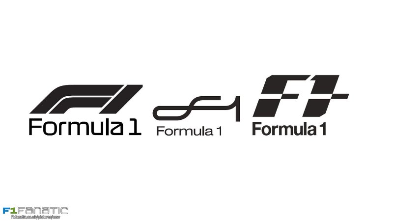
Along with millions of others I'd never noticed the 1 was the white bit in the middle. (....and now I can't stop seeing it )
)
Have you spotted the arrow in the Fed Ex logo or the bear in the Toblerone logo?Along with millions of others I'd never noticed the 1 was the white bit in the middle. (....and now I can't stop seeing it
)The Amazon A to Z arrow is a good one.
RosscoPCole said:
Have you spotted the arrow in the Fed Ex logo or the bear in the Toblerone logo?
It surprises me how few people see the FedEx arrow. I don't know who designed it but they must have been well self satisfied when they came up with it, and how irritated they must have been to have to explain it.More 'clever' ones here: http://www.toxel.com/design/2010/06/09/24-cool-log...
The ED one only works on the continent, so did they know we'd be leaving? The Amazon logo is poor; A to Z is nowhere else in their advertising so the logo is obscure to say the least.
I quite like the F1 logo. It is not too subtle nor contrived so why change? Probably Liberty want a clean break from the past. The new one has a lot to live up to. Or, to put it another way, will not be as good. It will be too clever, too obscure, too plain; too something anyway.
Gassing Station | Formula 1 | Top of Page | What's New | My Stuff