Climate Change - The Scientific Debate (Vol. II)
Discussion


well well, I can't believe this thread is still running with the same protagonists, anyway, I've been arguing/winding up a chap on fb about this and he came back with
"this is not "" natural". Look at the World Map the last time Greenland was green! New York, London, Cambridge won't exist, let alone Bangladesh. How you resist the evidence is simply mind-boggling to me. You seem to have no concept of the impact these changes in climate had on the World and the species that lived on it. I put in past tense as most are extinct. Simple facts. I eon Greenland and Antarctica melts, huge areas of land get submerged..Please think, Where are most human populations?"
"this is not "" natural". Look at the World Map the last time Greenland was green! New York, London, Cambridge won't exist, let alone Bangladesh. How you resist the evidence is simply mind-boggling to me. You seem to have no concept of the impact these changes in climate had on the World and the species that lived on it. I put in past tense as most are extinct. Simple facts. I eon Greenland and Antarctica melts, huge areas of land get submerged..Please think, Where are most human populations?"
Paganbronze said:
well well, I can't believe this thread is still running with the same protagonists, anyway, I've been arguing/winding up a chap on fb about this and he came back with
"this is not "" natural". Look at the World Map the last time Greenland was green! New York, London, Cambridge won't exist, let alone Bangladesh. How you resist the evidence is simply mind-boggling to me. You seem to have no concept of the impact these changes in climate had on the World and the species that lived on it. I put in past tense as most are extinct. Simple facts. I eon Greenland and Antarctica melts, huge areas of land get submerged..Please think, Where are most human populations?"
"this is not "" natural". Look at the World Map the last time Greenland was green! New York, London, Cambridge won't exist, let alone Bangladesh. How you resist the evidence is simply mind-boggling to me. You seem to have no concept of the impact these changes in climate had on the World and the species that lived on it. I put in past tense as most are extinct. Simple facts. I eon Greenland and Antarctica melts, huge areas of land get submerged..Please think, Where are most human populations?"
 naughty person, you should respect his religion, here is a link if he is worried about Greenland, although he needs to keep up, the problem is high temperatures in Antarctica.
 https://youtu.be/aWlBiih1p9Y
PRTVR said:
naughty person, you should respect his religion, here is a link if he is worried about Greenland, although he needs to keep up, the problem is high temperatures in Antarctica. https://youtu.be/aWlBiih1p9Y
https://www.youtube.com/watch?v=UFHX526NPbE
Paganbronze said:
PRTVR said:
naughty person, you should respect his religion, here is a link if he is worried about Greenland, although he needs to keep up, the problem is high temperatures in Antarctica. https://youtu.be/aWlBiih1p9Y
https://www.youtube.com/watch?v=UFHX526NPbE
kerplunk said:
Pretty weak arguments, as evidenced by being rendered invalid by just a few years more data - the putative pause is dead, the recent warming since the seventies no longer looks similar to early 20th century warming, antarctic sea ice icrease has reversed. Temperature drives the CO2 increase in the ice cores = 'not even wrong'. Sematic argument about ocean 'acidification'...
Looks pretty Pausey to me 

Jinx said:
kerplunk said:
Pretty weak arguments, as evidenced by being rendered invalid by just a few years more data - the putative pause is dead, the recent warming since the seventies no longer looks similar to early 20th century warming, antarctic sea ice icrease has reversed. Temperature drives the CO2 increase in the ice cores = 'not even wrong'. Sematic argument about ocean 'acidification'...
Looks pretty Pausey to me Gojira said:
I suppose it is a bit much to hope for graphs with the axes actually labelled?
That's one of the first tricks listed in my copy of "How to lie with statistics"...
http://www.woodfortrees.org/plot/uah6/from:1998 have funThat's one of the first tricks listed in my copy of "How to lie with statistics"...
Jinx said:
Gojira said:
I suppose it is a bit much to hope for graphs with the axes actually labelled?
That's one of the first tricks listed in my copy of "How to lie with statistics"...
http://www.woodfortrees.org/plot/uah6/from:1998 have funThat's one of the first tricks listed in my copy of "How to lie with statistics"...
It could be a graph of my IQ versus time, for all the info that is actually there...

Gojira said:
Jinx said:
Gojira said:
I suppose it is a bit much to hope for graphs with the axes actually labelled?
That's one of the first tricks listed in my copy of "How to lie with statistics"...
http://www.woodfortrees.org/plot/uah6/from:1998 have funThat's one of the first tricks listed in my copy of "How to lie with statistics"...
It could be a graph of my IQ versus time, for all the info that is actually there...
http://www.woodfortrees.org/
Add your own labels.
Are you familiar with uah6?
I think scaling and colouring are more subtle ways of making statistics work for a cause these days. (If one excludes hiding things in one way or another.)
Gojira said:
Jinx said:
Gojira said:
I suppose it is a bit much to hope for graphs with the axes actually labelled?
That's one of the first tricks listed in my copy of "How to lie with statistics"...
http://www.woodfortrees.org/plot/uah6/from:1998 have funThat's one of the first tricks listed in my copy of "How to lie with statistics"...
It could be a graph of my IQ versus time, for all the info that is actually there...
LongQ said:
You could start here. The page explains what the site is about.
http://www.woodfortrees.org/
Add your own labels.
Are you familiar with uah6?
I think scaling and colouring are more subtle ways of making statistics work for a cause these days. (If one excludes hiding things in one way or another.)
Yep, I did spot the front page, and I've looked at uah6 now, so I get that it is a measure of temperatures at various levels of the atmosphere, and having poked around the website, I understand which set of uah6 data is being used.http://www.woodfortrees.org/
Add your own labels.
Are you familiar with uah6?
I think scaling and colouring are more subtle ways of making statistics work for a cause these days. (If one excludes hiding things in one way or another.)
But presenting a graph with no label and no units on one of the axes pretty much automatically tells me that someone is either hiding something, or is making huge assumptions.
I presume Jinx's graph was showing some sort of temperature anomaly, but what?
And if it is, are the units degrees Celsius, degrees Rankine, degrees Delisle, or what?
Ok, it is highly unlikely to be Delisle, as that scale has its zero at the boiling point of water, and +150 for the freezing point
To be clear, I don't have a problem with the graph on the website, where everything becomes clear from context, but just dropping an unlabelled graph into a discussion without that context doesn't help folks who are coming to it all a bit late.
But I'm glad I did have a poke around - I have learnt stuff, which is always good, and I have found that Jinx was being rather selective with his data...
Jinxs graph goes back to 1998, during the rise of a big spike in the data, but the info on the site goes back to the late 70's and looks very different...
Jinxs graph-
more historic data-
In both cases, the vertical axis is a temperature anomaly in Kelvin
But I'm glad, now, that Jinx didn't label his axes properly, as I wouldn't have found the time selectivity trick in his original graph, which makes a pause look more plausible in his graph...
Gojira said:
LongQ said:
You could start here. The page explains what the site is about.
http://www.woodfortrees.org/
Add your own labels.
Are you familiar with uah6?
I think scaling and colouring are more subtle ways of making statistics work for a cause these days. (If one excludes hiding things in one way or another.)
Yep, I did spot the front page, and I've looked at uah6 now, so I get that it is a measure of temperatures at various levels of the atmosphere, and having poked around the website, I understand which set of uah6 data is being used.http://www.woodfortrees.org/
Add your own labels.
Are you familiar with uah6?
I think scaling and colouring are more subtle ways of making statistics work for a cause these days. (If one excludes hiding things in one way or another.)
But presenting a graph with no label and no units on one of the axes pretty much automatically tells me that someone is either hiding something, or is making huge assumptions.
I presume Jinx's graph was showing some sort of temperature anomaly, but what?
And if it is, are the units degrees Celsius, degrees Rankine, degrees Delisle, or what?
Ok, it is highly unlikely to be Delisle, as that scale has its zero at the boiling point of water, and +150 for the freezing point
To be clear, I don't have a problem with the graph on the website, where everything becomes clear from context, but just dropping an unlabelled graph into a discussion without that context doesn't help folks who are coming to it all a bit late.
But I'm glad I did have a poke around - I have learnt stuff, which is always good, and I have found that Jinx was being rather selective with his data...
Jinxs graph goes back to 1998, during the rise of a big spike in the data, but the info on the site goes back to the late 70's and looks very different...
Jinxs graph-
more historic data-
In both cases, the vertical axis is a temperature anomaly in Kelvin
But I'm glad, now, that Jinx didn't label his axes properly, as I wouldn't have found the time selectivity trick in his original graph, which makes a pause look more plausible in his graph...
The putative 'pause' has always been about the trend since the 1998 El Nino spike so that's a given. UAH is also the lowest in the pack so that's another given cherry. Jinx's main cheekyness is saying 'it looks a bit a bit pausy' - looks can be deceiving and if you actually use the linear trend trend step on WFT you get this:
http://www.woodfortrees.org/plot/uah6/from:1998/pl...
Clicking the 'raw data' link below the graph and scroll to the bottom it gives you the linear trend in figures = +0.10C/decade.
Not hugely different to the trend for the whole dataset since 1979 (+0.13C/decade).
http://www.woodfortrees.org/plot/uah6/from:1979/pl...
kerplunk said:
Lots of us use WFT here without fretting about the minimal labelling because we're familiar with it.
The putative 'pause' has always been about the trend since the 1998 El Nino spike so that's a given. UAH is also the lowest in the pack so that's another given cherry. Jinx's main cheekyness is saying 'it looks a bit a bit pausy' - looks can be deceiving and if you actually use the linear trend trend step on WFT you get this:

http://www.woodfortrees.org/plot/uah6/from:1998/pl...
Clicking the 'raw data' link below the graph and scroll to the bottom it gives you the linear trend in figures = +0.10C/decade.
Not hugely different to the trend for the whole dataset since 1979 (+0.13C/decade).
http://www.woodfortrees.org/plot/uah6/from:1979/pl...
The putative 'pause' has always been about the trend since the 1998 El Nino spike so that's a given. UAH is also the lowest in the pack so that's another given cherry. Jinx's main cheekyness is saying 'it looks a bit a bit pausy' - looks can be deceiving and if you actually use the linear trend trend step on WFT you get this:
http://www.woodfortrees.org/plot/uah6/from:1998/pl...
Clicking the 'raw data' link below the graph and scroll to the bottom it gives you the linear trend in figures = +0.10C/decade.
Not hugely different to the trend for the whole dataset since 1979 (+0.13C/decade).
http://www.woodfortrees.org/plot/uah6/from:1979/pl...
of course though 0.1 degree per decade is far and away from dangerous global warming (needs to be +0.3 C/decade)Jinx said:
kerplunk said:
Lots of us use WFT here without fretting about the minimal labelling because we're familiar with it.
The putative 'pause' has always been about the trend since the 1998 El Nino spike so that's a given. UAH is also the lowest in the pack so that's another given cherry. Jinx's main cheekyness is saying 'it looks a bit a bit pausy' - looks can be deceiving and if you actually use the linear trend trend step on WFT you get this:
http://www.woodfortrees.org/plot/uah6/from:1998/pl...
Clicking the 'raw data' link below the graph and scroll to the bottom it gives you the linear trend in figures = +0.10C/decade.
Not hugely different to the trend for the whole dataset since 1979 (+0.13C/decade).
http://www.woodfortrees.org/plot/uah6/from:1979/pl...
of course though 0.1 degree per decade is far and away from dangerous global warming (needs to be +0.3 C/decade)Paganbronze said:
well well, I can't believe this thread is still running with the same protagonists, anyway, I've been arguing/winding up a chap on fb about this and he came back with
"this is not "" natural". Look at the World Map the last time Greenland was green! New York, London, Cambridge won't exist, let alone Bangladesh. How you resist the evidence is simply mind-boggling to me. You seem to have no concept of the impact these changes in climate had on the World and the species that lived on it. I put in past tense as most are extinct. Simple facts. I eon Greenland and Antarctica melts, huge areas of land get submerged..Please think, Where are most human populations?"
It's definitely not natural to have climate variations over long time periods?"this is not "" natural". Look at the World Map the last time Greenland was green! New York, London, Cambridge won't exist, let alone Bangladesh. How you resist the evidence is simply mind-boggling to me. You seem to have no concept of the impact these changes in climate had on the World and the species that lived on it. I put in past tense as most are extinct. Simple facts. I eon Greenland and Antarctica melts, huge areas of land get submerged..Please think, Where are most human populations?"

Came across this page, I was interested in the climate models being right/not being right.
https://thelogicofscience.com/2016/10/18/debunking...
https://thelogicofscience.com/2016/10/18/debunking...
Halb said:
Came across this page, I was interested in the climate models being right/not being right.
https://thelogicofscience.com/2016/10/18/debunking...
Wronghttps://thelogicofscience.com/2016/10/18/debunking...
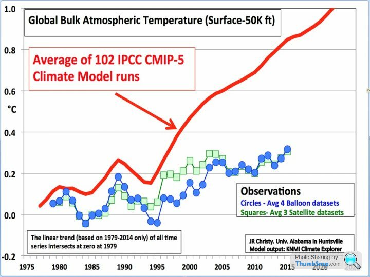
How about you post your source. I'm pretty sure that graph has been done to death.
However judging from your last interaction with a graph I'm pleased to see that you've regained your confidence enough to pass comment on one again. One merely needs to go back 3 pages.
ETA: Yes, I thought their were issues with the graph you posted and I was right.
John Christie's Misleading Graphs:
https://skepticalscience.com/comparing-models-sate...
Edited by Gadgetmac on Friday 28th February 15:31
Gassing Station | Science! | Top of Page | What's New | My Stuff