Climate Change - The Scientific Debate (Vol. II)
Discussion


A couple of papers exploring the solar eruptivity affect on climate vs CO2 and responding to some of Shaviv's earlier work (Shaviv being a regularly cited source of proof that solar forcing is more important than CO2 in changes in global temp). Basically the earlier work doesn’t take into account changes in ph which means that the impact of solar forcing is significantly over stated and that they’d made adjustments to the data (!) that significantly enhanced the relationship between solar forcing and climate cycles:
http://www.atmosedu.com/Geol390/articles/Royeretal...
https://agupubs.onlinelibrary.wiley.com/doi/abs/10...
...and more recently even Shaviv and Svensmark have recognised the role of CO2 in global temps:
https://nyaspubs.onlinelibrary.wiley.com/doi/full/...
Also I suspect the Paleocene-Eocene Thermal Maximum (PETM) that is referred to in the discussion re politics may not be as good a case study to raise as some think (ok so it's Wikipedia but references are included in the summary) - What caused the warming climate and over how long vs the current situation? How big were the impacts in terms of extinctions? How much did sea level change?
https://en.wikipedia.org/wiki/Paleocene–Eoce...
Edited by Lotus 50 on Friday 17th February 11:52
Did someone mention sea ice?
Antarctica sea ice melts to a record low
https://phys.org/news/2023-02-antarctica-sea-ice.h...
https://nsidc.org/arcticseaicenews/
Extract:
The Antarctic Ocean area covered by ice has shrunk to a record low, exposing the thicker ice shelves buttressing Antarctica's ground ice sheet to waves and warmer temperatures, scientists reported Thursday.
The National Snow and Ice Data Center (NSIDC) in the United States said Antarctica's sea ice fell to 1.91 million square kilometers (737,000 square miles) this week, the lowest extent since records began in 1979.
The previous all-time low was set last year.
"With a couple more weeks likely left in the melt season, the extent is expected to drop further before reaching its annual minimum," the NSIDC said in a statement.
Melting sea ice has no discernible impact on sea levels because the ice is already in ocean water.
But the sea ice rings Antarctica's massive ice shelves, the extensions of the freshwater glaciers that threaten catastrophic sea level rise over centuries if they continue melting as global temperatures rise.
The NSIDC said "much of the Antarctic coast" has water that is now without ice, "exposing the ice shelves that fringe the ice sheet to wave action and warmer conditions".
The Antarctic cycle undergoes significant annual variations during its summers of thawing and winters of freezing, and the continent has not experienced the rapid melting of the past four decades that plague the ice sheets of Greenland and the Arctic due to global warming.
But the high melt rate since 2016 raises concerns that a significant downward trend may be taking hold.
Melting of the sea ice is problematic because it helps accelerate global warming.
Gadgetmac said:
Did someone mention sea ice?
Antarctica sea ice melts to a record low
https://phys.org/news/2023-02-antarctica-sea-ice.h...
https://nsidc.org/arcticseaicenews/
Extract:
The Antarctic Ocean area covered by ice has shrunk to a record low, exposing the thicker ice shelves buttressing Antarctica's ground ice sheet to waves and warmer temperatures, scientists reported Thursday.
The National Snow and Ice Data Center (NSIDC) in the United States said Antarctica's sea ice fell to 1.91 million square kilometers (737,000 square miles) this week, the lowest extent since records began in 1979.
The previous all-time low was set last year.
"With a couple more weeks likely left in the melt season, the extent is expected to drop further before reaching its annual minimum," the NSIDC said in a statement.
Melting sea ice has no discernible impact on sea levels because the ice is already in ocean water.
But the sea ice rings Antarctica's massive ice shelves, the extensions of the freshwater glaciers that threaten catastrophic sea level rise over centuries if they continue melting as global temperatures rise.
The NSIDC said "much of the Antarctic coast" has water that is now without ice, "exposing the ice shelves that fringe the ice sheet to wave action and warmer conditions".
The Antarctic cycle undergoes significant annual variations during its summers of thawing and winters of freezing, and the continent has not experienced the rapid melting of the past four decades that plague the ice sheets of Greenland and the Arctic due to global warming.
But the high melt rate since 2016 raises concerns that a significant downward trend may be taking hold.
Melting of the sea ice is problematic because it helps accelerate global warming.
They also saidAntarctica sea ice melts to a record low
https://phys.org/news/2023-02-antarctica-sea-ice.h...
https://nsidc.org/arcticseaicenews/
Extract:
The Antarctic Ocean area covered by ice has shrunk to a record low, exposing the thicker ice shelves buttressing Antarctica's ground ice sheet to waves and warmer temperatures, scientists reported Thursday.
The National Snow and Ice Data Center (NSIDC) in the United States said Antarctica's sea ice fell to 1.91 million square kilometers (737,000 square miles) this week, the lowest extent since records began in 1979.
The previous all-time low was set last year.
"With a couple more weeks likely left in the melt season, the extent is expected to drop further before reaching its annual minimum," the NSIDC said in a statement.
Melting sea ice has no discernible impact on sea levels because the ice is already in ocean water.
But the sea ice rings Antarctica's massive ice shelves, the extensions of the freshwater glaciers that threaten catastrophic sea level rise over centuries if they continue melting as global temperatures rise.
The NSIDC said "much of the Antarctic coast" has water that is now without ice, "exposing the ice shelves that fringe the ice sheet to wave action and warmer conditions".
The Antarctic cycle undergoes significant annual variations during its summers of thawing and winters of freezing, and the continent has not experienced the rapid melting of the past four decades that plague the ice sheets of Greenland and the Arctic due to global warming.
But the high melt rate since 2016 raises concerns that a significant downward trend may be taking hold.
Melting of the sea ice is problematic because it helps accelerate global warming.
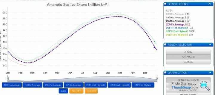
"Antarctic sea ice extent has been highly variable over the last several years. While 2022 and 2023 have had record low minimum extent, four out of the five highest minimums have occurred since 2008. Overall, the trend in Antarctic minimum extent over 1979 to 2023 is near zero. The current downward linear trend in the Antarctic minimum extent from 1979 to 2023 is 2,400 square kilometers (930 square miles) per year, or 0.9 percent per decade, which is currently not statistically significant. Nevertheless, the sharp decline in sea ice extent since 2016 has fueled research on potential causes and whether sea ice loss in the Southern Hemisphere is developing a significant downward trend."
"Overall, the trend in Antarctic minimum extent over 1979 to 2023 is near zero"
"The current downward linear trend in the Antarctic minimum extent from 1979 to 2023 is 2,400 square kilometers (930 square miles) per year, or 0.9 percent per decade, which is currently not statistically significant"
The problem is for the statistians is that the recent drop off is negated by very large sea ice extents from the last decade, 2012 to 2014
The BBC have done a good piece on this in their news, not just cut and paste stuff
https://www.bbc.co.uk/news/science-environment-646...
I thought that was a pretty good summary although their comments on SAM couldn't give the layman scientist a good idea whether a postive SAM meant more sea ice or less. You needed more background reading.
I liked the general talk on the BBC piece with the information on why the Arctic and Antarctic are so different, but then they can't help themselves with :-
"but this year is exceptional"
Compared to what exactly?
They said earlier
"Looking at the data from the last 40-odd years of available satellite data, the sea-ice extent shows great variability."
It's actually 50 years as mapping was done in the 60s with Nimbus 1
Some information here
https://nsidc.org/news-analyses/news-stories/glimp...
There is actually some discussion now on how much SAM actually effecfs the sea ice extent as it has been in opposite modes at times to the actual extent. From an email back in May 2018 with one of the leading scientists at NSIDC :-
"It’s clearly not only the SAM that is playing a role. I think it is still a bit of a mystery. There has been discussion that the ocean is important as well - linkages to exchange with tropical ocean waters.
I think one issue is simply that the Antarctic is more variable than we’ve thought. The satellite record was, for much of it, may have been a relatively “quiet” period with low variability. Now we’re seeing more typical variability. There is some evidence of such high variability in limited data from the 1960s. Of course, what causes that variability is a good question, but it puts the “extremes” we’ve seen in more context and we may not need to come up with extreme explanations."
That's 5 years old now so they might have got a better handle on it.
The point is that the Antarctic has few data points and not much history. So it is difficult to determine what is going to happen.
It's a bellweather, but needs long term trends studied rather than any given year and "exceptionalism" mentioned.
Edited by ColinGreaves on Friday 17th February 10:32
Forgot to put in the SAM graph
https://www.cpc.ncep.noaa.gov/products/precip/CWli...
Been mainly positve for the last 13 years or so including when Antarctica hit record highs and lows, hence why polar scientists now think that is not currently a bigger driving force as they once assumed.
https://www.cpc.ncep.noaa.gov/products/precip/CWli...
Been mainly positve for the last 13 years or so including when Antarctica hit record highs and lows, hence why polar scientists now think that is not currently a bigger driving force as they once assumed.
I was very careful on what bits I posted. The main thrust being...
The Antarctic cycle undergoes significant annual variations during its summers of thawing and winters of freezing, and the continent has not experienced the rapid melting of the past four decades that plague the ice sheets of Greenland and the Arctic due to global warming.
But the high melt rate since 2016 raises concerns that a significant downward trend may be taking hold.
Why do I keep seeing the hockey stick graph used in this discussion?
This was the global temp reconstruction by the IPCC back in 1990 side by side with the hockey stick:
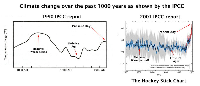
Showing no correlation whatsoever between CO2 levels and global temperature.
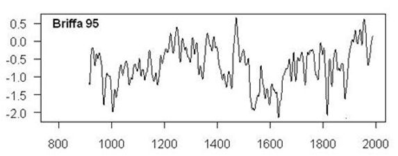
The other global temperature graph that was produced was by Kieth Briffa and showed similar trends;
The IPCC being a governmental body instead chose to run with Mann's fraudulent graph because it displayed more fear for the purpose of passing legislation.
So, knowing that Mann's graph is a fraud, because it is constructed from multiple (incompatible) datasets merged together to produce a hockey stick, why is it still being used in these discussions?
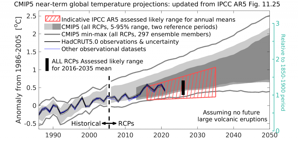
Even if we ignore the historic side of things and just look at the model predictions. We can see here that the models are about x2 to x3 hotter than observations over the past 20 or so years. So we can see from ongoing observations that both the model predictions are wrong and more so that the hockey stick is still a fraud.
This was the global temp reconstruction by the IPCC back in 1990 side by side with the hockey stick:
Showing no correlation whatsoever between CO2 levels and global temperature.
The other global temperature graph that was produced was by Kieth Briffa and showed similar trends;
The IPCC being a governmental body instead chose to run with Mann's fraudulent graph because it displayed more fear for the purpose of passing legislation.
So, knowing that Mann's graph is a fraud, because it is constructed from multiple (incompatible) datasets merged together to produce a hockey stick, why is it still being used in these discussions?
Even if we ignore the historic side of things and just look at the model predictions. We can see here that the models are about x2 to x3 hotter than observations over the past 20 or so years. So we can see from ongoing observations that both the model predictions are wrong and more so that the hockey stick is still a fraud.
Edited by GroundZero on Friday 17th February 12:27
GroundZero said:
Why do I keep seeing the hockey stick graph used in this discussion?
This was the global temp reconstruction by the IPCC back in 1990 side by side with the hockey stick:
Showing no correlation whatsoever between CO2 levels and global temperature.
You've used a version of the IPCC 1990 graph with 'present day' annotation added. This shows that you haven't done much reading about it. It should be obvious that a curve ending with a down slope isn't the present day (1990)This was the global temp reconstruction by the IPCC back in 1990 side by side with the hockey stick:
Showing no correlation whatsoever between CO2 levels and global temperature.
If you're genuinely interested I recommend you google 'IPCC Fig 7.1c' and do more leg work as this is an old subject
GroundZero said:
The other global temperature graph that was produced was by Kieth Briffa and showed similar trends;
Nope not global - siberia. You're making lots of mistakes - more care required.And if it were global so what?
From Briffa 95 - "This record shows that the mean temperature of the twentieth century (1901–90) is higher than during any similar period since AD 914." - so warmer than MWP and there's been 30 more years of warming since.
GroundZero said:
We can see here that the models are about x2 to x3 hotter than observations over the past 20 or so years.
share your basis for this so that "we can see"
GroundZero said:
IPCC AR6 acknowledges models running hot.

Strange to see any defence of the hockey stick graph given that its a known fraud.
I presume the faithful have a standard reply for "where's the medieval warm period?" , for which the hockey stick simply erases?
Given that the last decade or so of observational data is missing from that plot, what happens if it's added in? Strange to see any defence of the hockey stick graph given that its a known fraud.
I presume the faithful have a standard reply for "where's the medieval warm period?" , for which the hockey stick simply erases?
Isotopologue said:
GroundZero said:
IPCC AR6 acknowledges models running hot.
Strange to see any defence of the hockey stick graph given that its a known fraud.
I presume the faithful have a standard reply for "where's the medieval warm period?" , for which the hockey stick simply erases?
Given that the last decade or so of observational data is missing from that plot, what happens if it's added in? Strange to see any defence of the hockey stick graph given that its a known fraud.
I presume the faithful have a standard reply for "where's the medieval warm period?" , for which the hockey stick simply erases?
Source
Regarding "the" hockey stick
List of large-scale temperature reconstructions of the last 2,000 years:
https://en.wikipedia.org/wiki/List_of_large-scale_...
List of large-scale temperature reconstructions of the last 2,000 years:
https://en.wikipedia.org/wiki/List_of_large-scale_...
kerplunk said:
Regarding "the" hockey stick
List of large-scale temperature reconstructions of the last 2,000 years:
https://en.wikipedia.org/wiki/List_of_large-scale_...
From that link:List of large-scale temperature reconstructions of the last 2,000 years:
https://en.wikipedia.org/wiki/List_of_large-scale_...
Quantitative reconstructions have consistently shown earlier temperatures below the temperature levels reached in the late 20th century. This pattern as seen in Mann, Bradley & Hughes 1999 was dubbed the hockey stick graph, and as of 2010 this broad conclusion was supported by more than two dozen reconstructions, using various statistical methods and combinations of proxy records, with variations in how flat the pre-20th century "shaft" appears.
This was a reply to BatmanCryton's post which appears to have been pulled now 
https://climate.nasa.gov/ask-nasa-climate/3071/the...
https://climate.nasa.gov/ask-nasa-climate/3071/the...
Gadgetmac said:
kerplunk said:
Regarding "the" hockey stick
List of large-scale temperature reconstructions of the last 2,000 years:
https://en.wikipedia.org/wiki/List_of_large-scale_...
From that link:List of large-scale temperature reconstructions of the last 2,000 years:
https://en.wikipedia.org/wiki/List_of_large-scale_...
Quantitative reconstructions have consistently shown earlier temperatures below the temperature levels reached in the late 20th century. This pattern as seen in Mann, Bradley & Hughes 1999 was dubbed the hockey stick graph, and as of 2010 this broad conclusion was supported by more than two dozen reconstructions, using various statistical methods and combinations of proxy records, with variations in how flat the pre-20th century "shaft" appears.
I came across an article with the graphic posted by groundzero with the added 'present day' annotations - possibly the origin:
https://www.theunion.com/opinion/norm-sauer-mann-s...
In which the existence of the MWP is inflated as all crucial and fatal to the theory of MMGW:
"The search for truth starts with understanding that if the Medieval Warm Period existed before the industrial revolution then the man-made global warming (MMGW) theory of CO2 forcing sudden warming in the 20th century is baseless because our recent warming is not unusual, unique, unnatural, nor greenhouse gas related."
The logic of that makes my head hurt. If greenhouse gases weren't increasing but instead we'd observed an increase in solar irradiance would the existence of the MWP = dismissal of solar forcing as the cause of recent warming?
Edited by kerplunk on Monday 20th February 11:58
Gadgetmac said:
This was a reply to BatmanCryton's post which appears to have been pulled now
https://climate.nasa.gov/ask-nasa-climate/3071/the...
Apologies, new to the forum and trying to gauge how 'aggressive' or 'calm' replies should be in this science forum.https://climate.nasa.gov/ask-nasa-climate/3071/the...
I've been lurking on PH for a while but only just recently signed up to post stuff.
I created a reply which was basically pointing out that the observed data, when it is published, undergoes a lot of adjustment these days, (cooling the past and warming the present), and that the un-adjusted data does not follow model predictions. Its way off. And its now commonly accepted within those that follow this topic that the models are indeed running hot.

The graph only goes to 2012, but the divergence in trend is quite clear and no where near the model predictions going forward.
kerplunk said:
Gadgetmac said:
kerplunk said:
Regarding "the" hockey stick
List of large-scale temperature reconstructions of the last 2,000 years:
https://en.wikipedia.org/wiki/List_of_large-scale_...
From that link:List of large-scale temperature reconstructions of the last 2,000 years:
https://en.wikipedia.org/wiki/List_of_large-scale_...
Quantitative reconstructions have consistently shown earlier temperatures below the temperature levels reached in the late 20th century. This pattern as seen in Mann, Bradley & Hughes 1999 was dubbed the hockey stick graph, and as of 2010 this broad conclusion was supported by more than two dozen reconstructions, using various statistical methods and combinations of proxy records, with variations in how flat the pre-20th century "shaft" appears.
I came across an article with the graphic posted by groundzero with the added 'present day' annotations - possibly the origin:
https://www.theunion.com/opinion/norm-sauer-mann-s...
In which the existence of the MWP is inflated as all crucial and fatal to the theory of MMGW:
"The search for truth starts with understanding that if the Medieval Warm Period existed before the industrial revolution then the man-made global warming (MMGW) theory of CO2 forcing sudden warming in the 20th century is baseless because our recent warming is not unusual, unique, unnatural, nor greenhouse gas related."
The logic of that makes my head hurt. If greenhouse gases weren't increasing but instead we'd observed an increase in solar irradiance would the existence of the MWP = dismissal of solar forcing as the cause of recent warming?
Being a largely regional (or even a multi-regional) event its absence or presence depicts an uneven heat redistribution around the globe which suggests it's something other than a global uplift in greenhouse gas concentrations like carbon dioxide that's the cause.
BatmanCryton said:
Gadgetmac said:
This was a reply to BatmanCryton's post which appears to have been pulled now
https://climate.nasa.gov/ask-nasa-climate/3071/the...
Apologies, new to the forum and trying to gauge how 'aggressive' or 'calm' replies should be in this science forum.https://climate.nasa.gov/ask-nasa-climate/3071/the...
I've been lurking on PH for a while but only just recently signed up to post stuff.
I created a reply which was basically pointing out that the observed data, when it is published, undergoes a lot of adjustment these days, (cooling the past and warming the present), and that the un-adjusted data does not follow model predictions. Its way off. And its now commonly accepted within those that follow this topic that the models are indeed running hot.
The graph only goes to 2012, but the divergence in trend is quite clear and no where near the model predictions going forward.
We should judge global warming/model performance by temps high up in the troposphere
And there's a consensus about it.
And you are a follower of the subject.
hmmm ok - welcome anyway

Gassing Station | Science! | Top of Page | What's New | My Stuff