B a d g e S p a c i n g
Discussion


With badging, less is definitely more. The Golf R for example looks much nicer than normal Golfs.
Don't take that too far though, no badge at all looks cheap/naff.
The Bentley above has got the spacing right.
Wide(ish) spacing can look OK with a longish name but looks rubbish with a short name.
Don't take that too far though, no badge at all looks cheap/naff.
The Bentley above has got the spacing right.
Wide(ish) spacing can look OK with a longish name but looks rubbish with a short name.
I didn't realise extended badged were a problem, they've been around on loads of cars. I remember the first time I saw a Subaru in the late 90s as a kid, that was the first time I clocked the wide-spaced badge. I've had two Imprezas and they've both had the recognisable spaced badge on the back.

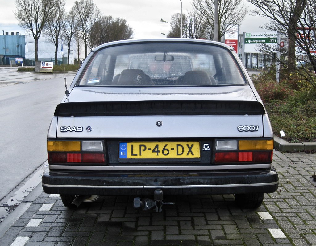
I also have a Merc R320 that's a bit wordy on the back. Given the thing's enormous it doesn't look too bad, but when you stop and read "R320 CDI 4MATIC" - there's a lot going on there. (photo's not of my car)

I also have a Merc R320 that's a bit wordy on the back. Given the thing's enormous it doesn't look too bad, but when you stop and read "R320 CDI 4MATIC" - there's a lot going on there. (photo's not of my car)


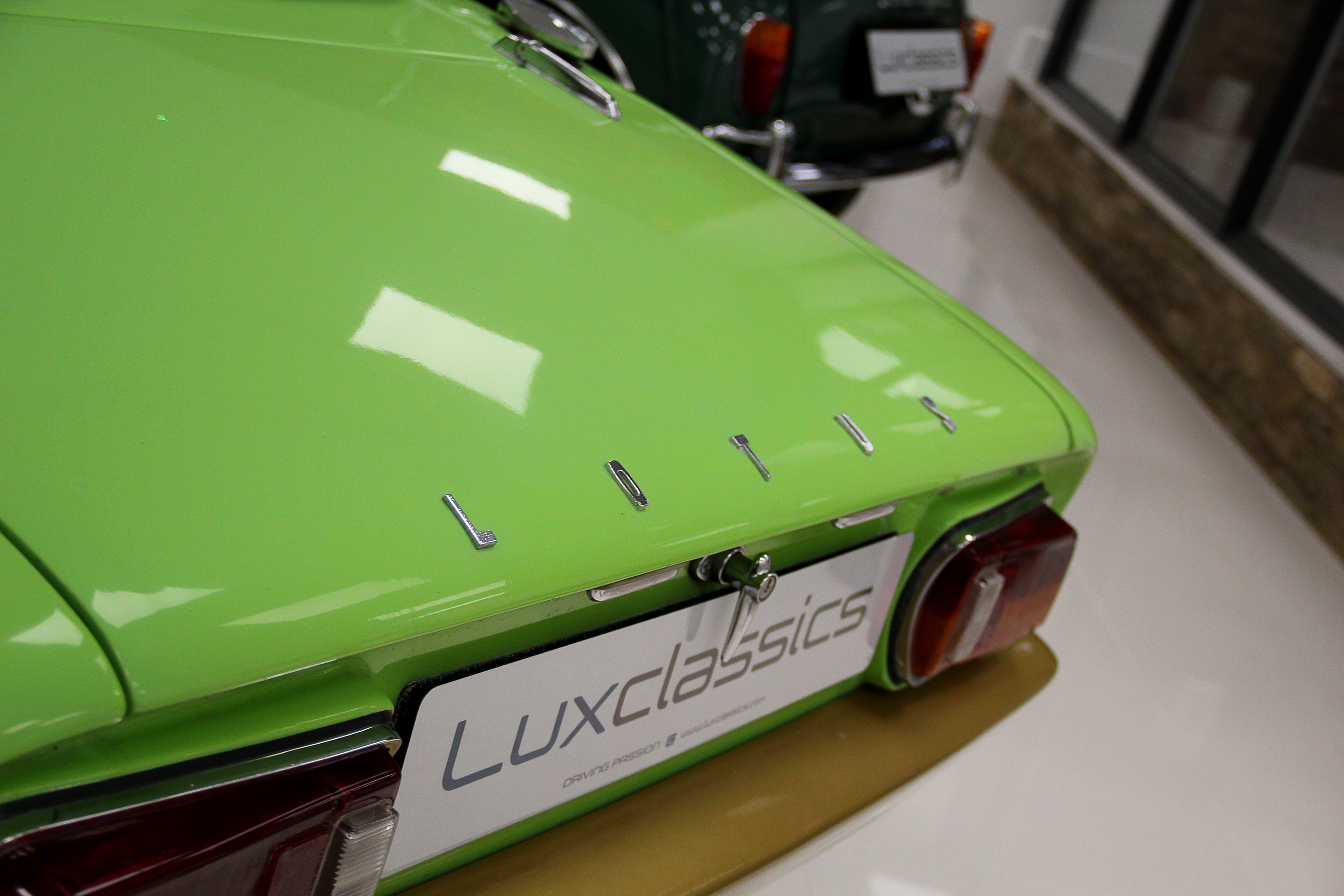


Obviously in typography tracking (the space between letters) has been around forever. The legibility of words set in capital letters is generally improved by wider tracking (more space between letters), and designers often use it as a technique to add some sophistication and refinement to words. I think it can work well, though it has to be used cohesively and sparingly. There are certainly some horrific examples around at the moment, Porsche in particular. Bentley and Subaru have it spot on in my professional opinion.

Leins said:
Firstly, kudos to the OP for the thread title!
Secondly, I miss obscure badging that denotes a technical feature of a car:
Vauxhall seem to be sticking T U R B O to the back of everything, presumably because pretty much all their engines are now shrunken forced induction efforts.Secondly, I miss obscure badging that denotes a technical feature of a car:

Gassing Station | General Gassing | Top of Page | What's New | My Stuff