New Classified Format !!!
Discussion


Vixpy1 said:
Been playing the classifieds today, have to say i don't have any problems at all. Seems to work tickety boo. Submitted an ad on fri as well which was really easy.
Me too. I like them. Power and drivetrain searches are great. I also like the search thing where if I can just type in the model name rather than scrolling through lists of manufacturers to get there.Then it did this:
Though that's the

macdeb said:
OK, sorry for giving an opinion that doesn't tow the line as critiscism doesn't sit well. Best I keep quiet.
You're not listening. I'm not saying you are wrong at all - your opinion is your own and one you're entitled to express here (without swearing at least Edited by macdeb on Monday 1st October 16:08
 ) and criticise us over. It isn't a one way street though - I'm simply listing the reasons why I don't think it's fair to say that we're just like Trader. Tell me how we are, and I'll shut up!
 Feedback mostly constructive 
No problems with the new functionality - it is a leap forward
The UI is a mess with all sorts of unnecessary clutter e.g. Back to top: on one page when scrolling you have none and another page you have three - can someone explain the logic ? Another example is the header letters in the left hand column.
Why is the selection UI completely different between the home page and the Classifieds tab ?
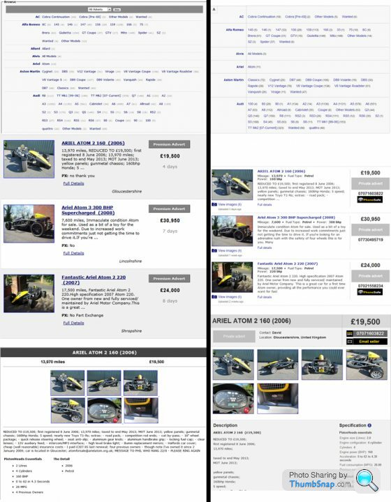
Yes pictures are bigger but they are worse due to artifacting - I have no idea how you achieved this
Suggestions to improve load time:
Don't produce thumbnails from full sized images
Why are you running a non minified JQuery UI ?
Compress the stylesheet
Does this need to be 27kb?
Same goes for icon-sprite.png and new-pointer-modal.png
Hoping not to end up in Parc ferme again
No problems with the new functionality - it is a leap forward
The UI is a mess with all sorts of unnecessary clutter e.g. Back to top: on one page when scrolling you have none and another page you have three - can someone explain the logic ? Another example is the header letters in the left hand column.
Why is the selection UI completely different between the home page and the Classifieds tab ?
Yes pictures are bigger but they are worse due to artifacting - I have no idea how you achieved this
Suggestions to improve load time:
Don't produce thumbnails from full sized images
Why are you running a non minified JQuery UI ?
Compress the stylesheet
Does this
need to be 27kb?Same goes for icon-sprite.png and new-pointer-modal.png
Hoping not to end up in Parc ferme again
cuneus said:
Feedback mostly constructive
No problems with the new functionality - it is a leap forward
The UI is a mess with all sorts of unnecessary clutter e.g. Back to top: on one page when scrolling you have none and another page you have three - can someone explain the logic ? Another example is the header letters in the left hand column.
Why is the selection UI completely different between the home page and the Classifieds tab ?
Yes pictures are bigger but they are worse due to artifacting - I have no idea how you achieved this
Suggestions to improve load time:
Don't produce thumbnails from full sized images
Why are you running a non minified JQuery UI ?
Compress the stylesheet
Does this need to be 27kb?
Same goes for icon-sprite.png and new-pointer-modal.png
Hoping not to end up in Parc ferme again
Thanks for this. I'll get a tech to answer these as almost all are beyond my limited technical capabilities. I *think* we discussed the thumbnails thing as this was raised (possibly by you) elsewhere last week, and Phil seemed to think that this was an isolated issue related to a few migrated ads, but I'll ask one of them to clarify.No problems with the new functionality - it is a leap forward
The UI is a mess with all sorts of unnecessary clutter e.g. Back to top: on one page when scrolling you have none and another page you have three - can someone explain the logic ? Another example is the header letters in the left hand column.
Why is the selection UI completely different between the home page and the Classifieds tab ?
Yes pictures are bigger but they are worse due to artifacting - I have no idea how you achieved this
Suggestions to improve load time:
Don't produce thumbnails from full sized images
Why are you running a non minified JQuery UI ?
Compress the stylesheet
Does this
need to be 27kb?Same goes for icon-sprite.png and new-pointer-modal.png
Hoping not to end up in Parc ferme again
birdcage said:
Perhaps when I look at the photo's I am doing it wrong as it seems a more convoluted way of seeing them, then they show as a pop up in box with the arrow left and right, even dealers have stopped using this format because it's so untidy.
You can either use the arrows to navigate, or you can jump between any picture in the gallery using the filmstrip above the images. You'll also see that just clicking (or touching, on iPad) in the right hand area of the picture more generally prompts it to display the next image.The only other thing which still needs to be done (minor job, not prioritised as highly as other things) is using cursor keys to scroll through images. A tiny thing I realise, but it slipped through.


cuneus, all this is actually very helpful...
It's a bit easier to reply to these one by one in your quote.
Cheers,
-Matt
It's a bit easier to reply to these one by one in your quote.
cuneus said:
Feedback mostly constructive
No problems with the new functionality - it is a leap forward
The UI is a mess with all sorts of unnecessary clutter e.g. Back to top: on one page when scrolling you have none and another page you have three - can someone explain the logic ? Another example is the header letters in the left hand column.
MD - The logic for "back to top" is one per letter on each make.
Why is the selection UI completely different between the home page and the Classifieds tab ?
MD - This is because they're completely different sites using their own CSS. I'd agree it's something we should fix, but it's not an immediate concern.
Yes pictures are bigger but they are worse due to artifacting - I have no idea how you achieved this
MD - Fair comment. I do think we should review our image resizing code, though I don't agree it's any worse than the old site (and yes I've seen your image comparing the two sites).
Suggestions to improve load time:
Don't produce thumbnails from full sized images
MD - This only affects a small number of images. It was caused by some rogue data migration code and isn't possible to reproduce if you upload an ad through the new site. This will go away.
Why are you running a non minified JQuery UI ?
MD - Fair point.
Compress the stylesheet
MD - As is this
Does this need to be 27kb?
MD - And this
Same goes for icon-sprite.png and new-pointer-modal.png
MD - And this
Hoping not to end up in Parc ferme again
Excellent feedback, and I'll see if we can improve some of these over the next few weeks.No problems with the new functionality - it is a leap forward
The UI is a mess with all sorts of unnecessary clutter e.g. Back to top: on one page when scrolling you have none and another page you have three - can someone explain the logic ? Another example is the header letters in the left hand column.
MD - The logic for "back to top" is one per letter on each make.
Why is the selection UI completely different between the home page and the Classifieds tab ?
MD - This is because they're completely different sites using their own CSS. I'd agree it's something we should fix, but it's not an immediate concern.
Yes pictures are bigger but they are worse due to artifacting - I have no idea how you achieved this
MD - Fair comment. I do think we should review our image resizing code, though I don't agree it's any worse than the old site (and yes I've seen your image comparing the two sites).
Suggestions to improve load time:
Don't produce thumbnails from full sized images
MD - This only affects a small number of images. It was caused by some rogue data migration code and isn't possible to reproduce if you upload an ad through the new site. This will go away.
Why are you running a non minified JQuery UI ?
MD - Fair point.
Compress the stylesheet
MD - As is this
Does this
need to be 27kb?MD - And this
Same goes for icon-sprite.png and new-pointer-modal.png
MD - And this
Hoping not to end up in Parc ferme again
Cheers,
-Matt
macdeb said:
If only. Look bloke, I realise some time, effort and MONEY has been spent on the 'new look' and I'm sure for some it works, but for others it doesn't. I fall into the latter. For me, it doesn't work just my view, or shouldn't I have one?
That's fine, and always has been. I was just giving you the opportunity to tell me why you think it's just like all the other sites so that we can act upon your feedback.I'll leave it there then.

Gassing Station | Website Feedback | Top of Page | What's New | My Stuff