Hello PHers and welcome to your new look forums!
Discussion


Wh00sher said:
rscott said:
It's called change - some don't seem to cope well with it....
I don`t care one way or the other if they change something. I`ll just get used to it. 
My issue with this font / colour scheme is it makes my eyes ache after several minutes ! Seriously, I have to close the window as I can feel my eyes starting to hurt. I`m not moaning for the sake of it, I`m moaning because I can`t read it !

Just to confirm, your layout is like this, right?

There shouldn't be anything in this that causes and promotes eye strain. May I suggest turning your screen brightness down, lighting your room better, or eliminating glare? Have you been recently going back and forth a site that contrasts highly with the softer look of the new PH theme? I have a feeling your eye strain is simply from general use rather than the specifics of this theme.

HorneyMX5 said:
I'm finding this all very odd. For me it's a massive improvement on all the platforms I use. Looks clean and more modern. No problems for me with quotes or colour scheme.
I seem to be in the minority.
Looks much better to me too, I like the colour differentiation on what's new and the less garish blue header bars. The fonts are readable on pc (Firefox) and mobile (Opera in desktop mode). I don't like the quote style though, the original classic style was clearer. I seem to be in the minority.
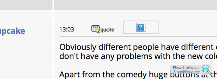
Obviously different people have different eyes, which strain differently, and I confess I am atypical inasmuch as I have reduced colour perception (what some people erroneously refer to as colour blind), but I don't have any problems with the new colour scheme. It's fine to my eyes and doesn't strain them the least (on the desktop - not tried the mobile version).
Apart from the comedy huge buttons at the top, and the bubble quoting, it seems entirely usable to me.
Apart from the comedy huge buttons at the top, and the bubble quoting, it seems entirely usable to me.
Monkeylegend said:
Doofus said:
We're up to 54 pages of mutterings now, and I ain't going to wade through all that, so can somebdoy explain the colours to me please?
Blue
Blue bold
Purple
Purple bold
You must be a member of the PH development team Blue
Blue bold
Purple
Purple bold

 k Up The Quoting" project, but they made me redundant. Apparently, they don't think that team is necessary.
rampageturke said:
There shouldn't be anything in this that causes and promotes eye strain. May I suggest turning your screen brightness down, lighting your room better, or eliminating glare? Have you been recently going back and forth a site that contrasts highly with the softer look of the new PH theme? I have a feeling your eye strain is simply from general use rather than the specifics of this theme.
The lighting here is good, the contrast and reflections are fine and every other website I visit it fine. I`m finding it hard to explain, quite simply because this has never happened before so I`m at a bit of a loss as to what specifically is causing the issue but I can tell you with 100% certainty that I will not browse PH as much if the layout / font remains fixed as it is now, which is why I`m mentioning it because I still want to browse PH !
The fact that others have posted earlier in this thread saying they too are suffering with eyestrain since the change suggests it`s not something unique to me and my setup.
ClockworkCupcake said:
rampageturke said:
I don't know how old this forum software actually is.
You see how at the bottom of the page it says "Copyright PistonHeads 1998-2017"? That's a fair indication. I joined PH in August 2001 and it had already been running for a year or so. The code has grown organically in that time - ie. probably a bit of a mess.
As we've discussed several times already on this thread, a migration to a new off-the-shelf forum platform would not be a trivial task, and would also involve big up-front investment for only a long-term gain. Fixing what you have is always quicker and cheaper in the short term (but not the long term).
It's not that difficult with the tools provided by the BBS provider.
I managed it and I haven't worked in IT for 15 years, I now throw spanners at cars for a living.
Scoobynet used to run a BBS that was written by the owner, when that was sold to Internet Brands a few years ago they carried out a full migration to an off the shelf modern BBS package.
This is not rocket science, it's not even expensive to implement and would probably be cheaper than trying to bespoke write this archaic package, which is bloody awful now.
pc.iow said:
Its so cold and clinical.
DELETED: Comment made by a member who's account has been deleted. The old version was the best forum I've seen for clarity and visual ease. Now we have one just like the rest, requiring effort to view, instead of a nice, relaxed experience.
pc.iow said:
Its so cold and clinical.
DELETED: Comment made by a member who's account has been deleted. I, like many more apparently find the differing shades of light blue a strain on the eyes.
Even the white is a dirty shade of light blue.
Font could be a bit bolder as well.
pc.iow said:
pc.iow said:
Its so cold and clinical.
DELETED: Comment made by a member who's account has been deleted. I, like many more apparently find the differing shades of light blue a strain on the eyes.
Even the white is a dirty shade of light blue.
Font could be a bit bolder as well.
Now it looks like I've said 'its so cold and clinical', then said 'i like cold and clinical'!
Do you really have no problems looking at this page?

Can anyone explain all the multitude of fking colours on My Stuff.
I have Bold Purple, thin purple, bold blue and thin blue. With a mixture of blue and purple page numbers both bold and thin. It looks fking awful and I haven't got a clue what's going on.
Also the font seems to be blurred - maybe because it's so washed out? Argghhhhh its fking horrible.
king colours on My Stuff.I have Bold Purple, thin purple, bold blue and thin blue. With a mixture of blue and purple page numbers both bold and thin. It looks f
king awful and I haven't got a clue what's going on.Also the font seems to be blurred - maybe because it's so washed out? Argghhhhh its f
king horrible.Gassing Station | Website Feedback | Top of Page | What's New | My Stuff