(PENDING) Strange formatting in Firefox
Discussion


Since yesterday morning I'm getting a strange hybrid of desktop view and mobile view in Firefox on Android. I tried Chrome and it still gives the normal mobile view. In Firefox this is pretty unusable because there seems to be no way to open a thread other than from the beginning.

Firefox 67.0.3 on a Mate 20 Pro. I've tried deleting the cache and recycling the browser, it still starts with that formatting. Refreshing the page doesn't help either.
I've seen an older threead describing pretty much the same thing, but that's closed. It appears to have come back.
Firefox 67.0.3 on a Mate 20 Pro. I've tried deleting the cache and recycling the browser, it still starts with that formatting. Refreshing the page doesn't help either.
I've seen an older threead describing pretty much the same thing, but that's closed. It appears to have come back.
tirolo_ said:
I can confirm was just a temporary thing while new infrastructure was being put in place... should all be back to normal now.
Sorry any inconvenience this might have caused
It didn't cause any inconvenience but I guess you don't always know the impact of development/infrastructure work will be at implementation......Sorry any inconvenience this might have caused
Would the team consider sticking a heads up post in this section prior to implementation to say "things might go a bit squiffy formatting wise for an hour or two - don't panic it'll be short lived and back to normal as we spot the issues and fix on the fly"
B'stard Child said:
It didn't cause any inconvenience but I guess you don't always know the impact of development/infrastructure work will be at implementation......
Would the team consider sticking a heads up post in this section prior to implementation to say "things might go a bit squiffy formatting wise for an hour or two - don't panic it'll be short lived and back to normal as we spot the issues and fix on the fly"
You're right! We've took many precautions to avoid disruptions but as you can imagine it's not easy to move such a massive and old code base into new technologies/infrastructure without missing some minor things here and there, needless to say that shouldn't be used as a excuse.Would the team consider sticking a heads up post in this section prior to implementation to say "things might go a bit squiffy formatting wise for an hour or two - don't panic it'll be short lived and back to normal as we spot the issues and fix on the fly"
I think someone has brought up something similar to your suggestion before within the team but I think the direction is more to "learn from the pain and make sure we don't commit the same errors again" instead of "let them know and feel comfortable in delivering poor experience" kinda thing... (surely lacking words to express this better here
 )
)We continue to work hard to make sure these won't affect our end users in the future and recognise there's still a long way to go but also wanted to share we are super happy with the progress made so far in such a short period of time, I know most of it is not customer facing but it's surely paving a solid way for that to follow.
As always we really appreciate this kind of feedback so keep them coming!
tirolo_ said:
B'stard Child said:
It didn't cause any inconvenience but I guess you don't always know the impact of development/infrastructure work will be at implementation......
Would the team consider sticking a heads up post in this section prior to implementation to say "things might go a bit squiffy formatting wise for an hour or two - don't panic it'll be short lived and back to normal as we spot the issues and fix on the fly"
You're right! We've took many precautions to avoid disruptions but as you can imagine it's not easy to move such a massive and old code base into new technologies/infrastructure without missing some minor things here and there, needless to say that shouldn't be used as a excuse.Would the team consider sticking a heads up post in this section prior to implementation to say "things might go a bit squiffy formatting wise for an hour or two - don't panic it'll be short lived and back to normal as we spot the issues and fix on the fly"
I think someone has brought up something similar to your suggestion before within the team but I think the direction is more to "learn from the pain and make sure we don't commit the same errors again" instead of "let them know and feel comfortable in delivering poor experience" kinda thing... (surely lacking words to express this better here
)We continue to work hard to make sure these won't affect our end users in the future and recognise there's still a long way to go but also wanted to share we are super happy with the progress made so far in such a short period of time, I know most of it is not customer facing but it's surely paving a solid way for that to follow.
As always we really appreciate this kind of feedback so keep them coming!
tirolo_ said:
Are you guys seeing the issue with the icons on the bottom bar (mobile) or the issue people are reporting on the other thread about the back button?
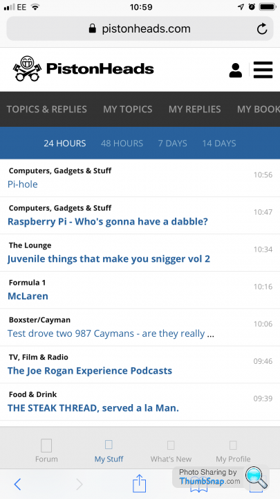
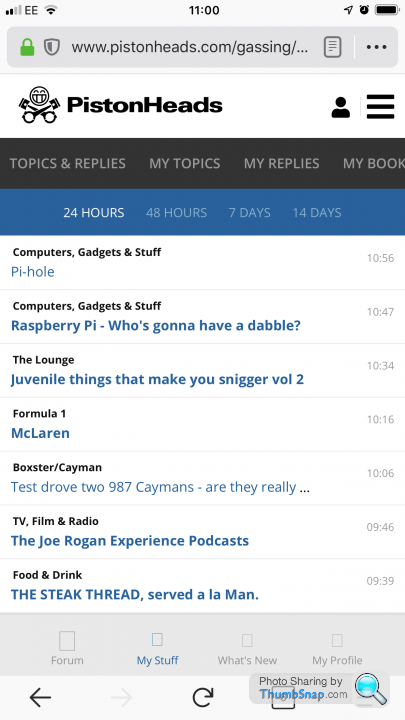
My issue is that the mobile view still looks like the screenshot in the first post. Until a day or two ago it looked normal in both Firefox and Chrome.It is like that on entry, it isn't associated with the back button. When I tried Chrome there was a period yesterday where the icons across the bottom were just rectangles with an 'X' in them, but that's fixed now, and it also appears to be fixed in Firefox:

Note the icons now show correctly compared to the screenshot in the first post. The rest of it is still unusable though.
Apart from not being associated with the back button it does look just the same as what people were reporting over there.
- Edit* it seems there are two threads about the back button. The one I mean is https://www.pistonheads.com/gassing/topic.asp?h=0&... where it shows a badly-rendered version of the desktop site on mobile.
Edited by karma mechanic on Wednesday 26th June 08:44
Edited by karma mechanic on Wednesday 26th June 08:48
karma mechanic said:
My issue is that the mobile view still looks like the screenshot in the first post. Until a day or two ago it looked normal in both Firefox and Chrome.
It is like that on entry, it isn't associated with the back button. When I tried Chrome there was a period yesterday where the icons across the bottom were just rectangles with an 'X' in them, but that's fixed now, and it also appears to be fixed in Firefox:
Note the icons now show correctly compared to the screenshot in the first post. The rest of it is still unusable though.
Apart from not being associated with the back button it does look just the same as what people were reporting over there.
I see! Can I get the specific mobile and browser version? It might be that our device detection is failing to detect your device as a mobile... actually if you could send me your User-Agent would be perfect! If you just search on google: "what's my user agent" it will show you...It is like that on entry, it isn't associated with the back button. When I tried Chrome there was a period yesterday where the icons across the bottom were just rectangles with an 'X' in them, but that's fixed now, and it also appears to be fixed in Firefox:
Note the icons now show correctly compared to the screenshot in the first post. The rest of it is still unusable though.
Apart from not being associated with the back button it does look just the same as what people were reporting over there.
- Edit* it seems there are two threads about the back button. The one I mean is https://www.pistonheads.com/gassing/topic.asp?h=0&... where it shows a badly-rendered version of the desktop site on mobile.
Edited by karma mechanic on Wednesday 26th June 08:44
Edited by karma mechanic on Wednesday 26th June 08:48
Gassing Station | Website Feedback | Top of Page | What's New | My Stuff