Lousy Forum structure
Discussion


Why not tell us which bit you don't like so we can agree or disagree?
For what it's worth on a desktop I think it's very very easy to negotiate.
On a mobile somethings can get lost - for example I may want to be in a dedicated forum, but clicking up often takes me to the larger list - ie: watches - click up - takes me to the full pie & piston which is not where I want to go. But that's a minor thing easily avoided.
Kondeeler said:
We are just going to have to agree to differ.
After all what would someone who has a background in software design and teaching possibly know?
I don't know, but assuming you are someone who has a background in software design and teaching could you give us some pointers about what's wrong with PH as it is?After all what would someone who has a background in software design and teaching possibly know?
The replies have come from people who have been here 64 months (5 years) + so are used to it, and are presumably fans of how simple it looks.
Kondeeler said:
We are just going to have to agree to differ.
After all what would someone who has a background in software design and teaching possibly know?
Genuinely interested to know what you don't like and how you find it difficult.. I mean, its a flat list divided in to sections, I can't quite grasp how it could be simpler.After all what would someone who has a background in software design and teaching possibly know?
Kondeeler said:
We are just going to have to agree to differ.
After all what would someone who has a background in software design and teaching possibly know?
Unless you're trolling, please do finally tell us what it is you think is maze like and non-intuitive.After all what would someone who has a background in software design and teaching possibly know?
All of the responses that you've received don't seem to have found the problems that you complain of.
 k all about user interface design and user journeys
  There's a few bits that could be fixed but I've seen a lot worse
citizensm1th said:
Johnnytheboy said:
citizensm1th said:
Johnnytheboy said:
How about like Facebook, where it puts the same threads at the top visit after visit, because its algorithm has decided they are what you want to read most?
FRO, just use what's new and mystuff. Then navigate to particular forums as needed.Make your own choice what to interact with not some algorithm coded by some chimp interested in the latest macrame pattern

Johnnytheboy said:
Riley Blue said:
Kondeeler said:
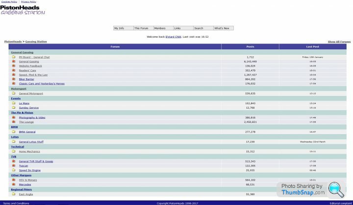
Does anyone else find navigating PistonHeads, Non-intuitive, maze-like structure a real PITA?
How would you structure it?No thank you, I'd have to wade through too much FB generated rubbish to find anything interesting.


anonymous said:
[redacted]
Yeah, the names made sense when they were created but I can see why someone looking at them now would just see a hodge-podge of weird names.Here's what it looked like in 2001

https://web.archive.org/web/20010815051417/http://...
But when one of the subforums got too busy it would be split off and given a name that made sense back then, but now it's just a name without an explanation.
For example when people started talking about non-car stuff on PH the Pie and Piston subforum was created for all non-car topics (for a while non-car topics were locked but the mods gave in in the end), when too many people started talking about politics in there NP&E was spawned and Pie and Piston became the overarching name for all the non-car forums and The Lounge was the general non-car chat forum.
I feel old.
The usual story of people stuck in the dark ages, much like the forum itself. It’s ancient. We shouldn’t be taken to a completely new page to respond or edit a post. We should be able to search properly for something more recent than a decade old. We should be able to send messages to each other within the forum software. We should be able to tag users and see when our posts are quoted or when we’ve been tagged. All standard forum software stuff from this decade.
While I agree the clean colours and aesthetics are something that should be kept, and certainly can be, the forum itself is mired in 2010, not 2020. Anyone who says otherwise is clinging on to it for dear life when it needs out down.
While I agree the clean colours and aesthetics are something that should be kept, and certainly can be, the forum itself is mired in 2010, not 2020. Anyone who says otherwise is clinging on to it for dear life when it needs out down.


anonymous said:
[redacted]
You're confusing CarGurus (new owner) with Haymarket (previous owner). Haymarket did essentially pull all engineering resource off PH and there was probably at least a year where we had next to no support at all.CarGurus are investing heavily in PistonHeads and we probably have the biggest engineering team we've ever had. Naturally as the classifieds is our core source of revenue, that's still getting the majority of engineering resource but the forums now have more resource than they've probably had in at least five years, if not more.
Ben Lowden said:
anonymous said:
[redacted]
You're confusing CarGurus (new owner) with Haymarket (previous owner). Haymarket did essentially pull all engineering resource off PH and there was probably at least a year where we had next to no support at all.CarGurus are investing heavily in PistonHeads and we probably have the biggest engineering team we've ever had. Naturally as the classifieds is our core source of revenue, that's still getting the majority of engineering resource but the forums now have more resource than they've probably had in at least five years, if not more.
Gassing Station | Website Feedback | Top of Page | What's New | My Stuff