
Which car manufacturer has the best/worst badge/emblem?
Discussion


Taking any aspirational qualities out of the equation, which car manufacturer do you consider to have the best and worst badge/emblem? It interests me that the majority of European car manufacturers have instantly recognisable badges/emblems, especially the German manufacturers (VW, Audi, BMW, Mercedes, Porsche etc). Is it just coincidence that they tend to have a strong brand? I also find roundels/shields the strongest/most recognisable badges.
The Japanese/Korean manufacturers typically suck at badges and lack a little imagination, despite making some excellent cars. Honda, Toyota, Nissan, Mazda and Hyundai all have very boring badges (although Subaru and Mitsubishi deserve some credit here).
Although perhaps not having the strongest model line-up (but certainly improving), my favourite has to be Alfa Romeo, although there seems to be some debate over whether the snake is eating the man or he is coming out of the snake's mouth and being reborn! Most confused seems to be Fiat, who seem to have changed their badge multiple times over the years!

My least favourite is a toss-up between SEAT and Kia (probably Kia). They both make some decent vehicles but the badges just look crap.


So which car manufacturer in your opinion has the best badge/emblem and which the worst?
The Japanese/Korean manufacturers typically suck at badges and lack a little imagination, despite making some excellent cars. Honda, Toyota, Nissan, Mazda and Hyundai all have very boring badges (although Subaru and Mitsubishi deserve some credit here).
Although perhaps not having the strongest model line-up (but certainly improving), my favourite has to be Alfa Romeo, although there seems to be some debate over whether the snake is eating the man or he is coming out of the snake's mouth and being reborn! Most confused seems to be Fiat, who seem to have changed their badge multiple times over the years!
My least favourite is a toss-up between SEAT and Kia (probably Kia). They both make some decent vehicles but the badges just look crap.
So which car manufacturer in your opinion has the best badge/emblem and which the worst?

You've posted the old SEAT badge, they've simplified it now, and I don't mind it, nor the old ones.
I like the Peugeot lion, shame it's usually attached to absolute shyte.
Always thought Skoda's looked like a flying turkey.
I like Toyota's since I learnt you can spell all the letters in the Toyota name with it.
Oh, and you can't not mention Jaguar!
I like the Peugeot lion, shame it's usually attached to absolute shyte.
Always thought Skoda's looked like a flying turkey.
I like Toyota's since I learnt you can spell all the letters in the Toyota name with it.
Oh, and you can't not mention Jaguar!
I hate the lopsided Jaguar leaper badge on the rear and have always thought it would be far better if they put it in or almost in a circle, like Vauxhall do with their Griffin. If they went one step further and filled the circle with enamel, it would look far better and more premium.
I'm no fan of the boring BMW badge.
Most Japanese manufacturers have crap, dull badges Toyota's ellipses, Honda's H, Hyundai's fat H, Lexus' L, Nissan's "Nissan" - I mean, come on...
My favourite simplistic design is probably the VW badge - it is clean, classical, clever and has been pretty much the same since the Beetle was about.
Other than that, it has to be this because it's iconic and brilliant (the Shelby snake isn't bad either)

I'm no fan of the boring BMW badge.
Most Japanese manufacturers have crap, dull badges Toyota's ellipses, Honda's H, Hyundai's fat H, Lexus' L, Nissan's "Nissan" - I mean, come on...
My favourite simplistic design is probably the VW badge - it is clean, classical, clever and has been pretty much the same since the Beetle was about.
Other than that, it has to be this because it's iconic and brilliant (the Shelby snake isn't bad either)
LuS1fer said:
I hate the lopsided Jaguar leaper badge on the rear and have always thought it would be far better if they put it in or almost in a circle, like Vauxhall do with their Griffin. If they went one step further and filled the circle with enamel, it would look far better and more premium.
I think they should use the head only on the rear, like the front grille, then have the leaper inside.Kierkegaard said:
You've posted the old SEAT badge, they've simplified it now, and I don't mind it, nor the old ones.
I like the Peugeot lion, shame it's usually attached to absolute shyte.
Always thought Skoda's looked like a flying turkey.
I like Toyota's since I learnt you can spell all the letters in the Toyota name with it.
Oh, and you can't not mention Jaguar!
I'm not seeing that with the Toyota badge (will have to read up on that). I like the Peugeot lion, shame it's usually attached to absolute shyte.
Always thought Skoda's looked like a flying turkey.
I like Toyota's since I learnt you can spell all the letters in the Toyota name with it.
Oh, and you can't not mention Jaguar!

Are you talking about Jaguar in a good or bad way?
The "leaper" looks OK out of context but rubbish on the car because it's assymetrical. The solution would be to use the "growler", which I think looks better on the vehicle.

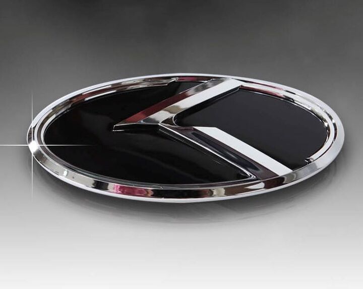

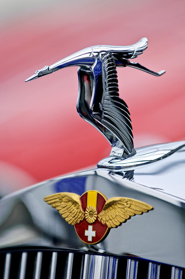
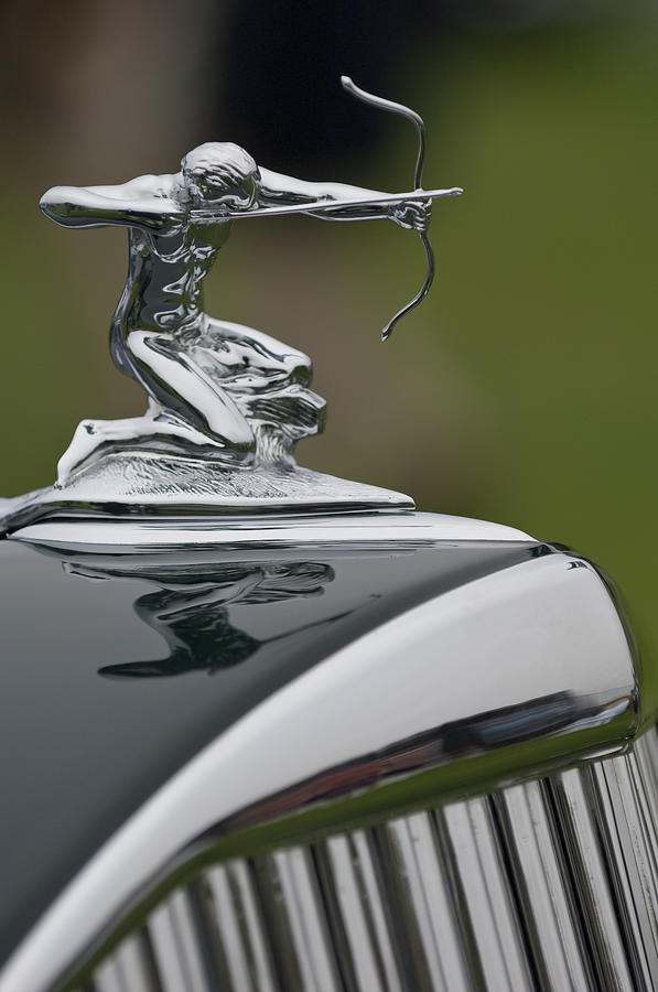


Alfa and Lamborghini are the best for me for me (although I'm biased), in Alfa's case even more so where the badge is integrated into the grille, double stamps on the 'instantly recognisable' front...

The raging bull representing Ferruccio Lamborghini's birth sign of Taurus...

A slight variation on the older dealership emblem...

(I'd love to know how the Gordon Keeble badge came about though!)
The raging bull representing Ferruccio Lamborghini's birth sign of Taurus...
A slight variation on the older dealership emblem...
(I'd love to know how the Gordon Keeble badge came about though!)
white_goodman said:
I'm not seeing that with the Toyota badge (will have to read up on that).
Are you talking about Jaguar in a good or bad way?
The "leaper" looks OK out of context but rubbish on the car because it's assymetrical. The solution would be to use the "growler", which I think looks better on the vehicle.
Can’t beat a good Growler.Are you talking about Jaguar in a good or bad way?
The "leaper" looks OK out of context but rubbish on the car because it's assymetrical. The solution would be to use the "growler", which I think looks better on the vehicle.


Forums | General Gassing | Top of Page | What's New | My Stuff