
New Porsche crest for 75th Anniversary
Here's the story behind that iconic symbol - and how it'll change later this year
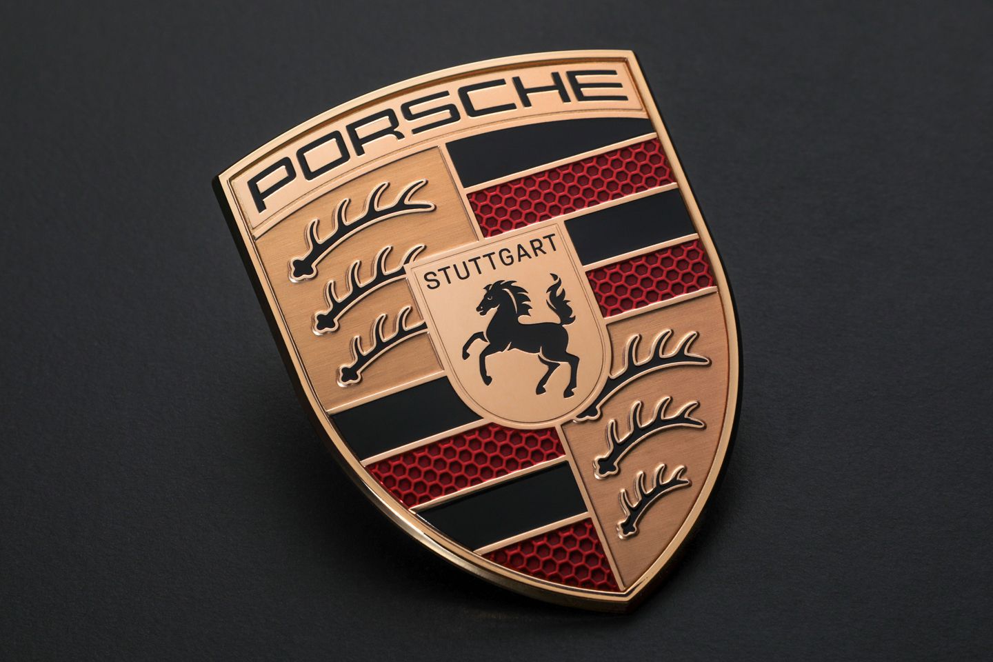
Porsche has announced that a tweaked version of its famous crest will be appearing on its literature and cars to mark the company’s 75th anniversary. When will we start to see it? From the 75th Porsche anniversary event next Thursday, where the firm is likely to preview what it thinks the sports car of the future will look like. Why is it changing? Well, I’ll let Michael Mauer, Vice President Style Porsche, explain: "The “75 years of Porsche sports cars” anniversary was the occasion for us to rework this trademark". Makes sense, I guess, so what’s changed? "With its cleaner and more state-of-the-art execution, the refined crest communicates the character of Porsche. We have reinterpreted historical characteristics and combined them with innovative design elements such as a honeycomb structure and brushed metal. The result is an aesthetically ambitious arc that bridges the history and the future of the brand".
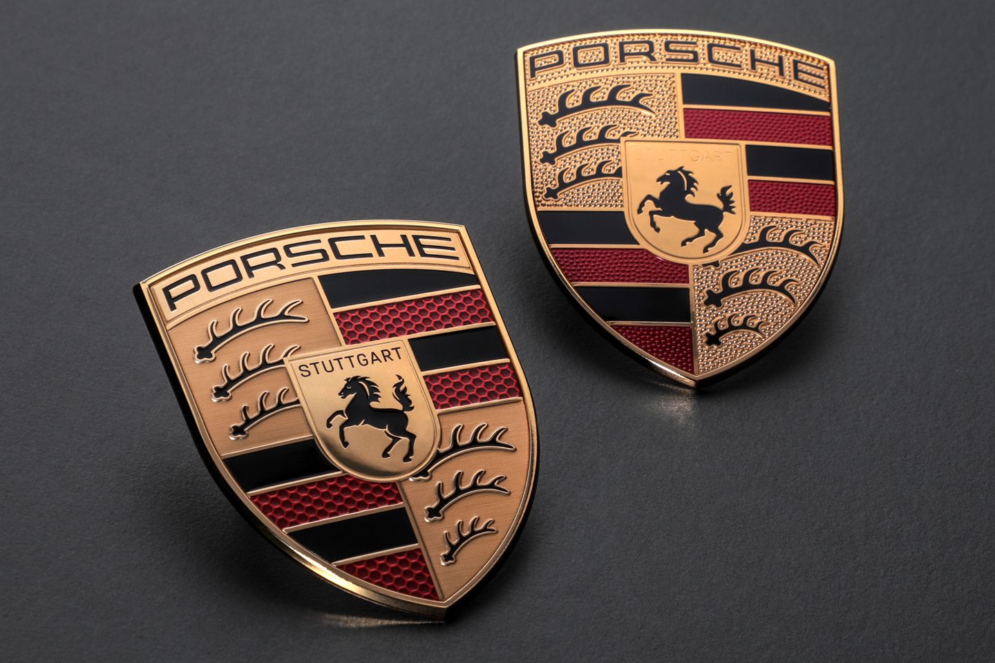
In essence, the mottled red enamelled panels in the crest have migrated to a honeycomb finish, while the brass sections, which were textured, are now smooth, from which the black deer antlers have been raised slightly. You’ll need to have a close look to notice the changes, then, and it’s hard to see why such subtle changes took three years to complete. Nice work if you can get it, I suppose.
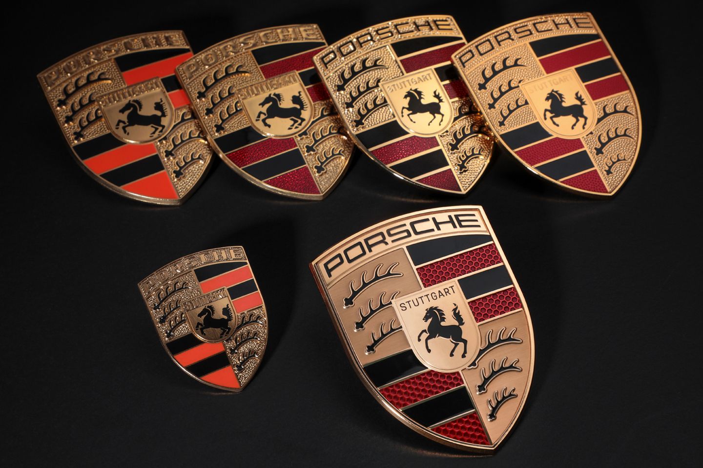
In case you’re wondering, this isn’t the first time the crest has been altered. The first version came out in 1952, and was changed in 1954, 1963, 1973, 1994 and 2008. Other than the honeycomb effect, which hasn’t been seen before, this latest adaptation reincorporates some elements that have in been there in the past.
Last year I was in Stuttgart for the 50th anniversary of the Carrera RS. While I was there, we were taken on a tour of the Porsche Archive that’s housed in the same building as its museum. We were shown all sorts of interesting items from Porsche's history, but the most memorable was undoubtedly the original drawing of the Porsche crest. In objective terms, this was just a piece of paper with some ink on. But to see this piece of automotive history in the raw – and actually hold it in my hands – and be told about how and why the crest came to be felt very significant.
Back in 1951, Porsche didn’t have a logo. Its cars simply had the letters spelling the maker’s name on them. The idea of a logo was first discussed early in 1951. In March that year, an art collector from Stuttgart, called Ottomar Domnick, launched a competition at German art academies to design one. There was even a prize of 1,000 German marks for the winning design. In the end, however, none of the submissions were deemed right by the Porsche management and nothing changed.
In December 1951, Ferry Porsche was in the U.S. having a meeting with a man called Max Hoffman. Hoffman was Austrian-born fella who had moved to New York and set up in business importing high-end European cars into America – not only the Porsche 356, but cars including the Mercedes 300 SL and BMW 507. He told Ferry Porsche that to sell cars in the U.S. he needed to create a recognisable logo.
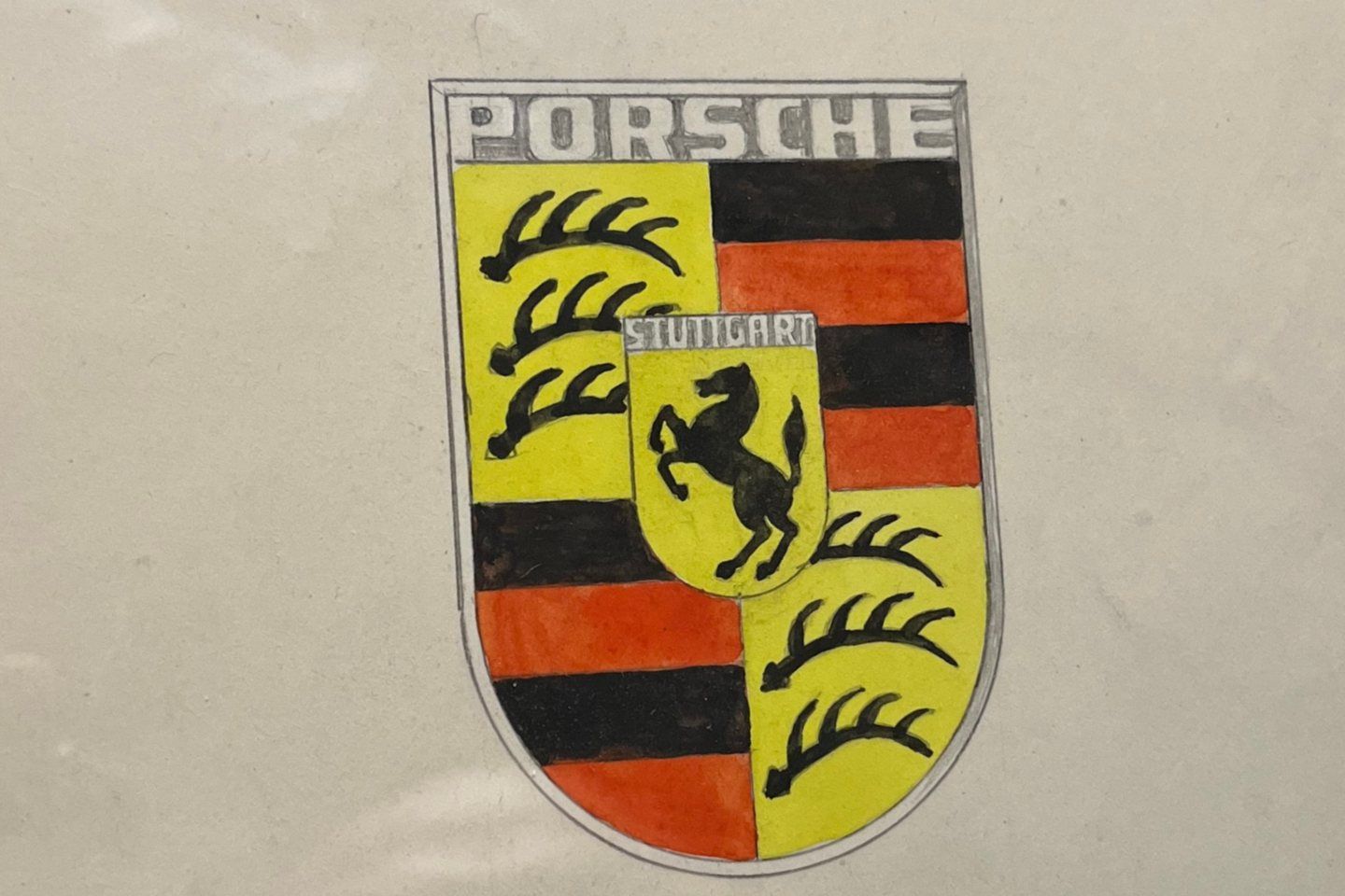
This clearly focused Porsche’s mind, because early in 1952 he commissioned Franz Xaver Reimspieß, a designer and talented draughtsman, to sketch one. It was to be something that would tie Porsche to the region where it was based, which is called Swabia, and more specifically to the city where its factory was located, which, of course, is Stuttgart. And this original sketch (pictured) was the one that I held last year.
What does all the symbolism in the crest mean? Well, the horse in the middle of the Porsche logo isn’t merely copy of Ferrari's prancing horse. It’s from the seal of the city of Stuttgart, which is a traditional horse-breeding city – Stuttgart literally translates to ‘stud garden’. The background crest, with the red and black colours and the deer antlers is simply the coat of arms for the state of Württemberg-Hohenzollern, of which Stuttgart is the capital city.
By the end of 1952 the logo was used on the steering wheel rim of the 356, but it wasn't until November 1954 that it was finally seen on the exterior of a Porsche. That was when it was integrated into the bonnet handle on the 356 Speedster. After 1959 it was added to hubcaps of every sports car from Zuffenhausen and the rest, as they say, is history...


it is not a crest...
- a crest appears at the top of a coat of arms
- this is a shield, or escutcheon - on which appears the charges (design on the shield) - so the prancing horse is an heraldic charge...
[/pedantry]

No one else really cares. Quite rightly.
Legal dep't: You can do that if you like but you'll destroy the carefully protected trademark and brand image built up over the past 75 years. Leave it alone.
Marketing dep't: Brilliant, we'll make it the same but fiddle with it just enough to justify the huge pile of cash we've spent.
An example of how important it is to use a brand properly occurred during Camel (cigarettes) sponsorship of Lotus F1. On the Camel brand logo the camel always faces to the left. When they put the logo on the sides of the F1 car some bright spark decided the camel should always be facing the front of the car whichever side it was on, so the right side of the car had the camel facing the "wrong" way. It didn't stay that way for long and later versions of the car had the camel always facing to the left. If you google for images of the car you'll find some pics right and some pics wrong. (NB it's only the right hand side of the car that's affected.)
it is not a crest...
- a crest appears at the top of a coat of arms
- this is a shield, or escutcheon - on which appears the charges (design on the shield) - so the prancing horse is an heraldic charge...
[/pedantry]
it is not a crest...
- a crest appears at the top of a coat of arms
- this is a shield, or escutcheon - on which appears the charges (design on the shield) - so the prancing horse is an heraldic charge...
[/pedantry]
Porsche calls this das Wappen - translated as Coat of Arms or Blazon.

it is not a crest...
- a crest appears at the top of a coat of arms
- this is a shield, or escutcheon - on which appears the charges (design on the shield) - so the prancing horse is an heraldic charge...
[/pedantry]

Forums | General Gassing | Top of Page | What's New | My Stuff