Firefox android mobile view
Discussion


Hi
Not a spam post as this is my first post and hopefully more to come.
I have been a lurker on pistonheads for some years but I've finally built up the courage to sign up and report a bug? with the forum.
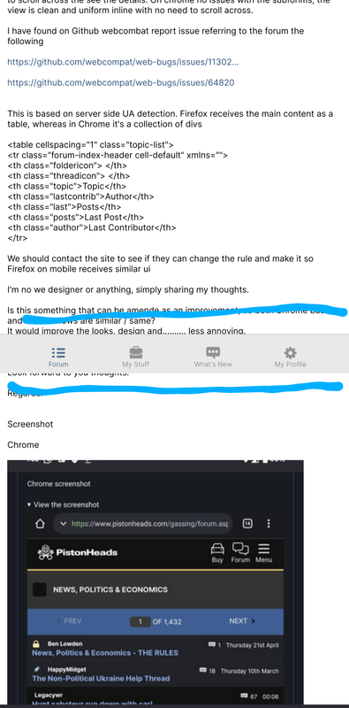
Im using Firefox android and on mobile view the subforums are presented as a table and is different to chrome browsers.
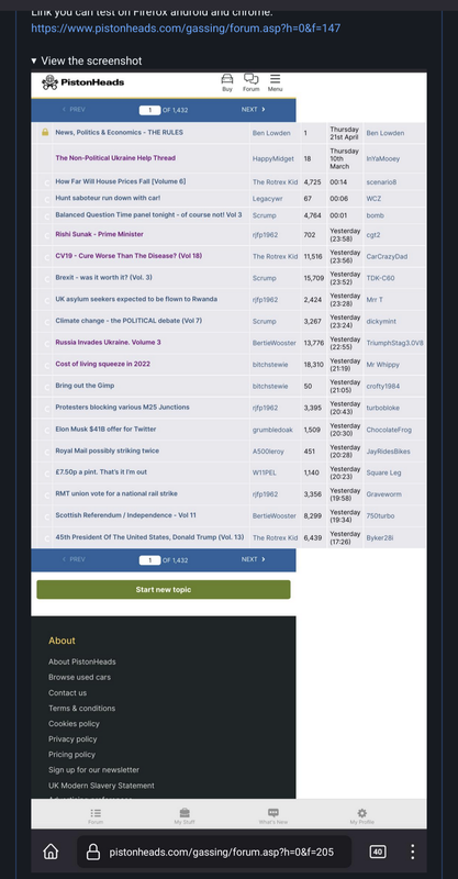
On Firefox android the user name, post time columns expand outside and you have to scroll across the see the details. On chrome no issues with the subforims, the view is clean and uniform inline with no need to scroll across.
I have found on Github webcombat report issue referring to the forum the following
https://github.com/webcompat/web-bugs/issues/11302...
https://github.com/webcompat/web-bugs/issues/64820
This is based on server side UA detection. Firefox receives the main content as a table, whereas in Chrome it's a collection of divs
<table cellspacing="1" class="topic-list">
<tr class="forum-index-header cell-default" xmlns="">
<th class="foldericon"> </th>
<th class="threadicon"> </th>
<th class="topic">Topic</th>
<th class="lastcontrib">Author</th>
<th class="last">Posts</th>
<th class="posts">Last Post</th>
<th class="author">Last Contributor</th>
</tr>
We should contact the site to see if they can change the rule and make it so Firefox on mobile receives similar ui
I'm no we designer or anything, simply sharing my thoughts.
Is this something that can be amende as an improvement, so both Chrome based and Firefox views are similar / same?
It would improve the looks, design and.......... less annoying.
Im posting on my mobile so I'll try add some screenshot example.
Look forward to you thoughts.
Regards.
Screenshot
Chrome

Firefox android
Not a spam post as this is my first post and hopefully more to come.
I have been a lurker on pistonheads for some years but I've finally built up the courage to sign up and report a bug? with the forum.
Im using Firefox android and on mobile view the subforums are presented as a table and is different to chrome browsers.
On Firefox android the user name, post time columns expand outside and you have to scroll across the see the details. On chrome no issues with the subforims, the view is clean and uniform inline with no need to scroll across.
I have found on Github webcombat report issue referring to the forum the following
https://github.com/webcompat/web-bugs/issues/11302...
https://github.com/webcompat/web-bugs/issues/64820
This is based on server side UA detection. Firefox receives the main content as a table, whereas in Chrome it's a collection of divs
<table cellspacing="1" class="topic-list">
<tr class="forum-index-header cell-default" xmlns="">
<th class="foldericon"> </th>
<th class="threadicon"> </th>
<th class="topic">Topic</th>
<th class="lastcontrib">Author</th>
<th class="last">Posts</th>
<th class="posts">Last Post</th>
<th class="author">Last Contributor</th>
</tr>
We should contact the site to see if they can change the rule and make it so Firefox on mobile receives similar ui
I'm no we designer or anything, simply sharing my thoughts.
Is this something that can be amende as an improvement, so both Chrome based and Firefox views are similar / same?
It would improve the looks, design and.......... less annoying.
Im posting on my mobile so I'll try add some screenshot example.
Look forward to you thoughts.
Regards.
Screenshot
Chrome
Firefox android
Edited by Mr-n on Saturday 29th October 13:57
Also when scrolling threads the profile bar moves along and covers the forum content.
 upload image from url
upload image from urlForums | Website Feedback | Top of Page | What's New | My Stuff