another website
Discussion


Like Fazz81 I've been building a website too, I'd appreciate your thoughts...
www.grant.gb.com
...I think it may well be dial-up unfriendly too, and needs more compression. Let me know anyway
>> Edited by badbeachbuggy on Friday 6th May 18:42
www.grant.gb.com
...I think it may well be dial-up unfriendly too, and needs more compression. Let me know anyway
>> Edited by badbeachbuggy on Friday 6th May 18:42
sorry to hijack the thread but heres my working progress on a website
www.alexgoss.com
www.alexgoss.com
white_van_man said:
sorry to hijack the thread but heres my working progress on a website
www.alexgoss.com
If you're sorry why did you do it?

Marin.
PS - great site tough...one of the easiest ever to navigate.
Grant,
Blimmin good work methinks.
Bit slow to load ... and not sure where the focus is (friends and Prince Charles?) Having said that - the pic of Amy is fab. If I had to make a comment, I'd decide where you are pitching... then go for it. The work is easily good enough - it just feels half 'my site' half 'pro site'.
(Like mine isn't! )
)
Lots of good work gone in there!
Steve
edited to add: BTW... that pic of Amy reminded me of a pic I took of me mate's daughter (younger... and how Gaelic can you get!) - just found it..
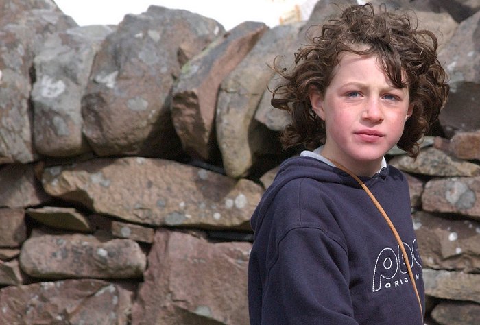
>> Edited by GetCarter on Friday 6th May 21:32
Blimmin good work methinks.
Bit slow to load ... and not sure where the focus is (friends and Prince Charles?) Having said that - the pic of Amy is fab. If I had to make a comment, I'd decide where you are pitching... then go for it. The work is easily good enough - it just feels half 'my site' half 'pro site'.
(Like mine isn't!
) Lots of good work gone in there!
Steve
edited to add: BTW... that pic of Amy reminded me of a pic I took of me mate's daughter (younger... and how Gaelic can you get!) - just found it..
>> Edited by GetCarter on Friday 6th May 21:32
 It'd probably work if you had a series of thumbnails rather than just one pic per section.


FunkyNige said:I agree with this, some thumbs would be nice, I like the site design, I'm trying to learn CSS at the moment.
I would prefer some thumbnails to be honest, the drop down menus are fine for navigating websites but for a gallery they tend to get in the way.
Seems to be a lot of photography sites popping up lately - I've just got mine running - www.gbyphotography.com

Gassing Station | Photography & Video | Top of Page | What's New | My Stuff