Discussion


joust said:
Second one doesn't work for me.
The first has promise with a bit of fiddling IMHO
The sky area looks a bit grey and mucky after posting - looks brighter and whiter on the screen I used for editing.
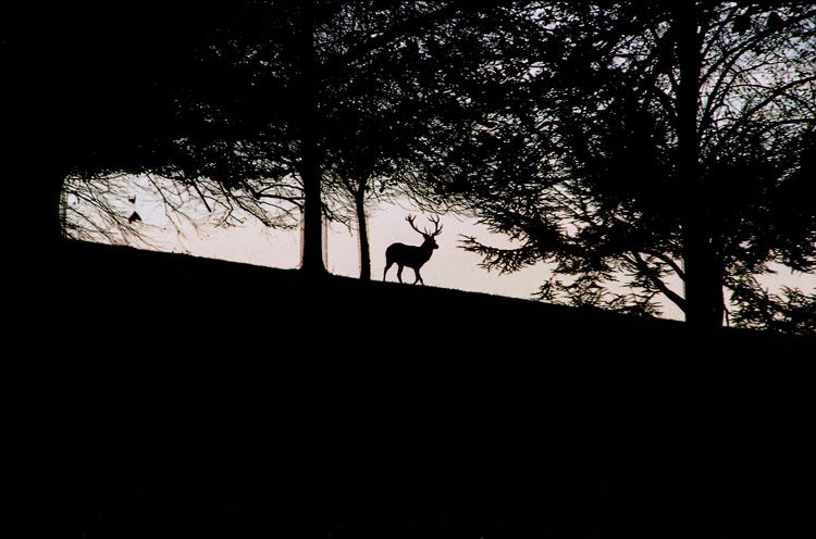
It is a colour negative original and the only change made, bar cropping the second one, is to zap the colours with a gamma adjustment and apply a tad of USM. So yes, there are a number of other options to play with.
There is also some fringing on the edges - probably on the original but may be due to the scan or augmented by the scan so I may play with the options there as well. However if the image doesn't appeal to the PH massive (Photography section) as an image there is probably not much point in taking the time to mess around with it. Hence the question.

Thanks for the input joust. What adjustments did you make?
Cropped.
Converted to greyscale
Then used the "levels" box to darken the dark parts and lighten the light parts (in PS, pull inwards the far left and far right ajustment arrows). That makes the sky "whiter".
I then did a "smart blur" (photoshop CS - you can do the same with a blue and then unsharp mask) to get rid of the artifacts in the sky whilst preserving the edge crispness.
The second image shows all sort of horrible chromatic issues, I don't think you'll get very far with that one apart from taking the original hi-res image, converting to GS, then convert to B&W, and then "smooth scale" the result back into greyscale. If you post a 200dpi original I could have a play for you.
J
simpo two said:
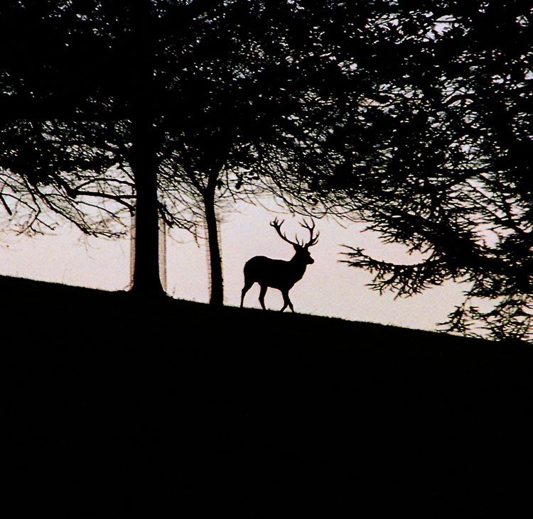
I liek the cropped version, but the tree guards look ugly.
Which cropped version? Joust's re-work or the 'square' crop from the original?
I have to say that my preference would be the full shot with the joust work applied but the initial rough crop was the result of a feeling that the central image of the stage may have been a bit too lost in the scale of the whole frame originally. Hence the post was about general form of the image but joust has provided me with a number of very useful tips on the detail side that I will be playing with later in order to become full cognisant!
simpo two said:Agreed - but I run out of time before having to go out for the evening to remove them. It wouldn't take that much PSing to get rid of them.
I liek the cropped version, but the tree guards look ugly.
It's a shame that landowners feel the need to put them around mature trees. The deer and trees existed fine for 1000's of years without them, but now we seem obsessed with keeping the deer from nibbling at the bark. It's surely going to result in years to come with only "perfect" trees, and the narled twisted old oaks and sycamores of my age will be no more.
Shame really.
J
joust said:
I liek the cropped version, but the tree guards look ugly.
It's a shame that landowners feel the need to put them around mature trees. The deer and trees existed fine for 1000's of years without them, but now we seem obsessed with keeping the deer from nibbling at the bark. It's surely going to result in years to come with only "perfect" trees, and the narled twisted old oaks and sycamores of my age will be no more.
Shame really.
J
I'm in two minds about leaving the tree guards in place.
I think the guards may be there to protect the trees from the local yoof rather than the smallish herd of deer. Climbing (H&S public liability stuff no doubt) and carving come to mind.
Maybe not, probably is a deer thing.
That one was great. It watched a few cars pass. When it was quiet for a moment it sussed out the tapes marking the route and jumped over some, crossed a couple of paths and then ducked under the last tape it wanted to traverse having deemed it a bit high for jumping. It moved the tape up out of the way with its antlers, passed underneath and went off after others of the herd.
For some reason I was expecting human like behaviour - just barge through and rip the tape, but it was completely the opposite.
Of course what its behaviour would have been like without the police presence we can only guess.

Revised ...
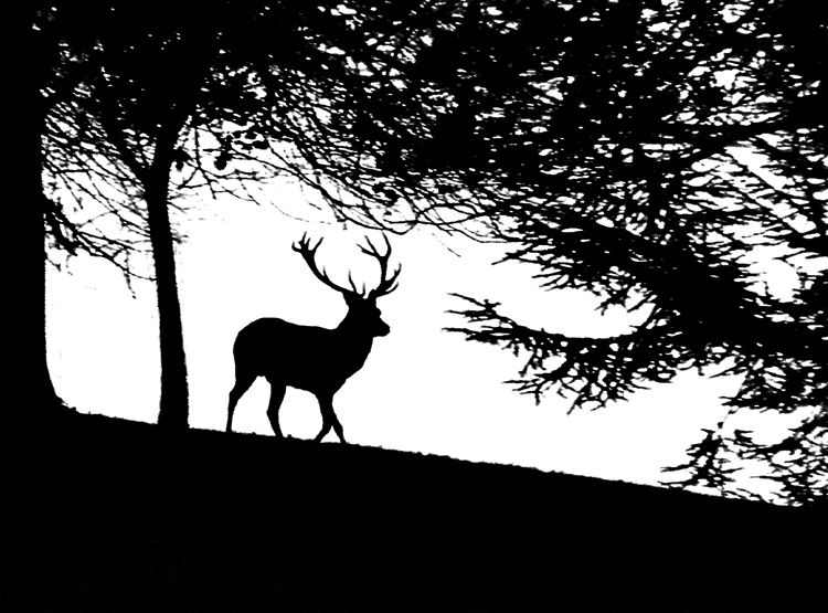
Now that's interesting. In deference to Simpo Two I cloned the tree protectors away. Not a perfect job at the edges on the trunks but enough to see the different effect.
Posted up on here there is some evidence of missing a few pixels here and there. On the notebook screen I am using for editing the newly 'white' sky area looks completely clear. The only way I can see the missed pixels is to crank the grey level right up towards the white level adjuster.
So, does that imply that I am running the screen too bright (I Did run an approximate colour calibration on it a while back but can't recall what the basis was off the top of my head).
Changing the screen brightness seems to make no difference at all, but the same file on a different screen running at a lower resolution and there they are. Hmm. Something else to watch out for.
Changes - convert to greyscale (which I should have done first time really but ... stretched the levels as joust suggested, a tad of extreme USM and the not quite complete edit mentioned above. Oh, and a bit more of a crop.
>> Edited by LongQ on Sunday 4th December 01:10
LongQ said:Laptops have cheap LCDs unfortunatly to meet the price point, and are very poorly "lit" due to power consumption concerns.
So, does that imply that I am running the screen too bright (I Did run an approximate colour calibration on it a while back but can't recall what the basis was off the top of my head).
There is very little you can do I'm afraid, apart from purchase one of those £200odd screen calibrating gizmos which should be able to compensate.
J
joust said:
So, does that imply that I am running the screen too bright (I Did run an approximate colour calibration on it a while back but can't recall what the basis was off the top of my head).
There is very little you can do I'm afraid, apart from purchase one of those £200odd screen calibrating gizmos which should be able to compensate.
J
The Dell notebook is running a UXGA (or is it WXGA? Whichever the top spec is) screen at 1920 x 1200 and 32bit colour.
By comparison my other main screen on the Desktop system is a 15" Sony TFT running at 1024x768 and 32bit colour. So I assume the difference is somehow explained by the lower resolution - or the higher resolution ...
I thought I would re-scan the negative at 200dpi and see what that gives. I'll post it when done. With luck it may be later tonight but is more likely to be tomorrow based on the way today is going!
Gassing Station | Photography & Video | Top of Page | What's New | My Stuff