
Suggestions for Improvement
Discussion


I don't like the tree in the foreground, I think that's the problem.
But... Just a change of the levels to make it more dramatic.
Push the mid point towards the top, and drop the end point

Second one is a clone out of the tree in the foreground and then crop on the valley with a bit less on the levels adjustment.

But... Just a change of the levels to make it more dramatic.
Push the mid point towards the top, and drop the end point
Second one is a clone out of the tree in the foreground and then crop on the valley with a bit less on the levels adjustment.
I agree about the trees getting in the way, it stops your eye following the "path" down the valley in the middle of the pic. Cropping it out totally gives a similar effect though, and makes your eye fall out through the bottom of the pic - it also loses the little houses at the bottom of the pic which I love because they give a sense of scale. I have cloned it out here, given it a slight vignette and a graduated filter over the sky to bring out the details. Maybe I have been watching too much Top Gear 
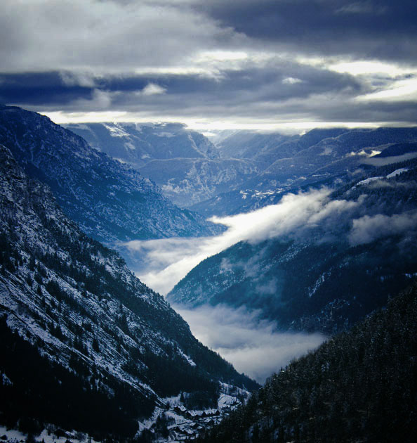
Hmm, tricky isnt it. It might stand being desaturated a bit, the blue looks a bit too intense and I'd like to chop some sky out, but that would take it further away from the rule of thirds. Of course photographic rules are meant to be broken...
Mike
Hmm, tricky isnt it. It might stand being desaturated a bit, the blue looks a bit too intense and I'd like to chop some sky out, but that would take it further away from the rule of thirds. Of course photographic rules are meant to be broken...
Mike
Gassing Station | Photography & Video | Top of Page | What's New | My Stuff