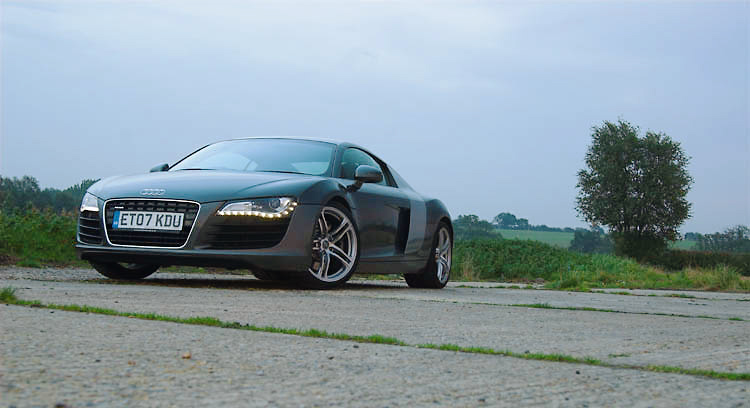
Audi R8 shoot - part one
Author
Discussion

trackdemon

Original Poster:

13,476 posts

292 months

Thursday 29th November 2007
quotequote all
Did this over a month ago now, but just got round to posting! Fantastic car, just as good as the hype suggests - I would choose one over a C2, although not a GT3! wink


Forthright MC

8,362 posts

314 months

Thursday 29th November 2007
quotequote all
great set of pics! love that bottom one, the sky creates a great effect and the LED running lights on the car look great lit up too!
good work! thumbup

2jamesl

1,346 posts

246 months

Thursday 29th November 2007
quotequote all
Hey, I really like the pictures but they almost seem to be lacking contrast? Is it due to the resizing or is that just the effect you like best?

LJ

RobDickinson

31,343 posts

285 months

Thursday 29th November 2007
quotequote all
Yeah lacking a bit of pop I think?

And those led lights are woefull.

_dobbo_

14,619 posts

279 months

Friday 30th November 2007
quotequote all
Last one is very nice - once again though I think you're way over compressing these, and it's that that is making them look less sharp and have less contrast, and also they look very noisy which I'm sure they aren't.

trackdemon

Original Poster:

13,476 posts

292 months

Friday 30th November 2007
quotequote all
_dobbo_ said:
Last one is very nice - once again though I think you're way over compressing these, and it's that that is making them look less sharp and have less contrast, and also they look very noisy which I'm sure they aren't.
Strange, as they look fine on my screen - no noise, and plenty contrast. They are resized @ 750pixels wide to avoid PH clipping them, so compression is same as others.

J111

3,354 posts

246 months

Friday 30th November 2007
quotequote all
I don't see a big problem with compression or noise, but the contrast doesn't look right to me, either. Very flat, with grey blacks and burnt out skies. Couple of stops over, maybe ?

Reidy10_0

1,123 posts

235 months

Friday 30th November 2007
quotequote all
I would be happy with the last pic

Scho

2,479 posts

234 months

Friday 30th November 2007
quotequote all
trackdemon]c said:
i don't know about noise but re-sizing for the web is allways going to cause a bit of jpeg damage.

looking at the levels you don't have much true black at all in the image. auto contrast on PS did this:


the sky has detail in it so i wouln't describe it as burnt out, it's not over exposure.

I think this effect is caused by lens flare ,which doesn't allways need to be visable in the form of those wierd disc things. this can really lower the contrast of an image.his might be a style thing which i quite like actually....refreshingly subtle.

btw i think the image i've quoted has real atmosphere.


Edited by Scho on Friday 30th November 10:20

_dobbo_

14,619 posts

279 months

Friday 30th November 2007
quotequote all
trackdemon said:
_dobbo_ said:
Last one is very nice - once again though I think you're way over compressing these, and it's that that is making them look less sharp and have less contrast, and also they look very noisy which I'm sure they aren't.
Strange, as they look fine on my screen - no noise, and plenty contrast. They are resized @ 750pixels wide to avoid PH clipping them, so compression is same as others.
I keep my screen pretty well calibrated so I hope my viewing environment is as good as it can be.

For example - in the last one there are massive compression artifacts in the sky which makes it look noisy even though it's not - it's only 46kb which for a photo at 750px wide is very low - I'd be aiming for more like 100kb at least, probably closer to 150kb.

The same is true on your rig thread - dcw@pr's photos look sharper and have more clarity, and it's because they are nearly 3 times the file size, and so contain more colour and more detail.

I think your photos suffer from this and they needn't do! Feel free to ignore me though.

finnyuk

173 posts

234 months

Friday 30th November 2007
quotequote all
The R8 is a lovely car. personal opinion and please dont take it the wrong way, not to keen on the first 3 pics, really like the back end pic and the one below. however I would alter the levels and contrast a bit tobring the colours up a bit.

If you dont mind, I'll do a little tweak on one and turn it into an animation so you can see the difference.


Podie

46,649 posts

306 months

Friday 30th November 2007
quotequote all
_dobbo_ said:
Feel free to ignore me though.
ears

What..?

hehe

finnyuk

173 posts

234 months

Friday 30th November 2007
quotequote all
ok tweak done.... see what you think.


pbsaxman

977 posts

256 months

Friday 30th November 2007
quotequote all
finnyuk said:
ok tweak done.... see what you think.

Thats so clever thumbup

After for me smile

finnyuk

173 posts

234 months

Friday 30th November 2007
quotequote all
pbsaxman said:
finnyuk said:
ok tweak done.... see what you think.

Thats so clever thumbup

After for me smile
haha cheers, all done in Photoshop including the animation.

tim-b

1,279 posts

241 months

Friday 30th November 2007
quotequote all
i also had a pop at this one, took some of the blue out and carefully adjusted the contrast to preserve the details:


also slightly sharpened it (but dobbo is right, the images are overly compressed!)

what do you reckon?