
serious question about spot colour
Discussion


I know it's generally hated, and I can understand why - but I've started a new little project up here - Over the next year or so I'm going to take a photo of all the residents of the local village (<80 people) doing what they do - which is mainly going out on fishing boats, sheep farming, running the local shop, making stained glass art, fixing outboards, joinery etc etc - and then make it into a book, as a 'snapshot' of people in 2008 up here in the most remote bit of mainland Britain.
So I've been experimenting with using B&W with VERY subtle use of colour - sometimes adding tints.
Not sure if it's naff or not.
Do you like or hate the subtle color added?
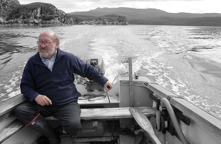
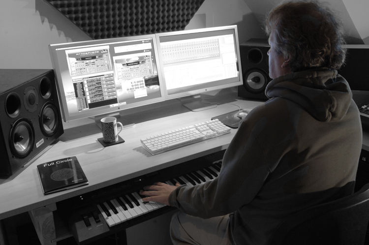
TIA
So I've been experimenting with using B&W with VERY subtle use of colour - sometimes adding tints.
Not sure if it's naff or not.
Do you like or hate the subtle color added?
TIA
Not sure. I suppose you have to think more about what your publisher and the readership like, not yourself or us.
What does old McTavish think when he's sitting on the steps of his be-turfed croft mending his nets when this ex-pat Englishmen comes hooning past in his Aston throwing gravel in his face and a Dukes of Hazzard airhorn blasting out?!
What does old McTavish think when he's sitting on the steps of his be-turfed croft mending his nets when this ex-pat Englishmen comes hooning past in his Aston throwing gravel in his face and a Dukes of Hazzard airhorn blasting out?!

Nope. Simply because I think it takes too much away from the image, I can foresee a pic of - say - a fisherman at work with colour in his clothes, his boat, the fish, the surrounding hills (& probably a beautiful sky as its you)..... I think the colour palette is part of what would make the picture so attractive to look at.

Thanks guys.
The pics above are desaturated to 37% - I'll play around a bit more.
I take on the point about 'what they do' needing colour - my reasoning is that I don't want the scenery to detract... again I'll have a play
As for old McTavish... when he sees me in the Aston he generally jumps in for a passenger ride (they are brilliantly uncool up here).
The pics above are desaturated to 37% - I'll play around a bit more.
I take on the point about 'what they do' needing colour - my reasoning is that I don't want the scenery to detract... again I'll have a play
Simpo Two said:
Not sure. I suppose you have to think more about what your publisher and the readership like, not yourself or us.
What does old McTavish think when he's sitting on the steps of his be-turfed croft mending his nets when this ex-pat Englishmen comes hooning past in his Aston throwing gravel in his face and a Dukes of Hazzard airhorn blasting out?!
Well the only people that would buy it would be local residents, It's not for a wider audience ... plus hopefully one copy will survive the third world war and people could look and see what life was like at the beginning of this century.What does old McTavish think when he's sitting on the steps of his be-turfed croft mending his nets when this ex-pat Englishmen comes hooning past in his Aston throwing gravel in his face and a Dukes of Hazzard airhorn blasting out?!
As for old McTavish... when he sees me in the Aston he generally jumps in for a passenger ride (they are brilliantly uncool up here).
Edited by GetCarter on Friday 21st March 11:52

GetCarter said:
as a 'snapshot' of people in 2008 up here in the most remote bit of mainland Britain.
TIA
Now steady on there matey TIA
 I know Sheildaig is a bit of a hike from the Central belt and all that...

Anyway, to the question...I can see what you want to do - bring out the characters - but whilst my initial thought was "yes" on reflection, I think 80 odd pages might grate a bit after a while. I'm all in favour of selective colouring on the odd photo where it genuinely enhances the image (god knows I'm guilty in the past of poor examples as well) but I think they work in small dosages.
Still, think about it from the non-photographers perspective (the target market) and it might work?
All the best with it anyway.
GetCarter said:
Well the only people that would buy it would be local residents, It's not for a wider audience
Okey doke, well how about making a few variants as prints and then going out and asking a few? As you say spot colour is an effect that can wear off and maybe we're used to it, but old McTavish might jump for joy at the sight of it.Then again, if your ambition is to make a record of life, then natural full colour would be more appropriate - like that Kahn geezer.
Actually I just found this - it's spot colour!


From www.bbc.co.uk/bbcfour/documentaries/features/alber...
Edited by Simpo Two on Friday 21st March 15:26
Thanks again... been doing a bit of 'market research' and - well let's face it, completely predictably, photographers generally hate it but the 'public' love it.
However, It may well be such a dated concept that I'll have to think of something else (I really don't just want 80 photos, I want some sort of visual theme)
ETA: That's a bit spooky, posted this and read the above... which is just what I did.
However, It may well be such a dated concept that I'll have to think of something else (I really don't just want 80 photos, I want some sort of visual theme)
ETA: That's a bit spooky, posted this and read the above... which is just what I did.
Edited by GetCarter on Friday 21st March 15:44
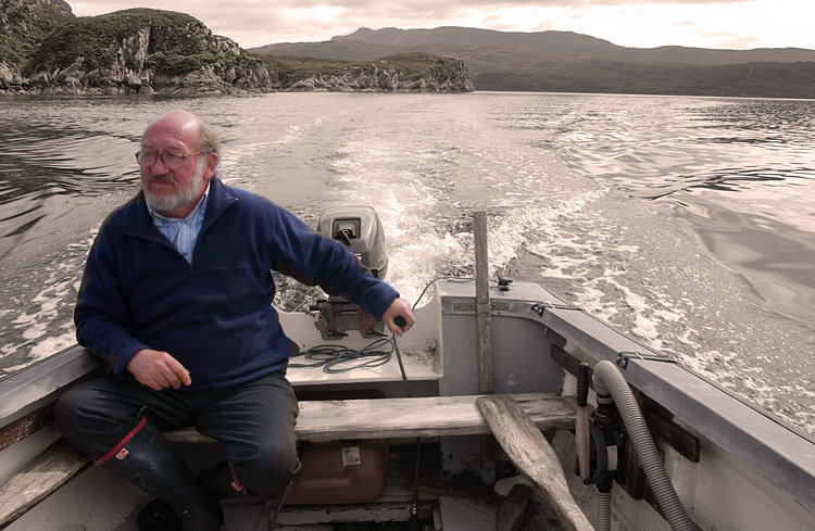
hi carter,
i thinkt that idea sounds fantastic. are you aware of the photographer august sander? he did a project called people of the 20th century. awesome stuff. lots of photos of people in thier work environment.
http://images.google.co.uk/images?hl=en&q=augu...
sort of uses thier proffesion as thier identity.
as for selective colour ect i'd shoot it straight. it's a strong concept and too much faff might be distracting.
rick.
Interesting project Steve!
And is it the residents that have decided that it will not go on general sale? It would be a pity if tourists couldn't buy a copy and help raise funds for the community/local charity etc
Good luck with it, make sure to post the results as you get them
Longers
Jenx said:
Not keen I'm afraid...your photography holds up without naf clichés.
mcgus said:
I can see what you want to do - bring out the characters - but ........ I think 80 odd pages might grate a bit after a while. I'm all in favour of selective colouring on the odd photo where it genuinely enhances the image ......... but I think they work in small dosages.
Totally agree with both of above. Where limited use of colour might help is pic's like keyboard / screen one above - would it look better with the screen in colour as well to show where the colours are "reflecting" from on the person and help the surrouding objects merge into the background? GetCarter said:
I take on the point about 'what they do' needing colour - my reasoning is that I don't want the scenery to detract... again I'll have a play
Surely the scenery can help put into context where and in what conditions some of people work in (assuming you'll go with a fisherman or farmer on a less than perfect summers day!)....?And is it the residents that have decided that it will not go on general sale? It would be a pity if tourists couldn't buy a copy and help raise funds for the community/local charity etc
Good luck with it, make sure to post the results as you get them
Longers

Steve,
The project sounds excellent - great idea
I think the spot colouring could work if the person is desaturated slightly, and if the B&W areas were more bold and contrasty - alike pushing Tri-X a stop or two - and this is where I feel your examples possibly don't work as well as they could.
This was a cool project: http://www.365portraits.com/ alike what you're considering doing, and may give you some ideas
Good luck!
Simpo Two said:
Scho said:
as for selective colour ect i'd shoot it straight.
Wow, you can shoot in spot colour then?! 
NB: Looking more closely at the Kahn photo I posted earlier I think it's actually be just reds, not spot colour. Still odd though.
Edited by Simpo Two on Friday 21st March 16:56

Gassing Station | Photography & Video | Top of Page | What's New | My Stuff