
A couple of logo designs.
Discussion


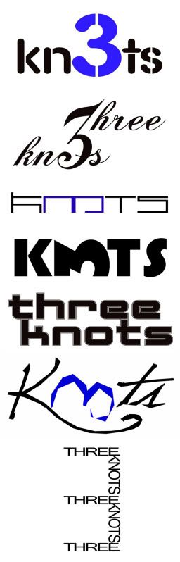

I don't like the top two - too fussy, difficult to read from a distance, not immediately recognisable.
I'd go for the 3rd last one - with the two words on separate lines - modern font which suits the style of music - easily readable/recognisable which is very important. I reckon you'd be changing the top two very quickly....
I'd go for the 3rd last one - with the two words on separate lines - modern font which suits the style of music - easily readable/recognisable which is very important. I reckon you'd be changing the top two very quickly....
Gassing Station | Photography & Video | Top of Page | What's New | My Stuff