
Brewery website design
Discussion


I'm designing a website for a client. I've been told to go with nice bright, bold and contrasting colours so hopefully this'll satisfy him.
Any thoughts on the design? It doesn't look cheap and nasty does it?
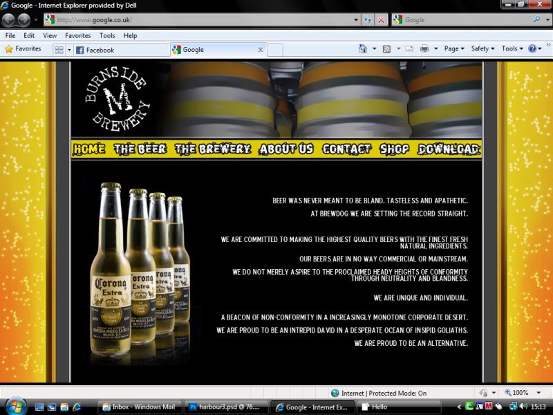
The text and bottles of corona are just gap fillers until I do some product photography for them.
Any thoughts on the design? It doesn't look cheap and nasty does it?
The text and bottles of corona are just gap fillers until I do some product photography for them.
Edited by Blukoo on Friday 3rd September 16:52
Don said:
Given it's Brewdog you are making the website for I personally think that's great.
The people who make Punk IPA and put the "You WIN! nothing..." cards on the bottles need something with some punch. A little bit tacky is probably a good thing!
Its not actually for Brewdog. As I said, I just borrowed a chunk of text to fill the gaps until I have more input from the client. However, i'm sure the brewery aim to hit a similar market.The people who make Punk IPA and put the "You WIN! nothing..." cards on the bottles need something with some punch. A little bit tacky is probably a good thing!
ruaricoles said:
I think that looks good; I'm not familiar with the particular brewery or its products, but assuming it's fun & light-hearted stuff I'd say your design is well suited.
Of course, if you'd like to send some of the beer through as well I'll be in a much better position to judge
I'm still trying to get my hands on a few bottles for "product photography" Of course, if you'd like to send some of the beer through as well I'll be in a much better position to judge
 Hopefully you'll see some of their product in a pub near you shortly.
Simpo Two said:
I'd put the text left and the bottles right.
That is an idea I toyed with, but with that particular image I found it led your eye to the text. Depending on the image I use on the real site, the layout may change.Thnaks for the input
Blukoo said:
Simpo Two said:
I'd put the text left and the bottles right.
That is an idea I toyed with, but with that particular image I found it led your eye to the text. Depending on the image I use on the real site, the layout may change.Thnaks for the input
Gassing Station | Photography & Video | Top of Page | What's New | My Stuff