Smartphone Data Aquisition
Discussion


I started looking into smartphone data acquisition a while back, purely because it didn't cost anything and I found it quite interesting.
This started out after using gimmicky apps like RevLite, Dynolicious, Harry's LapTimer etc. The data as presented on screen, even when overlaid over video, was nice looking but not really useful in the slightest. I wondered if, with all that computing power in our pockets nowdays, could you actually glean some decent information from it for the sort of events I do (autotests/sprints)?
A couple of quid on a specialised data capture app (without any bells or whistles) and a bit of work with the raw data and you can get something far more useful, particularly if you car share, as you can compare corner by corner and see the lead change over the run.
Sadly, by the time I started to plot the idea out, my competition car spun it's wheels for the last time and I didn't bother working on it any more. Now I'm back at the events after a 2 year break, I thought I'd make use of the almost purpose made moulding in the MX5's centre console, the decent capture app and finish sorting out the spreadsheet I made.
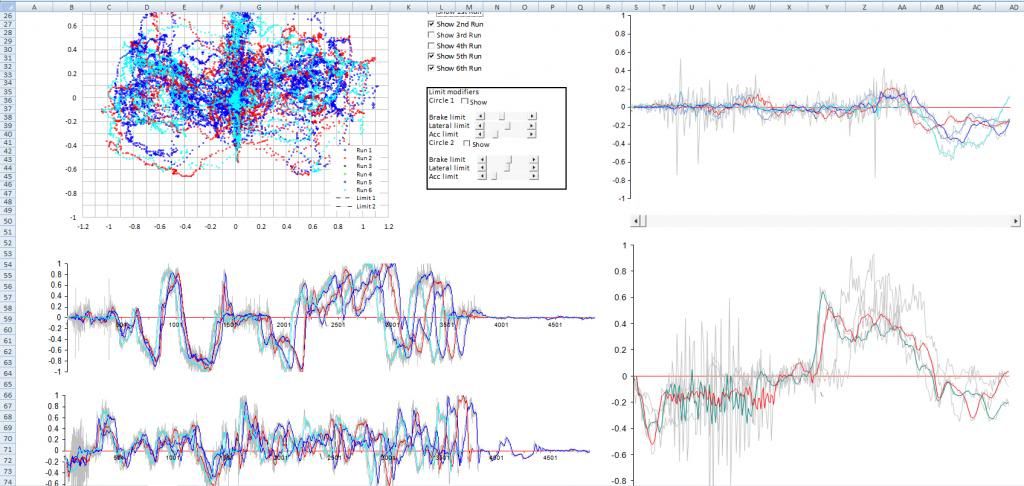
Here's the result of a few hours work pulling the raw data into something remotely useful.
 [/center]
Nothing's labelled on it yet.
Top left, a 'GG plot'. Basically a record of that XY G plot you see on racing games, F1 overlays etc. Essentially shows you your friction circle, and how well you're using it.
I'm not doing a very good job.
Here's my first run in blue, vs fastest in cyan. There are tick boxes for each run to show/hide each data trace.
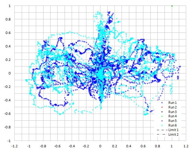
Those cheapy Uniroyals look suprisingly grippy...
Middle left, to lateral acceleration over the full run. Negative is right turns.
Bottom left, longitudinal acceleration over the full run. Positive is braking.
The larger plots on the right are zoomed in versions of the full run plots, which can be scrolled across, and also each run advanced to compare individual corners/braking points. In the first image, you can see the zoomed long. acc. one is showing the first section until just after the first braking zone on the full plot.
The grey lines are the raw data, sampled at 80hz. This is too noisy to really be useful, so the coloured lines are each run with some of the noise filtered out. This has created a seriously heavy spreadsheet so it can only hack four runs at 80hz.
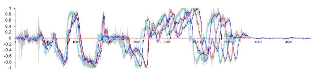
Here's a zoomed in plot of the lat. acc. through the first slalom and 180, coming back towards the finish box:
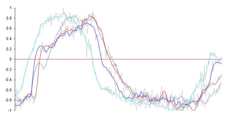
Cyan was my fastest run, clearly a lot smoother than the earlier runs.
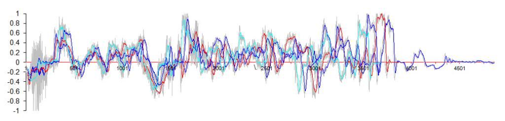
Here's acceleration off the line:
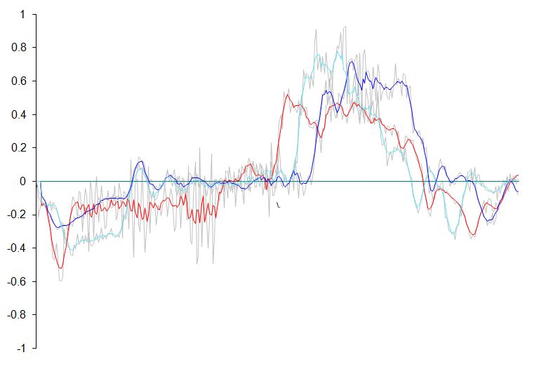
Red - Johnnybigpotatoes wheelspin launch.
Blue - Hooked up but bogged down.
Cyan - Hooked up properly
I'm not expecting this to turn me into a winner or anything of the sort, or for that many people to understand the appeal of going to so much effort to get some colourful squiggles, I just find it interesting to see exactly how and where time is lost and gained, especially given that this sort of stuff is so easy to get now.
Anyhow, that's what I done instead of watching s t on TV this evening. Anyone else done something similar?
C&C welcome.
This started out after using gimmicky apps like RevLite, Dynolicious, Harry's LapTimer etc. The data as presented on screen, even when overlaid over video, was nice looking but not really useful in the slightest. I wondered if, with all that computing power in our pockets nowdays, could you actually glean some decent information from it for the sort of events I do (autotests/sprints)?
A couple of quid on a specialised data capture app (without any bells or whistles) and a bit of work with the raw data and you can get something far more useful, particularly if you car share, as you can compare corner by corner and see the lead change over the run.
Sadly, by the time I started to plot the idea out, my competition car spun it's wheels for the last time and I didn't bother working on it any more. Now I'm back at the events after a 2 year break, I thought I'd make use of the almost purpose made moulding in the MX5's centre console, the decent capture app and finish sorting out the spreadsheet I made.
Here's the result of a few hours work pulling the raw data into something remotely useful.
[/center]Nothing's labelled on it yet.
Top left, a 'GG plot'. Basically a record of that XY G plot you see on racing games, F1 overlays etc. Essentially shows you your friction circle, and how well you're using it.
I'm not doing a very good job.
Here's my first run in blue, vs fastest in cyan. There are tick boxes for each run to show/hide each data trace.
Those cheapy Uniroyals look suprisingly grippy...
Middle left, to lateral acceleration over the full run. Negative is right turns.
Bottom left, longitudinal acceleration over the full run. Positive is braking.
The larger plots on the right are zoomed in versions of the full run plots, which can be scrolled across, and also each run advanced to compare individual corners/braking points. In the first image, you can see the zoomed long. acc. one is showing the first section until just after the first braking zone on the full plot.
The grey lines are the raw data, sampled at 80hz. This is too noisy to really be useful, so the coloured lines are each run with some of the noise filtered out. This has created a seriously heavy spreadsheet so it can only hack four runs at 80hz.
Here's a zoomed in plot of the lat. acc. through the first slalom and 180, coming back towards the finish box:
Cyan was my fastest run, clearly a lot smoother than the earlier runs.
Here's acceleration off the line:
Red - Johnnybigpotatoes wheelspin launch.
Blue - Hooked up but bogged down.
Cyan - Hooked up properly
I'm not expecting this to turn me into a winner or anything of the sort, or for that many people to understand the appeal of going to so much effort to get some colourful squiggles, I just find it interesting to see exactly how and where time is lost and gained, especially given that this sort of stuff is so easy to get now.
Anyhow, that's what I done instead of watching s
t on TV this evening. Anyone else done something similar?C&C welcome.
What I'd love to be able to do is look at my datalogging on my phone. Or an iPad (previous customer had an iPad, but it was useless at race meetings other than watching F1 on Sky Go!).
If there was some way I could get my data (from Bosch, AiM, Racepak, Race Technology, Motec etc) onto the phone so I can overlay laps or runs, see a track map with data on it, Zoom in, see max and mins on a phone or tablet without any hassle other than perhaps plugging it in to a laptop.
I suspect my wishes won't be granted for many years at club level.
What you've done is nice though. I like your smoothing - quite a complex sheet of equations I'd imagine.
Yes, that would be ideal, looking at the data after event is of limited use, being able to check back to back runs would be much more useful.
If I knew how to program, I would give it a shot! Any app developers want to team up and create something?
If I knew how to program, I would give it a shot! Any app developers want to team up and create something?
Edited by Kozy on Thursday 7th March 16:06
Kozy said:
Yes, that would be ideal, looking at the data after event is of limited use, being able to check back to back runs would be much more useful.
If I knew how to program, I would give it a shot! Any app developers want to team up and create something?
Interesting. What software did you use?If I knew how to program, I would give it a shot! Any app developers want to team up and create something?
Edited by Kozy on Thursday 7th March 16:06

I did quite a lot of logging on AutoSolos a few years back. I only logged GPS position with a 5Hx QStarz BT818X receiver. I derived a lot of useful information from it. I'd suggest looking at WiFiLapper for logging data on an Android phone. It supports IOIO and OBD devices for reading sensor data from the car. To analyse, I'd recommend XoomCentre, which is the best software I've found for sprints/autosolos and imports CSV format from WifiLapper. The developer is a hillclimb competitor and keen to help.
I remember analysing lines on different runs and seeing differences of a metre or two, which correlated well with the onboard video. With a decent GPS receiver (QStarz BT818X) rather than the internal one in the phone and good placement (base of the windscreen), the data is usable and repeatable between runs. Of course, runs in AutoSolo are just a few minutes apart, so GPS drift is negligible. I do notice more GPS drift at sprints where first practice can be 6 hours before the last timed run. XoomCentre accounts for GPS drift by converting lat/long into GPS x and GPS y in metres, normalising the data by using acceleration data to determine the start position. Without accelerometer data, you'll need to simulate it from GPS data, for which you could write a plugin for XoomCentre.
Gassing Station | UK Club Motorsport | Top of Page | What's New | My Stuff