
Lane markings - Newbury Robin Hood Roundabout
Discussion


Is there anything wrong with the arrows or lines in this image:
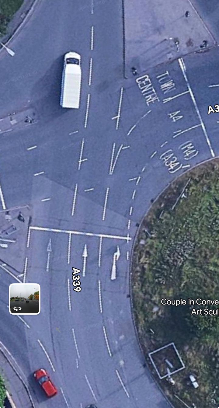
Lane 1 shows a straight ahead arrow, which the white van has followed.
Lane 2 also shows a straight ahead arrow.
Lane 3 shows a right turn arrow, therefore from this lane you then take up the Town Centre lane, or A4 lane, or (M4)/(A34) lane.
However, (if you ignore the straight ahead arrow) there are two painted lines that make it look like you can filter from Lane 2 directly into the Town Centre lane.
Like this:
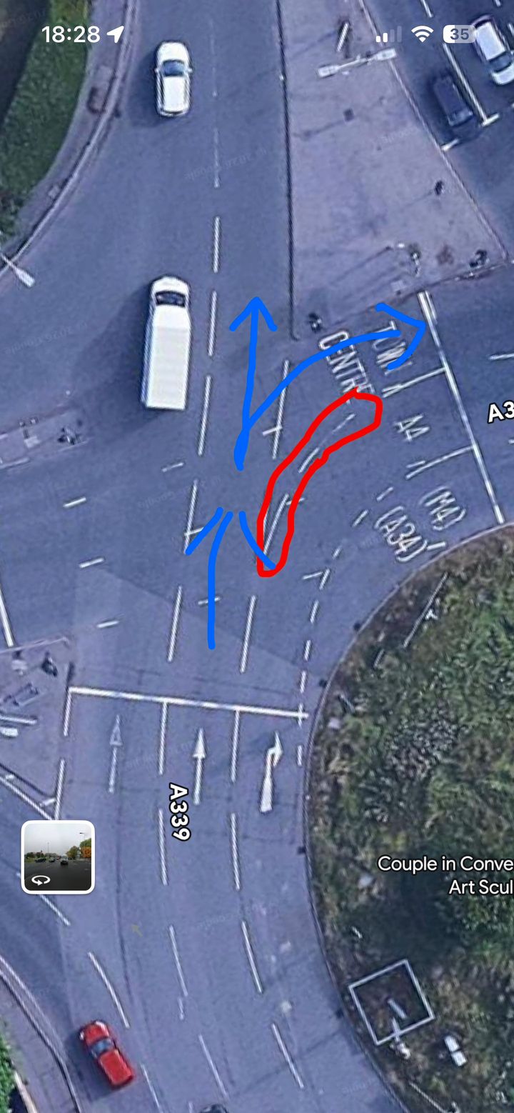
Should the two lines circled red be removed? Or made into smaller lines with more of them?
Should the straight ahead arrow in lane 2 be changed to a straight ahead or right arrow?
Or are no changes required and everything is exactly as it should be?
Interested to read expert opinion on what you see from the images…
Lane 1 shows a straight ahead arrow, which the white van has followed.
Lane 2 also shows a straight ahead arrow.
Lane 3 shows a right turn arrow, therefore from this lane you then take up the Town Centre lane, or A4 lane, or (M4)/(A34) lane.
However, (if you ignore the straight ahead arrow) there are two painted lines that make it look like you can filter from Lane 2 directly into the Town Centre lane.
Like this:
Should the two lines circled red be removed? Or made into smaller lines with more of them?
Should the straight ahead arrow in lane 2 be changed to a straight ahead or right arrow?
Or are no changes required and everything is exactly as it should be?
Interested to read expert opinion on what you see from the images…
What they should have done is put a 2 way arrow on the centre one to be technically correct to tell people they can go either straight on or turn right. This would also deconflict anyone going right as it is now and then moving into the left most lane if somebody ignore the straight ahead arrow.
Agree, the centre arrow would be better with a SO/R arrow.
Problem with these arrangements starts that they look great and clear on the drawing but when the markings are not well maintained as appears to be the case from looking at this island on satellite it gets confusing for drivers unfamiliar to the junction. That's particularly the case if locals seem to use their own interpretation.
Problem with these arrangements starts that they look great and clear on the drawing but when the markings are not well maintained as appears to be the case from looking at this island on satellite it gets confusing for drivers unfamiliar to the junction. That's particularly the case if locals seem to use their own interpretation.
Gassing Station | Roads | Top of Page | What's New | My Stuff