Discussion


Deckchairs and titanic spring to mind, i don’t know why companies bother to focus on re-branding when they are in trouble.
My bet is this is all driven by branding being visible on f1 cars on the TV, nothing that benefits the car company.
I wonder if its cheaper to make as it has less raised metal ridges - once you have paid for all the retooling……
My bet is this is all driven by branding being visible on f1 cars on the TV, nothing that benefits the car company.
I wonder if its cheaper to make as it has less raised metal ridges - once you have paid for all the retooling……
Edited by oilit on Wednesday 20th July 17:35
Would I have noticed the change if they hadn't told us about it? I suppose so, but it's hardly earth shaking. Still looks fine to me.
But as always, I feel so much more warm and fuzzy about it after hearing Marek's explanation as quoted in today's Autocar article:
Marek Reichman, chief creative officer, added: “Because we are designing to make people fall in love, to connect with the hearts and minds of our customers, every object we design at Aston Martin has deep meaning and intention and is created with honesty and emotion.”
Jon39 said:
Others will know more about this than me, but there are reasons for the different background colours for wings badges.
I think a green background suggests a normal engine.
Is it black for higher powered engines?
There is red too, but not sure when that is used.
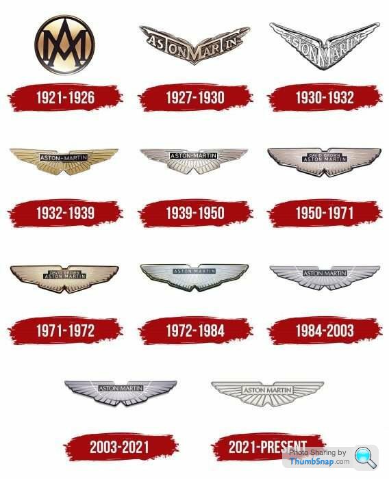
I reckon that the vast majority of the general public won’t be able to tell the difference between the new one and the old one. It is such a waste of time, resources and money. But is anyone on here really that surprised nowadays?
Best Regards
Minglar
Jon39 said:
Others will know more about this than me, but there are reasons for the different background colours for wings badges.
I think a green background suggests a normal engine.
Is it black for higher powered engines?
There is red too, but not sure when that is used.
So Jon, given my Cygnet has a very large (oversized) black background then I had to go and check under the bonnet in case there was a v8 in there and I hadn’t realised - but alas its still a straight 4 lol


nathwraith1 said:
As a 31 year old and considered “younger” by Aston, I don’t really understand the logo change. Just seems like doing something for the sake of it. Would rather them put more effort into the products than marketing pomp.
On a similar note, what were they thinking at KIA? Is it only me that can only see K and a backwards N?
I found myself on a page where the new badge and re-branding were being discussed.
Was puzzled by the high frequency of posting, then realised I was on the General Gassing forum.
amongst the criticism is some humour.
They are now on page 6 already.
A couple of extracts;
'I never realised that was the reason I ended up in a 911 not an Aston. And all the while I thought it was because the recent batch look hideous from the front - but change the badge and it's sorted!
'As a young dude, I must admit that the wings were holding me back from ordering a new Aston. Now they have given me new wings (that I love) I will now be placing my order. And here was I thinking I would never own a brand new Aston. Praise the Lord.'
'Is that all they had to do to get Aston Martin back in super car buyers pockets and turning a profit? I bet Lionel Martin, Robert Bamford, David Brown and every other person who's never made a penny owning them is kicking themselves they never thought of such a cunning plan to turn things around.'
https://www.pistonheads.com/gassing/topic.asp?h=0&...
Gassing Station | Aston Martin | Top of Page | What's New | My Stuff