
best / favourite manufacturer logo
Discussion


Just wondering what people's favourite manufacturer logo is and the reasons why?
Most people will probably tend to specify logos of their own cars, but I'm ideally interested to hear about the logo itself - design, typography, colour, shape, what makes it special. Ideally not what the brand itself stands for (price, performance, quality etc).
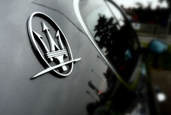
I really like the simplicity of the Aston Martin wings, and the Mercedes logo, but my favourite is Maserati.
We all know the logos, but here they are (courtesy of screen grab of Parkers):


Most people will probably tend to specify logos of their own cars, but I'm ideally interested to hear about the logo itself - design, typography, colour, shape, what makes it special. Ideally not what the brand itself stands for (price, performance, quality etc).
I really like the simplicity of the Aston Martin wings, and the Mercedes logo, but my favourite is Maserati.
We all know the logos, but here they are (courtesy of screen grab of Parkers):


 ksocks! I hate you!


Possibly Rolls Royce and Skoda for me... One for looking like an old engineered plate in a very 'manly' concise format, and the latter for the use of colours, I just like them... Followed closely by Renault which i think is quite timeless.
Others I hate include Ford because it's just so naff, Hyundai because it looks so dated, and Porsche because it just doesn't apply to the brand. Yes I do like Porsche as a brand, just not the physical badge itself.
Others I hate include Ford because it's just so naff, Hyundai because it looks so dated, and Porsche because it just doesn't apply to the brand. Yes I do like Porsche as a brand, just not the physical badge itself.




Gassing Station | General Gassing | Top of Page | What's New | My Stuff