
Chris Ward C900 Mono-Pusher Chronograph
Discussion


I think Christopher Ward is an occasional favourite here, offering an affordable alternative to better known watches along with their own designs, so it was interesting to see their new chronograph.

The movement is based on an Unitas/ETA 6497 which was a 1960s pocket watch movement but has been used by Panerai, Victorinox, Debaufre, LeCroix, Hamilton and others; a well known, robust and proven work horse calibre. From this initial base, they have added a chronograph function, (nicely controlled by column wheel and regulated with a swan neck), but not an ordinary chronograph set-up - but a mono-pusher (one pusher starts/stops/resets) and a monopusher incorporated into the crown at that.

The movement is very clear and must be a joy to watch in the large display back - very simple and very effective, not over embellished or trying to be something it's not - the simplicity and architecture speaks for itself I think and is better for its plainess.

The dial and handset design is wonderful - cohesive, minimal and elegant. Right up there with the Max Bills of this world I think.

OK, not as slim-line as some, but a great flag-ship watch for the company I think.
Linky-poos -
Reviewed: http://wornandwound.com/2012/12/19/c-ward-c900-har...
http://www.ablogtowatch.com/christopher-ward-c900-...
Explained: http://www.christopherward.co.uk/singlepusherartic... (worth a read for the story of the two watchmakers involved).
(All pics from those sites)
The movement is based on an Unitas/ETA 6497 which was a 1960s pocket watch movement but has been used by Panerai, Victorinox, Debaufre, LeCroix, Hamilton and others; a well known, robust and proven work horse calibre. From this initial base, they have added a chronograph function, (nicely controlled by column wheel and regulated with a swan neck), but not an ordinary chronograph set-up - but a mono-pusher (one pusher starts/stops/resets) and a monopusher incorporated into the crown at that.
The movement is very clear and must be a joy to watch in the large display back - very simple and very effective, not over embellished or trying to be something it's not - the simplicity and architecture speaks for itself I think and is better for its plainess.
The dial and handset design is wonderful - cohesive, minimal and elegant. Right up there with the Max Bills of this world I think.
OK, not as slim-line as some, but a great flag-ship watch for the company I think.
Linky-poos -
Reviewed: http://wornandwound.com/2012/12/19/c-ward-c900-har...
http://www.ablogtowatch.com/christopher-ward-c900-...
Explained: http://www.christopherward.co.uk/singlepusherartic... (worth a read for the story of the two watchmakers involved).
(All pics from those sites)
I like the look if that a lot.
But..I haven't seen one for real, but all the pictures give me the impression that you'd have to give it more than a glance to actually see what the time is.
If only there was a bit of colour, like making the main hands slightly bolder and blued steel, and the chrono second hand in very dark red or something.
But..I haven't seen one for real, but all the pictures give me the impression that you'd have to give it more than a glance to actually see what the time is.
If only there was a bit of colour, like making the main hands slightly bolder and blued steel, and the chrono second hand in very dark red or something.
Wasn't there a thread about this watch some months back? Can't find it using the search function though 
Fine looking dial and handset, clean and free of embellishment as has been said and the 3/9 bi-compax is my preferred sub-dial format, perhaps a blued steel handset option would work as well though I understand their use of a minimal colour palate. Some fantastic work on the movement with no shame at all with it being based on something older, and perhaps we'll see Johannes Jahnke's name being mentioned even more in the future. Not sure about the Chr. Ward thing, it might wear on the large side (movement dictated, I suppose), and I'd love to know how many of the 250 have been sold. I've handled a C90 before and thought it to be very well finished indeed, that should bode well for the 900.
The name and price may hold it back, which would be a shame.
Fine looking dial and handset, clean and free of embellishment as has been said and the 3/9 bi-compax is my preferred sub-dial format, perhaps a blued steel handset option would work as well though I understand their use of a minimal colour palate. Some fantastic work on the movement with no shame at all with it being based on something older, and perhaps we'll see Johannes Jahnke's name being mentioned even more in the future. Not sure about the Chr. Ward thing, it might wear on the large side (movement dictated, I suppose), and I'd love to know how many of the 250 have been sold. I've handled a C90 before and thought it to be very well finished indeed, that should bode well for the 900.
The name and price may hold it back, which would be a shame.
andy tims said:
I do wish they'd drop the stupid Chr.Ward though. Christopher Ward, C. Ward, or C.W. all work much better to my mind.
This ... and the Roman numerals, which ruin it for me. Other than that, I like it! If I was seriously interested, I'd lurk the CW Forums to see if any come up second hand. I think your observations are spot on chaps;
I reckon you can get away with the handset, it's a dress watch with no lume so practicalities are further down the priorities list here maybe, but there's merit in what was said about shiny hands not being the best for quick reading in some lights.
The 'Chr.Ward' on the dial would be far better in the 'Cw' logo form, as on the crown and movement, while the full 'Christopher Ward' in a suitably scrolling italic could decorate the bridge.
The price/name doesn't seem to go together at first, as Andy points out though it's good value for this type of chronograph and for this amount of bespoke movement work but it's the name/association that will, wrongly or rightly, give pause. I look at it in terms of it being like JLCs QuadrophonicSphericAthmospheric tourbillon, or whatever it is, a flag-ship demonstration work, perhaps even a lose-leader, but hopefully a sign of serious stuff from Ward in the future and marking out some horological turf at the present.
- Sorry if this has been covered before btw
ETA - yes, normally I'm put right off by roman numerals, but this seems to be the least offensive that I've seen.
For a while I've followed Habring²s work, they've done some cracking stuff in terms of their modifications and 'novelties'/complications - simple but interesting - but for me they've never quite hit my design sweet spot. I've said before that if they used their more bespoke chronograph movements with either a more Bill/Rams style or a more classical design, I'd be saving for one now, . Out of interest then, a few more dress chronographs with interesting twists:
Crown operated (by twisting) chrono - no pushers -
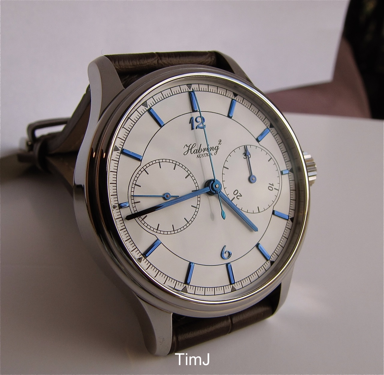
Crown Operated System + centre minutes/centre seconds chrono -

Split-second (i.e. double) chronograph -

(Habring was instrumental in designing the IWC Doppel while he was there)
All pics (TimJ/WPS).
I reckon you can get away with the handset, it's a dress watch with no lume so practicalities are further down the priorities list here maybe, but there's merit in what was said about shiny hands not being the best for quick reading in some lights.
The 'Chr.Ward' on the dial would be far better in the 'Cw' logo form, as on the crown and movement, while the full 'Christopher Ward' in a suitably scrolling italic could decorate the bridge.
The price/name doesn't seem to go together at first, as Andy points out though it's good value for this type of chronograph and for this amount of bespoke movement work but it's the name/association that will, wrongly or rightly, give pause. I look at it in terms of it being like JLCs QuadrophonicSphericAthmospheric tourbillon, or whatever it is, a flag-ship demonstration work, perhaps even a lose-leader, but hopefully a sign of serious stuff from Ward in the future and marking out some horological turf at the present.
- Sorry if this has been covered before btw
ETA - yes, normally I'm put right off by roman numerals, but this seems to be the least offensive that I've seen.
For a while I've followed Habring²s work, they've done some cracking stuff in terms of their modifications and 'novelties'/complications - simple but interesting - but for me they've never quite hit my design sweet spot. I've said before that if they used their more bespoke chronograph movements with either a more Bill/Rams style or a more classical design, I'd be saving for one now, . Out of interest then, a few more dress chronographs with interesting twists:
Crown operated (by twisting) chrono - no pushers -
Crown Operated System + centre minutes/centre seconds chrono -
Split-second (i.e. double) chronograph -
(Habring was instrumental in designing the IWC Doppel while he was there)
All pics (TimJ/WPS).
Edited by andy_s on Saturday 12th January 16:05
Ikemi said:
andy tims said:
I do wish they'd drop the stupid Chr.Ward though. Christopher Ward, C. Ward, or C.W. all work much better to my mind.
This ... and the Roman numerals, which ruin it for me. Other than that, I like it! If I was seriously interested, I'd lurk the CW Forums to see if any come up second hand. However, those Habrings look fantastic.
Such is the way that the Roman numerals have been incorperated I think that they actually add to the design, and I'm not usually a fan of them either. They blend in with the hour markers, a great touch.
Habring is a new one to me, they have a quality look about them, should drop the 2 though! Will have a look through their site with interest...
Habring is a new one to me, they have a quality look about them, should drop the 2 though! Will have a look through their site with interest...

Gassing Station | Watches | Top of Page | What's New | My Stuff